 majal
majalmajal — Brand Guideline
From research to a living brand
majal's brand is built in three movements — research the field, define the brand, then build & activate it. Each phase below has one job and one output, and the next can't really begin until the one before it is decided.
-
0
Research & Evidence
DoneStudied 18 reference venues and 901 posts to learn what actually works in brand and social — distilled into 8 principles. Extended with a second track: a graphic research read of 14 design-strong accounts (magazines, Berlin venues, Iranian café culture and our own reference venues) — 7 visual trends with image evidence and engagement markers, mapped on the warm↔dynamic / photo↔graphic axes.
-
1
Brand Definition
You are here6 of the 18 decisions are settled: the essence one-liner (D1), the name metaphor (D2), lowercase casing (D4) and the Arabic-led logo hierarchy (D5) are locked; the gloss line (D3) is dropped; the epithet set (D10) is resolved. The first reviewer-comment round is applied. 12 remain open — several with clear research leans (D6, D7, D9, D12, D21, D22) — converge with ♥ / ✕ / 💬, then one consensus session for the items §10 marks as collective.
-
2
Verbal lock & assets
Handle live — copy pendingFreeze name, voice and copy; translate the frozen strings + boilerplate into all six languages. The name assets are secured and live: @majal.community and the domain majal.community — one string across web and social. Still to lock: the “majal Berlin / Neukölln” SEO construction (the jazz trio MAJÄL already exists).
-
3
Visual identity
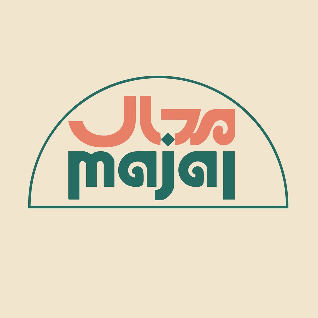
Started — logo deliveredThe logo exists: Arabic-led dual-script wordmark — مجال in terracotta above majal in deep green on cream. It executes D5 (Arabic-led) and de-facto answers the palette lean (D15 — the logo trio are the primary colors, a base not a cage). A logo v2 is requested from the designer: Instagram profile-picture fit, more contrast, and the arch container dropped — the arch is no longer a brand device. Still to build: colour tokens + the rotation logic, the text faces (the designer’s call — every script must read native; Arabic and Farsi may differ), and the recognition rules. The Design Brief hands all of this over, with the Graphic Research (7 evidenced trends, real palettes, the warm↔dynamic target) as reference.
-
4
Templates
LaterApply the new identity to the short, fixed set of working templates — event poster, Instagram post + story, menu / price board, shelf talkers, signage, podcast cover — as editable files anyone in the collective can use. The operating rules are already written: the anti-costume-change protocol in the social plan (locked templates, one motif, the partner-material rule, brand fonts in reels, one gatekeeper).
-
5
Brand kit
The goalPackage it all: logo files, colour tokens, fonts, the templates, the voice & language guide, and the usage rules from §10. This — together with the decided Brand Definition — is the brand kit.
-
6
Social media
ThenRun the channels with the kit: the five content pillars (§5), fixed calendar slots, recaps over announcements — the third movement of the process. The plan is drafted through v0.2, including the graphic guidelines with engagement evidence and the costume-change protocol.
The brand & content guideline for majal, distilled from 18 reference venues and 986 scraped posts. Start with The Proposal; the other panels hold the evidence — branding and visual patterns across the strong brands, a caption-level read of what performs, and the raw engagement numbers. Findings come from an LLM read of every caption and the top post images of each feed, with every numeric claim re-verified against the dataset.
Engagement leaders average likes as % of followers
| Venue | Followers | Avg likes | Engagement rate | Posts / month |
|---|---|---|---|---|
| Subkontinent Berlin @_subkontinent | 2.7k | 117 | 2.1 | |
| Jiwar Space Berlin @jiwarspace.berlin | 16.6k | 501 | 12.2 | |
| Haymarket House @haymarkethouse | 6.6k | 163 | 0.4 | |
| Sankofa Video, Books & Café @sankofadc | 23.7k | 359 | 3.9 | |
| Riwaq Berlin @riwaq.berlin | 11.2k | 154 | 4.5 | |
| Trampoline House @trampolinhusetdk | 4.9k | 60 | 2.1 | |
| Spore Initiative @spore.initiative | 33.5k | 336 | 13.3 | |
| Brunnenpassage @brunnenpassage | 8.2k | 78 | 12.4 | |
| Tía Chucha's Centro Cultural & Bookstore @tiachuchas | 42.1k | 357 | 36.7 | |
| DARNA / La Cantine Syrienne @darna.excantinesyrienne | 7.1k | 59 | 9.6 | |
| Making Worlds Bookstore and Social Center @makingworldsbooks | 7.4k | 45 | 9.7 | |
| Bavul Sanat & Kultur Cafe @bavulcafeberlin | 7.8k | 30 | 2.4 | |
| Casino for Social Medicine @casinoooooooooooo | 8k | 16 | 11.5 |
Posts/month is measured over each profile's scraped window — for thin samples (e.g. Haymarket: 16 of 170 posts) it understates the real cadence.
Small and focused beats big and busy. Subkontinent — the tiny Neukölln project space with 2.7k followers — leads the comparable set at 4.3% engagement. Personal, neighborhood-scale pages punch far above their weight.
The two cautionary tales are both Berlin pages. Bavul — the venue closest to the majal format — posts ~2×/month with hashtag-heavy captions (0.4%). Casino for Social Medicine posts 11.5×/month yet sits last at 0.2%: its grid is almost entirely weekly schedule carousels, which its 8k followers have learned to scroll past. Frequency cures nothing if the genre is wrong.
Caveats: Barzakh Café, Uncle Bobbie's and Café con Libros hide like counts on (nearly) all posts, so they can't be ranked despite strong followings — Café con Libros' single visible-likes post suggests ~1.6%. Hidden likes also thin out other pages (Spore 12 of 81 posts, Sankofa 11 of 39). Scrape coverage ranges from 0.2% to 82% of each feed, so “top post” always means top of the scraped window. Making Worlds left its space in December 2025 and has been quiet since April 2026 — treat its numbers as historical. Jiwar, Allerweltshaus and Mezrab have no scraped posts yet (rate-limited during scraping).
What actually performs caption-level analysis of all 901 posts, numbers verified against the data
- The strongest genre everywhere: existential, first-person news about the place itself. Spore's response to racist vandalism of its building is its most-liked scraped post (2,652 likes, 117 comments). Making Worlds' “we are leaving our 45th Street space” did ~15× their average. Sankofa's 25-years-of-Black-storytelling post (2,625) and Uncle Bobbie's “Staying in Germantown” (194 comments) follow the same pattern. Followers treat a venue as a character in a story and show up for the plot points.
- Political content roughly doubles a post's odds of landing in the top quartile (~2×) — but only when it's concrete and embodied: a purchasable book stack as an anti-ICE statement (Tía Chucha's shelf photo, 6,026 likes — 17× their average), a dated lecture, residents' own demonstration. Abstract commemorations flop: Subkontinent's Babri Masjid memorial got 52 likes while its Ambedkarite film-event launch got 230. Statement-as-action beats statement-as-position.
- Recurring-program posts are engagement poison. Casino's weekly schedule carousels draw 2–6 likes from 8,000 followers; the same template fatigue shows at Brunnenpassage, Trampoline House, Riwaq and DARNA. Audiences habituate to any repeated format — the weekly schedule belongs in stories, not on the grid.
- Books only travel with a named human attached. Making Worlds is the cleanest A/B test in the set: a staff pick fronted by a named bookseller with one quote gets 177 likes; their anonymous #fridayfiction display series gets 3–8. Same store, same books — personhood is worth 25–80×.
- Joy beats prestige. Haymarket's community bake sale (523 likes) beat every author event in its scraped feed, including Bill Ayers and Keeanga-Yamahtta Taylor (112). Riwaq's record is a four-word photo set: “Reasons for beauty” (741). The cake makes the theory credible — not the reverse.
- The recap often beats the announcement. Brunnenpassage's poetic listening-walk recap (239) outdid its announcements; Tía Chucha's “putting on this festival is a lot of work” behind-the-scenes video (2,945) crushed its program-detail posts (32–57). Comment magnets are interactive and people-centered: Tía Chucha's comment-to-enter giveaway (150 comments) and their bookkeeper's birthday (30). Flyer-style posts almost never draw comments.
- Format effects are real but small. Per-profile normalized: video 1.1×, carousels 1.0×, single images 0.9×; captions under 50 characters underperform (0.6×, small sample). Genre and voice matter far more than format.
- Posting more does not buy engagement. Frequency correlates negatively with engagement rate in this set: the engagement leaders post 2–4×/month, while Casino posts 11.5×/month at the bottom and Tía Chucha 37×/month at 0.8%. The consistent institutional pages run 9–13 posts/month — treat that as a sane ceiling, not a target.
What the strong brands share
- Culturally rooted names with a story. Barzakh (the Islamic in-between realm), Sankofa (the Adinkra symbol), Riwaq (Arabic for arcade/portico), Tía Chucha (the founder's actual aunt). The name itself does branding work — majal (مجال, "room/scope/field" — the same word in Arabic and Farsi) already fits this pattern; tell that story explicitly.
- A one-line values tagline. Café con Libros is “unapologetically feminist”; Uncle Bobbie's is “where everybody is somebody”; DARNA means “our home.” Every strong brand can be quoted in five words.
- The “home / living room” metaphor recurs constantly. Uncle Bobbie's living-room furniture, Mezrab's “House of Stories,” DARNA. Spaces that brand as domestic rather than institutional read warmer.
- Multilingualism as identity, not translation. Riwaq is the model: Levantine dialect first, with German or English saved for the punchline — the in-jokes (“a year of turn-down-the-voluuume,” 389 likes) drive its comment threads. Side-by-side full translations read institutional, and monolingual niche posts narrowcast (Sankofa's Amharic video: 31 likes). The first language of a caption tells the community whose room it is.
- A consistent visual world — but a system alone doesn't create reach. Spore's sage-green editorial design, Café con Libros' bold pink/black feminist palette, Riwaq's warm photos of full rooms. Barzakh proves the limit: a handsome, perfectly consistent flyer template with near-zero visible engagement. Winners combine the system with real faces, rooms, or causes.
Visual design from reading the top post images of all 15 feeds with photos
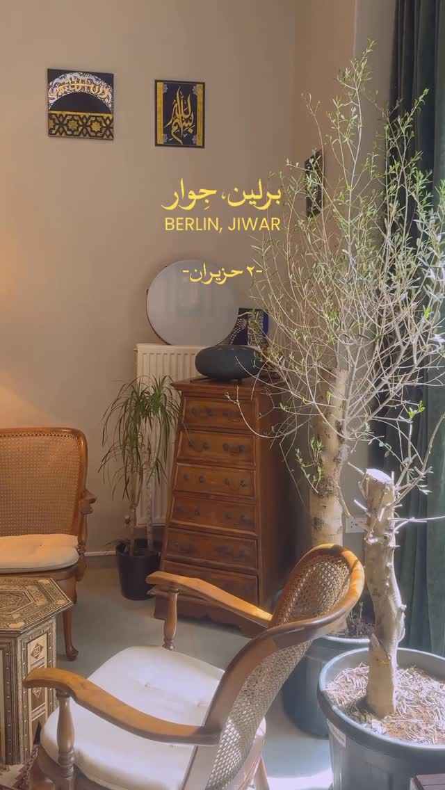
- Show the real place, not a flyer. Where feeds mix formats, photographs of the real place and its people beat designed flyers: the #1 posts of tiachuchas (teal store interior + statement), sankofadc (golden-hour storefront), riwaq.berlin (smiling bartender), unclebobbies (storefront in winter light) and trampolinhusetdk (raw arrest footage) are all photographic, while flyer-only feeds (barzakh, haymarket, darna, _subkontinent) plateau lower for similar follower bases.
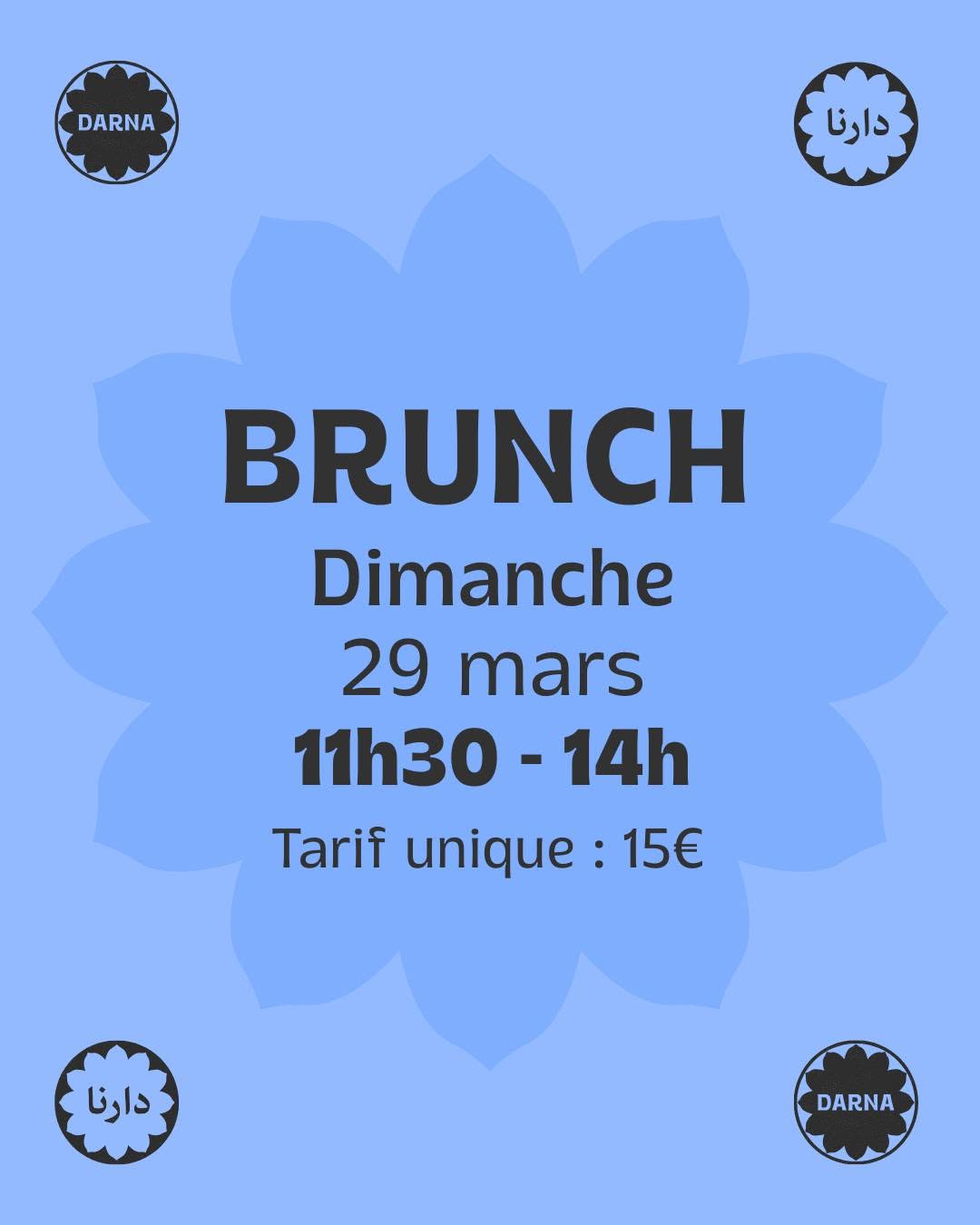
- Warm, saturated palettes win. Warm saturated palettes dominate the winners — terracotta, orange, amber, red-on-cream, golden-hour light — across riwaq, sankofa, _subkontinent, bavul and brunnenpassage's photo insets; pale, low-contrast or cool-blue designs (darna's brunch card, bavul's watercolor text sheet, _subkontinent's blue poster) consistently land at or below the median.
- Faces sell. Nearly every top post has one or two large, expressive faces (bartender, keffiyeh portrait, celebrity selfie, umbrella couple), while mid posts typically show no people, anonymous backs, or faces too small to read at thumbnail size.
- Conviction, set as type. Values delivered as type are a distinct engagement engine: spore.initiative's anti-racist statement on indigo, tiachuchas' 'we were interrogated' text-over-store, and makingworldsbooks' plain logo post all spiked because communities rally around conviction and identity — typography-as-image works when it says something that matters, not event logistics.
- A system — plus faces, the room, or a cause. The strongest identities are repeatable systems, not one-off designs — barzakh's cream/blue template, casinoooooooooooo's card-back series, darna's rosette + flat color, _subkontinent's duotone + doodles — but consistency alone does not create reach (barzakh's likes are near zero); the winning combination is a recognizable system that regularly features real faces, the real room, or a real cause.
- What sinks a post. Common visual mistakes on weak/mid posts: system-font text on stock watercolor or clip-art backgrounds, dense info-collages with tiny type, decorative kitsch or merch close-ups with no people or place, and pale low-contrast cards — all of them disappear at feed scale; several venues' feeds also contradict their stated brand aesthetic (darna posts in full color despite a 'black-only' identity, _subkontinent is polished riso design rather than a lo-fi notice board, casinoooooooooooo never shows its bar), so majal should define its aesthetic from what it will actually post.
Linked examples: Tía Chucha's store-interior statement (6,026) · Sankofa's golden-hour storefront (2,625) · Riwaq's smiling bartender (741) · Uncle Bobbie's winter storefront (194 💬) · Spore's statement on indigo (2,652) · Trampoline House's demo footage (313). Per-venue visual signatures are in each profile's “Feed Insights” block under the Venues tab.
The majal guideline eight principles, each linked to its evidence
- Narrate majal as a character from day one. The founding journey — “we found a space,” “renovation day 3,” “our first bookshelf” — is the strongest genre in the entire dataset (Spore, Making Worlds, Sankofa, Uncle Bobbie's all peak on existential first-person news). You have a free narrative arc before you even open.
- 6–12 posts/month is plenty — and never let the weekly program take over the grid. Schedules go in stories; the grid gets stories, people and recaps. Casino shows what template fatigue does to 8k followers.
- Write dialect-first captions with real voice. Riwaq-style: Arabic (or Farsi, rotating) first — colloquial, funny, emoji-rich — German/English as a short second line, not a mirrored translation block. Six languages is the differentiator; perform it, don't translate it.
- Make politics concrete, not commemorative. A purchasable solidarity book stack, a dated lecture, a shelf curated as a statement — Tía Chucha's anti-ICE shelf did 17× their average. Abstract memorial posts underperform everywhere.
- Put named people in front. Staff picks with a name, face and one quote (worth 25–80× vs anonymous book posts at Making Worlds), member portraits, guest features — plus interactive formats like giveaways and “which book should we stock?”, the proven comment-drivers.
- Build the visual system around warm photos of the real room. Warm saturated palette (terracotta, amber, golden-hour), faces large enough to read in thumbnails, one repeatable flyer template for events — and reserve type-as-image for values statements. Avoid pale low-contrast cards and dense info-collages, the signature of every weak feed.
- Post joy on purpose. Bake-sale energy — food, music, parties — outperforms prestige programming on every political page in the set. The cake makes the theory credible.
- Recap every event, don't just announce it. A photo set of the full room afterwards beats the flyer before, and compounds: each recap is proof the place is alive.
majal — Brand Definition
Foundation
Why majal exists, who it is for, and where it stands — the bedrock every other choice rests on.
Brand core
Purpose
why majal exists beyond revenue: So that the Kiez has a room of its own: a place for encounter, discussion and collective political education across languages — at a time when open, affordable, community-run places in Berlin are disappearing while the need for them grows. (direct from Konzept §1–2)
Mission
what we do daily: We run a café (10–18h), a multilingual bookshop, an event space and a small media and music studio in one ground-floor room in Neukölln — a low-threshold meeting point where people sit, read, work and meet without obligation, and where readings, films, workshops, concerts and learning groups happen in several languages.
Vision
the city we work toward: Berlin has a long tradition of self-organized cultural places; we add to it. We want a Berlin where multilingual culture is visible and ordinary, where communities exchange rather than coexist, and where a cooperative, solidarity-run space can sustain itself for the long term. (Konzept §1, §7)
Values as commitments
(each value = a practice of learning and unlearning, not an adjective — model: Artisans Co-op; dataset: politics lands as action, not position):
- Feminist — this means: the shelf foregrounds feminist and gesellschaftskritische literature (Konzept §4); programming centers FLINTA* and marginalized voices; we never book all-male panels.
- Anti-racist — this means: multilingual literature is the core of the shop, not an "international" corner. We focus on co-creating the program with the communities of the Kiez, not about them, and we commit to representing them without migration-cliché imagery or exoticizing language.
- Solidarity — this means: Soli pricing at events, nobody policed for not buying, space and co-programming for local initiatives (Konzept §3); we never let the café's commercial logic override the cultural purpose.
- Multilingual — this means: majal is a multilingual space, not a venue with a translation service bolted on; several working languages (Arabic, German, English, Farsi, French, Italian) are simply how the shelf, the captions, the counter and the signage already speak; we never use a language as decoration.
- Accessible / low-threshold — this means: ground floor, wheelchair-accessible, affordable prices, daytime hours for people who don't go to night venues (Konzept §2); we never make participation depend on money, German fluency, or insider knowledge.
Brand essence one-liner
(D1 — locked: option C):
"Ein Wohnzimmer zum Reden, Lesen, Streiten, Organisieren und Ausruhen." / "A living room to talk, read, argue, organize and rest."
The warm, activity-led reading — recasts the مجال (room to move) as verbs. Locked from options A–D; the alternatives are kept in the decisions table for the record.
Positioning & audience
Positioning statement
For people in Neukölln and beyond who want more than consumption from a public place, majal is the collectively-run, multilingual café-bookshop-stage-studio — unlike chain cafés (no community), monolingual bookshops (no Kiez), and institutional Kulturorte (no everyday warmth). Because we live here, organize here, and rent cooperatively (WBV), majal is of the neighborhood, not just in it. (Konzept §2, §5)
Audience sketches
(short, no persona decks):
- Kiez regulars — neighbors who want a daytime place to sit, read, work, bring kids; many will never attend an "event" and that's fine (café 10–18h is for them), and some slide from regular to organizer, putting on their own gatherings.
- Diaspora readers — Arabic- and Farsi-reading Berliners (plus FR/IT/EN) who came up on anti-colonial writers and order them online because no Kiez shop stocks them as core; here that literature is the core, and they should recognize "their" shelf and their language at the counter.
- The political-cultural scene — like-minded activists, authors, artists and initiatives from the collective's existing networks (Kiezkantine, Solile e.V. …) who share our values and co-create the program (Konzept §3, §5).
- Makers needing the studio — podcasters, musicians, groups recording talks, people taking music classes. A smaller, less certain revenue stream than venue hire; we are holding it open and will revisit it at the 6-month review (Konzept §2).
- Event & seminar organizers (venue hire) — NGOs, Vereine, unions, academic, feminist and diaspora groups, and small companies who book the room for a day (seminar, workshop, launch, meeting). A revenue audience, not a community one: they care about capacity, AV, accessibility, daytime availability and price. Every booking agrees that the space's values and code of conduct apply to their event; how far beyond that floor we ask for alignment is set at the first 6-month review (D22). They are reached on the website and by email, never the community feed.
Two offers, one place
majal is two things in one room — a socio-political community space, and a space one can hire. Outside program hours the same room that holds the café and the program is let by the day for seminars and events, and that rent helps carry the political and cultural work the community space is built around (Konzept §2, §6). The brand stays one; the register shifts for the two audiences (see §4), and the hire stance is set in §10.
Neighborhood stance
Arabic script is the storefront vernacular of Sonnenallee; Latin-only minimalism is the visual code of gentrifying cafés. majal is neither: it is a third option — dual-script presence, cooperative rent, Kiez prices — visible in §2 (lockup) and §7 (palette).
Verbal identity
What we are called and how we sound — the name and story, the personality, the messaging, and the fixed descriptions.
Name & story
The canonical name story
the long telling of the name: rung 4 of the description ladder (§6). Use it verbatim; counter-example Oyoun never told theirs and the press told it for them.
Primary name metaphor
(D2 — locked: combination A + C + D; drives the visual motif in §7 and recurring copy):
The metaphor is the room itself, seen three ways at once: an open field — common ground with no fences, where many languages and politics move freely (Arabic root ج-و-ل: مجال is the place where one roams); a breathing-space — the chance and the pause the city rarely affords, which the daytime café makes literal (Farsi majāl dādan, "to give the chance"); and a circuit — books, tongues, music and people making the jawla, the round, between shelf, counter, stage and studio, and recombining. Field, breath, circulation: ground held open, and movement through it.
Fused from options A, C and D and anchored in the actual space, so every part of the metaphor has a physical proof point on site. Option B ("room for everyone") is dropped; the alternatives are kept in the decisions table for the record.
Casing
(D4 — locked: option C): majal — lowercase, indie — used everywhere including running text, even at sentence start. (Alternatives A Majal / B MAJAL kept in the decisions table for the record. Avoid the umlaut spelling "Majäl" — that's how the Berlin jazz trio writes it; see naming note.)
Pronunciation guide
"majal — ma-JAAL, stress on the long second syllable (rhymes with the start of 'Taj Mahal')." The J is an English j, not a German y. Arabic majāl and Farsi majâl are pronounced effectively the same — the word belongs to both. (goes on the website /about and in the press kit)
Naming note
(from the research — decide and act early): مجال / majal is usable but not distinctive in SWANA cultural branding. The one real local clash is the Berlin-based jazz trio MAJÄL (oud + guitar + percussion, actively touring) — relevant because of our media and music studio and music events. Mitigations: lock the "majal Berlin" / "majal Neukölln" construction for SEO and keep a descriptor in the lockup so the name never travels naked (see D5, D10). Name assets are locked and live: the handle @majal.community and the domain majal.community — one string across web and social; "community" doubles as the descriptor, so the name never travels naked anywhere it appears. Use the same handle on every new channel. Other same-word orgs (Majal.org digital-rights NGO; Majal Space in Giza; the Majal creator app) are different sectors or countries — low confusion risk.
Script hierarchy of the logo
(D5 — locked: option C — the most-copied asset; it silently announces whose room this is):
Arabic-led, Latin secondary — مجال large, majal small. The strongest diaspora-first signal; the storefront speaks Sonnenallee's vernacular first (§3). Mitigate the legibility risk for non-Arabic-reading passers-by and press: the Latin "majal" and the descriptor (D10) always travel with the mark — the name never appears in Arabic alone (see naming note).
(Alternatives A equal dual-script / B Latin-led kept in the decisions table for the record; the dataset leaned A — the collective chose the stronger statement.)
- Design note: both scripts want a wide, calm, baseline-led lockup — مجال is horizontal with a dip-and-lift rhythm (the low jīm bowl, then the tall final lām), and lowercase "majal" is equally flat and horizontal. Set them on a shared baseline; let the jīm descender drop below it as the one expressive break. The horizontality itself pictures a field — on-brand for the locked D2 metaphor.
Personality & voice
Personality traits with guardrails
- Warm but not cutesy — hospitality, no kitsch, no infantilizing emoji walls.
- Political but not preachy — the program is the statement; the feed is its window. Politics lands through whom we invite, who shows up, what we shelve and what it costs — never as slogans in a caption: if a post reads like a position paper, replace it with the event, the guest or the shelf that proves the same point (dataset: Tía Chucha's purchasable anti-ICE shelf at 17× average vs. flopping commemorations).
- Multilingual but never performative — a language appears because someone speaks it here, not as garnish.
- Playful but reliable — jokes in captions, fixed slots in the calendar (dataset: Riwaq's in-jokes drive comments; habituated schedule-spam kills feeds).
- Collective but personal — "we" as default, real first names and faces in people-content (dataset: a named staff pick outperforms anonymous book posts 25–80×).
Tone matrix
(voice constant, tone shifts):
| Context | Lead language | Register | Emoji | Length |
|---|---|---|---|---|
| Instagram caption | per D6 | colloquial, playful | yes, sparing | short + second-language line |
| Window / A-board | DE + AR | warm, plain | no | one line |
| Event announcement | event's language | inviting, concrete | minimal | feeling first, logistics last |
| Funding application | DE | clear, confident, sober | no | as required |
| Press boilerplate | DE/EN | factual-warm | no | 50–100 words |
| Venue-hire inquiry / rate card | DE + EN | professional, warm, concrete | no | facts first, as needed |
Two registers, one voice
community and front-of-house comms are warm and political (the traits above). The venue-hire register — the rate card, inquiry replies, the venue page (§3, §10) — is the same brand but leads with reliability and facts: capacity, access, AV, price, availability. Same values (they are a selling point for the right renters), less politics up front; professional-warm, never corporate-cold.
- AEvent-language-first — each announcement leads in the language of the event (Arabic night → Arabic first), short DE or EN second line; Verein-official texts in DE(+EN). (Riwaq model — their dialect-first posts are their top comment-drivers. Research + dataset lean: A.)
- BRotating lead — posts rotate lead language on a schedule regardless of content (maximal parity, harder to keep natural).
- CGerman-led always — DE first everywhere, other languages second (safest for reach, weakest identity signal; "side-by-side reads institutional").
why we lean A
Riwaq’s dialect-first posts are their top comment-drivers: the first language of a post tells the community whose room it is. Leading in the event’s language is the strongest identity signal that still reaches everyone through the short second line.
- AHybrid (recommended): code-switching with personality on social (dialect, punchlines crossing languages), strict parallel DE/EN (+ event language) for official texts, access info, prices.
- BAlways parallel — every text fully mirrored (Mil Mundos "Home/Inicio" model): maximum clarity, institutional feel, unmaintainable across several languages.
- CFull code-switch everywhere — strongest voice, risks excluding readers from official information.
why we lean A
Code-switching with personality keeps the social voice strong, while strict parallel DE/EN for official texts, access info and prices keeps the things that must be clear, clear. You get the warmth without losing anyone.
Transcreation rules per language
(voice traits constant; texts transcreated, not translated):
- German: du, never Sie, in all front-of-house comms.
- ADoppelpunkt (Leser:innen)
- BSternchen (Leser*innen — what konzept0.md mostly uses)
- Cneutral rewording where possible (Lesende).
your call — no clear lean yet
Pick one; konzept0.md currently mixes BesucherInnen / Unterstützer*innen.
- Acolloquial Levantine/Iraqi for social, MSA for official & literary texts (mirrors D7-A)
- BMSA everywhere (gravitas, less warmth)
- Ccolloquial everywhere.
why we lean A
Dataset: colloquial drives engagement; a bookshop may still want MSA for literary contexts → A.
- Farsi: conversational register, not bureaucratic; FA wordings drafted by the Farsi speakers of the collective.
- QA rule: a text is approved for brand fit, not just fluency — by a speaker of that language in the collective.
Epithet string
the fixed descriptor after the name (D10 — resolved: situational set): rung 2 of the description ladder (§6). The voice rules here still govern it — see banned words.
Banned / chosen words
(Berlin-specific; word choice carries funding politics — Hopscotch refuses "decolonial" in the German context, Oyoun's funding conflict shows the stakes):
- Ause "anti-colonial / antikolonial"
- Buse "decolonial / dekolonial"
- Cuse neither; say what we do instead.
- Never: "Integration", "Migrationshintergrund" (use: mehrsprachig, diasporisch, or name the language/community), "exotisch", "orientalisch", "multikulti", "Geheimtipp", "Brennpunkt".
- Always: communities by their own names; "Kiez" over "Standort"; "Raum" over "Location".
Inclusive language commitments
anti-ableist (no "blind für…", "lahm"), anti-appropriative (no AAVE/borrowed slang as decoration), gender-inclusive per D8, plain language where the information matters (access, prices, dates).
- AHybrid (recommended): the brand speaks as "we"; people appear with first names and faces in people-content (staff picks, behind-the-scenes); 1–2 designated press contacts so journalists get a person. (Dataset: named humans move content; research: founder-faced venues get disproportionate press.)
- BStrict collective "we" — no individual faces/names ever (News from Nowhere / AK Press model): purest structure-as-face, costs reach and press.
- CDesignated public faces — 1–2 members are "the faces of majal" consistently (Café con Libros model): max press traction, sits oddly with a non-hierarchical Verein.
why we lean A
Named humans move content (a named staff pick outperforms anonymous book posts 25–80×) and founder-faced venues get disproportionate press — while a default “we” keeps the non-hierarchical collective honest.
Messaging
Messaging pillars
(become the social content pillars; each with proof points):
- Building the place, together — the founding journey, milestones, setbacks, the room itself. (Dataset: existential first-person news about the place is the #1 genre everywhere.)
- Literature across languages — the multilingual shelf as the offer commercial bookshops don't make (Konzept §4); staff picks with names and faces; the podcast from the studio.
- Politics as practice in the Kiez — curated shelves as statements, solidarity events, co-programming with local initiatives; concrete, dated, embodied — never commemorative-abstract.
- Joy & hospitality — food, music nights, Sprachcafé, celebrations; the cake that makes the theory credible. (Dataset: Haymarket's bake sale beat their star-author panels.)
- (optional fifth — → D13: keep or fold into 2/3?) Learning in common — workshops, skill-sharing, learning groups, storytelling as collective political education (Konzept §1, §3).
Politics → proof points
(every adjective maps to an enforceable practice):
- Feminist/critical shelf focus → the published curation rule
- Solidarity → the Soli sentence on every event + free formats (Sprachcafé)
- Anti-racist/multilingual → several languages on shelf, counter, captions (D6) + co-programming with communities
- Collective → no boss, no owner: Verein + collective of 4–5 runs everything (Konzept §5)
Tagline
parked — decide after the visual identity exists (the essence one-liner, D1, is locked in §1).
- Akeep "Learning in common"
- Bor fold into pillars 2/3
The description ladder
A fixed set of descriptions per length — pick the rung that fits the space and the variant that fits the situation; never improvise a new one.
1 · Name alone
majal / مجال (lockup per D5)
Used: logo, stamp, book spine, favicon, profile pictures.
2 · Epithet string
the fixed descriptor after the name; a fixed set, picked per situation (D10 — resolved: situational set).
Used: window lettering, A-board, press mentions, event listings, imprints, partner pages, Instagram bio.
- A — descriptive.
DE: "mehrsprachige Buchhandlung, Café & Veranstaltungsraum in Neukölln"
EN: "multilingual bookshop, café & event space in Neukölln"
Use for: window lettering and A-board (with the lockup, per D5), grants and funding applications, official listings, press boilerplate. - B — politics first.
DE: "feministische, antirassistische, mehrsprachige Buchhandlung & Café in Neukölln" (Café con Libros / Oyoun model)
Use for: scene contexts where the politics open doors — political program partners, movement media. - C — Instagram bio.
Two rotating versions, each one Latin + one non-Latin script:
Version 1 — DE + AR:
"Ein unabhängiger Raum auf der Sonnenallee – für Kultur, Austausch, gemeinsames Lernen und Collective Care."
"مساحة مستقلة في زوننآلي – للثقافة والتبادل والتعلّم المشترك والرعاية الجماعية."
Version 2 — EN + FA:
"An independent space on Sonnenallee — for culture, exchange, learning together and collective care."
"فضایی مستقل در زوننآله – برای فرهنگ، تبادل، یادگیری جمعی و مراقبت جمعی."
Use for: the Instagram bio; rotate version 1 ↔ 2. AR/FA drafts — to be approved by the language speakers of the collective (§4 QA rule).
3 · Boilerplate
50–100 words, DE first; opens with epithet variant A.
Used: press releases, funding applications, partner sites, website footer.
majal ist [Epithet A]. Ein Erdgeschossraum in Neukölln: tagsüber Café (10–18 Uhr), an den Wänden Bücher in mehreren Sprachen — internationale, feministische und gesellschaftskritische Literatur —, abends Lesungen, Filme, Workshops, Konzerte und ein kleines Medien- und Musikstudio. Man kann hier auch einfach nur sitzen, lesen, arbeiten — niemand muss etwas kaufen. Getragen wird der Raum von einem Kollektiv aus Community-Organisator:innen und einem gemeinnützigen Verein für Kultur und Literatur — und von den Nachbar:innen, die ihn nutzen.
(EN + AR + FA versions follow once D8/D9 are fixed.)
4 · The full name story
use this telling verbatim.
Used: website /about, press kit.
the full story — unfold
majal (مجال) is the word for room to move — a field, an open space, the scope you have to act. The same word, written with the same letters, in Arabic and in Farsi. Its root means to roam, to circulate, to move freely: مجال is, literally, free movement made into a place — and into a moment: to have majāl for something is to have the time for it as much as the room. In Arabic, majāl li-n-niqāsh is "room for discussion," and afsaḥa l-majāl means "to make room, to clear the way." In Farsi it is the chance, the respite — the room to breathe that a hurried city rarely gives. That is what we are building: room — for languages, for books, for argument and for rest. A socio-political meeting point, not just a place to consume: a café where nobody has to buy anything to stay, shelves of feminist, critical and international literature in several languages, a stage and a small media and music studio for the Kiez's own voices. Room to move between them.
Visual identity
How we look — the brief for the logo, colour, type and visual motif that the design phase delivers.
Visual direction
- AThe "room beneath" curve — take the jīm's dropped bowl from مجال (the word's signature low curve) as a recurring device: a hollow that cradles space beneath the line, used as image crops, frames and a motif in the room. Strong system glue, ties straight to the wordmark; pair with a "max one per artifact" rule.
- BOpen-field horizontality — no single device; the system is wide, calm, baseline-led layouts with generous space (the expanse made visual). Hardest to copy, most "designed," least gimmicky.
- CIn the logo only — the lockup carries the idea; everything else stays free and photo-led.
- ATerracotta/amber/cream + deep green accent — warm Mediterranean-domestic; photographs of the room will sit naturally in it.
- BCream + black + one warm red — riso/political-print tradition (Subkontinent's duotone polish); strongest for type-led posters, cooler feel.
- CDeep indigo + warm amber/yellow — statement-driven contrast (Spore's indigo values-posts); strong for type-as-image, less domestic.
Typography requirement
every script must read native — faces designed for Arabic and for Farsi, not Latin fonts with bolted-on glyphs; Arabic and Farsi may use different typefaces; Farsi glyph coverage (پ چ ژ گ) is mandatory; faux-oriental Latin display faces are banned; max two typefaces per graphic. (The choice of faces belongs to the design phase — the designer proposes, native readers in the collective verify.)
Photography principles
the real room and real people; warm light; faces large enough to read at thumbnail size; candid as the default — posed portraits of staff, hosts and event makers welcome, the stiff group line-up is what we avoid; never migration/poverty clichés, never stock. People photographed with dignity and consent — community members as hosts and protagonists, not subjects.
Type-as-image
reserved for values statements and existential announcements (dataset: it spikes for conviction, dies for logistics). Event logistics live in layouts, not headline graphics.
Accessibility
WCAG AA contrast minimum in all palette combinations — a brand value, not an afterthought.
Templates needed
(only these, one system): event poster A3/A4 · Instagram post + story (event, recap, statement, staff-pick variants) · menu/price board · shelf talkers · window/A-board signage · podcast cover.
Experience
How the brand shows up in the space and the programme — the shelf, the signage, the formats.
Organization
The Verein, the support model, and who stewards the brand over time.
Verein & support framing
- AMembership as front-of-house brand — "Mitglied werden / support your space" on the website header, menu footer and a supporter wall in the room (Mil Mundos model); the Verein is part of the story: "Der Kaffee trägt die Kultur — und die Mitglieder tragen beides."
- BQuiet e.V. — the Verein lives in the Impressum; front-of-house reads simply as café-bookshop; membership pitched only at events.
- CMiddle path — one standing transparency line ("Der Kaffee trägt die Kultur") + membership CTA on the website and at events, no supporter wall.
why we lean C
Member income is structural to the funding mix (Konzept §6) and existential transparency about the place is the dataset’s single highest-engagement genre — so name the Verein and add a membership CTA, but skip the full supporter wall.
Funding transparency
once a year, an open "wie sich majal trägt" post/letter (income mix, what members made possible). (Dataset: existential institutional news is the highest-engagement genre — transparency is brand-building here, not risk.)
Venue hire — the space as revenue
(the second offer; see the audience in §3 and the register in §4): Outside program hours the room is rented for one-day seminars, workshops, launches and meetings. It is structural revenue alongside café, books, events and membership (Konzept §6), and it pays toward the cultural mission. Two things are set here — how the offer is branded, and who we rent to.
- AOne brand, professional register — "majal" everywhere, with a venue-hire page and rate card in the same identity; only the voice shifts to facts-first (§4), the look does not.
- BNamed sub-offer — a light label ("majal Raumvermietung" / "Raum bei majal") under the same identity, to mark the commercial offer distinctly.
- CSeparate brand — a distinct name and identity for rentals; the brand-architecture overhead the collective otherwise deliberately skipped.
why we lean A
A five-person collective can’t sustain two brands — and the political identity is an asset, not a liability, for the value-aligned organizers you most want to rent to. Keep one look; shift only the register to facts-first for the hire page (§4).
- AValue-aligned only — we rent to people and organizations whose work doesn't conflict with our values; published criteria; we may decline without justifying. Targets the natural market: NGOs, Vereine, unions, feminist, diaspora and academic groups.
- BOpen + values clause — open to anyone who agrees in writing that the space's values and code of conduct apply to their event; we decline only on breach.
- CCase-by-case — no published policy; each booking decided by the collective: flexible, but slow, inconsistent, and silent on where we stand.
why we lean A
For a feminist, anti-racist space, renting to a misaligned client is both a contradiction and a textbook crisis trigger. A published “value-aligned only” gate protects the brand and happens to target your natural market — NGOs, Vereine, unions, academic and diaspora groups.
Governance
- Brand stewards: 2 named members (TBD at founding) — they maintain this doc and the templates; they are not an approval bottleneck.
- Consensus required (whole collective): name & lockup, epithet string, values & commitments (§1), political statements in majal's name, pricing model, this document's major revisions.
- Free within the rules (any member, no sign-off): daily posts, event texts, recaps, menu copy — as long as they follow §4 (voice, language lead, banned words) and use the templates.
- Review: every 6 months, 1-hour collective session; version + date at the top of this file. Participatory ("Brand IDEA": integrity, democracy, affinity), not policing.
majal — Social Media & Communications Strategy
Channels — distinct jobs, not copies
Instagram — the shop window.
Handle locked and live: @majal.community. Recaps with real faces, place-news, joy, named staff picks. Caption leads in the event's language (D6), second language under (D7). Bio: rotating two-script pair (§6). The channel rule: the program is the statement; the feed is its window — no position papers, no slogan captions. Keep off it: schedule grids, logistics dumps, rental sales.
Telegram — the direct line.
No algorithm, instant, two-way; a primary channel for Arabic- and Farsi-speaking Berlin. Day-of reminders, changes, quick drops, a regulars' group. Only when there's something to say.
Email — the owned audience.
Monthly digest, founding journey, the annual transparency letter (§10), member updates; the inbox where hire inquiries land. High substance, low frequency.
Website — the home base.
Domain locked and live: majal.community. The name story told properly (§6 — tell it before the press does), the access block, program/calendar, membership signup, press kit, the venue-hire page + rate card, Impressum/DSGVO. Reference and conversion, not a feed.
One event, four jobs
website listing → IG announcement (a teaser, not the flyer) → Telegram + story reminder day-of → IG recap within 48h → email digest folds it in.
confirm the launch set: Instagram + Telegram + Email + Website, nothing else until one is clearly underused.
Content
Pillars (§5)
building the place · literature across languages · politics as practice · joy & hospitality · learning in common. No new ones here.
The rules that shape the feed
- Recaps and place-news lead, announcements follow — that's what performs, and it's the proof the room is alive.
- Fewer, better posts. Frequency correlates negatively with engagement. No daily quota.
- Schedules live in Stories and the calendar, never the grid.
- Type-as-image only for conviction (values, existential news), never logistics.
- "What is majal" texts come from the description ladder (§6) — never improvised.
Post types — the four templates
(the design deliverables, defined in the Design Brief; every grid post is one of these):
- Event announcement — title, date, one picture or a flat ground; a teaser, not the co-host's flyer.
- Recap — photos from the event after it happened, in the small recap frame. Also carries place-news, joy, behind-the-scenes.
- Statement card — purely typographic, one sentence fills the tile, dual-script. Values and existential news.
- Book-quote card — a sentence from a shelf book, author cited; may carry the book or other visuals. Also carries staff picks.
No dedicated story templates — posts plus hand-written story text carry us.
Per language
each post has a lead language and a writer/approver who speaks it — approved for brand-fit, not just fluency.
Accessibility
alt text, video captions, the access block on every event post, logistics never trapped inside an image-only graphic.
The post plan
(rhythm, not quota):
- Phase 0 — before opening: the founding journey as a serial — lease signed, build-out, shelves in, sign up. The #1 genre in the research, and majal has a year of it for free. 1–2 posts a week.
- Opening: three set pieces — the name story (pinned), the logo reveal, the storefront at golden hour.
- Weekly: 2–3 grid posts max — one program post, one place/people/shelf post, slack for the spontaneous. Never two announcements back-to-back.
- Per event: announcement as a short portrait of the guest, never a date/time flyer → reminder day-of → recap within 48h with the full room and real faces. The recap is routinely the stronger post.
- Monthly: one program-overview post at most, the digest, one batch-production session.
- Rotation guard: three event posts in a row → the next is the room, a person or the shelf.
Post ideas — the starter list, evidence-linked (per pillar)
- Building the place: "we signed the lease" / keys-in-hand · build-out before/after pairs · "the shelves are in" · the sign going up · storefront at golden hour · the annual "wie sich majal trägt" letter with real numbers (Trampoline House naming the exact DKK 54,423 raised built the deepest loyalty) · association life as content (plenums, membership drives — democratic mechanics as proof of seriousness).
- Literature across languages: named staff picks — a member's hand + the book, one honest first-person sentence, signed with a first name; named picks outperform anonymous book posts 25–80×. Shelf-as-commentary — re-arrange the front table to the week's news and photograph it (Tía Chucha's anti-ICE shelf: 17× their average). The quote card — one striking sentence from a shelf book, typeset as an object, author cited, ideally bilingual. Author events as guest portraits, never flyers. Kill anonymous series — they flatline.
- Politics as practice: event + meal bundles (DARNA's Sudan talk-plus-dinner: 180 vs 57 avg) · practical skill trainings · reading-circle launches with named stakes · co-published programs with allied collectives (pooled audiences) · community members as actors, not recipients. Never commemorative-abstract — concrete beats memorial 5:1.
- Solidarity spotlight: one initiative from the communities majal holds space for — portrait of the people, what they're building, one concrete action, co-published with their account. DARNA's support evening (1.8×), their shared Mujawara program (3.8×, their top post), Trampoline House's voting guide and thank-you naming the exact amount raised. The rule: named cause, named people, concrete stakes, report-back after — never a vague appeal.
- Joy & hospitality: the full happy room with a four-word caption (Riwaq's page record: "أسباب الجمال / Reasons for beauty") · bake-sale-grade neighborhood events · trilingual in-jokes — German can be the punchline · behind-the-scenes work · no-registration drop-in formats (Tía Chucha's sewing club: 1,105 likes).
- Learning in common: the Sprachcafé properly promoted (a proven Berlin format) · learning-group recaps that say what was learned, in the group's language · skill-shares with concrete stakes, not wellness-vague.
- Recurring: a repeated Kiez sign-off phrase (Uncle Bobbie's "See you in Germantown" became community shorthand — majal needs its Neukölln line) · recaps written as values statements: the values are read off the event, not proclaimed.
Graphic guidelines — how a majal post looks.
Every repeat winner commits fully to one of two grammars — a real photo of the room mid-use, or a fully designed poster — and nearly every underperformer sits in between (a photo with an info block on top, a template with the date swapped). The board shows both grammars on real winners; the full rules and evidence sit beneath it. The complete reference read lives in Graphic Research.
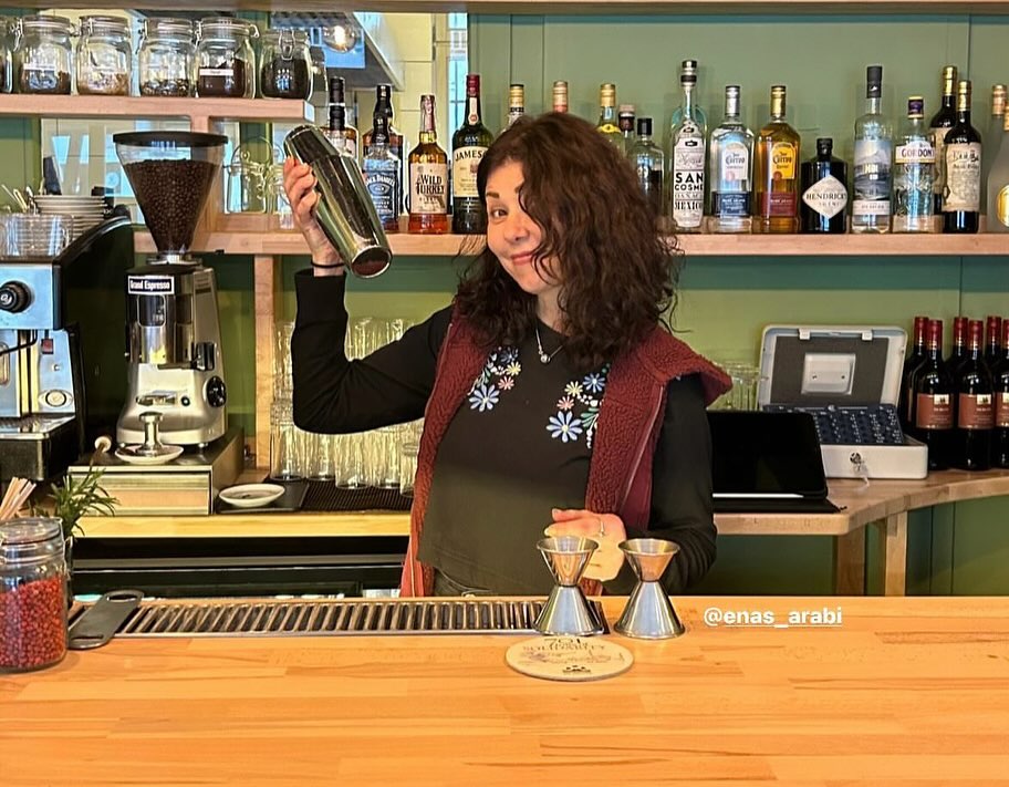 4.8× — the full room, four words
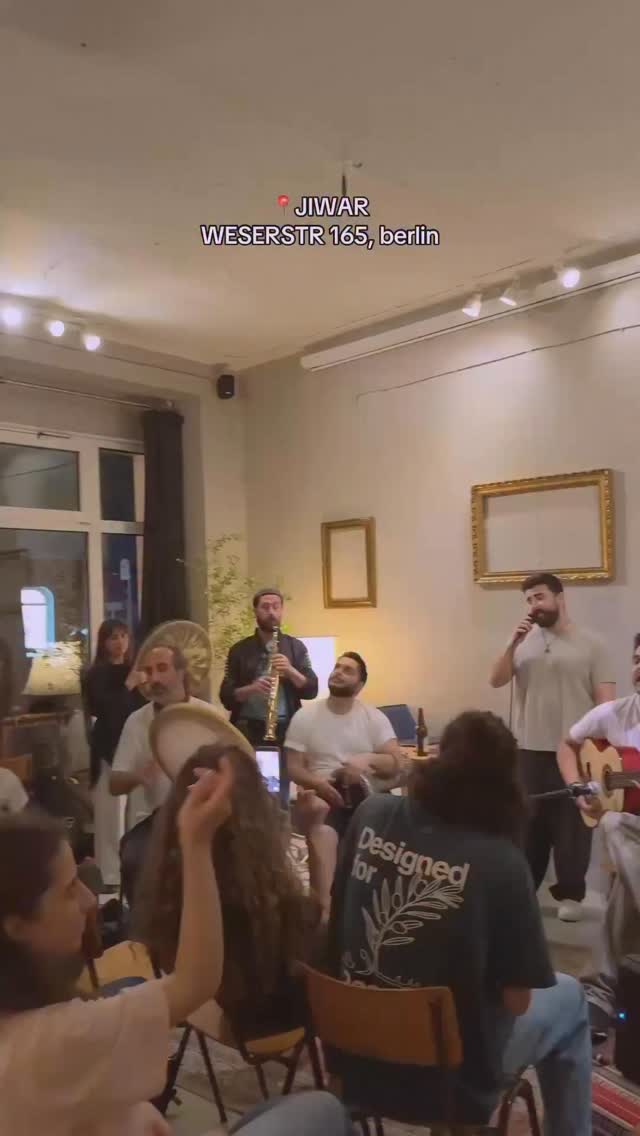 4× — a music moment, not a flyer
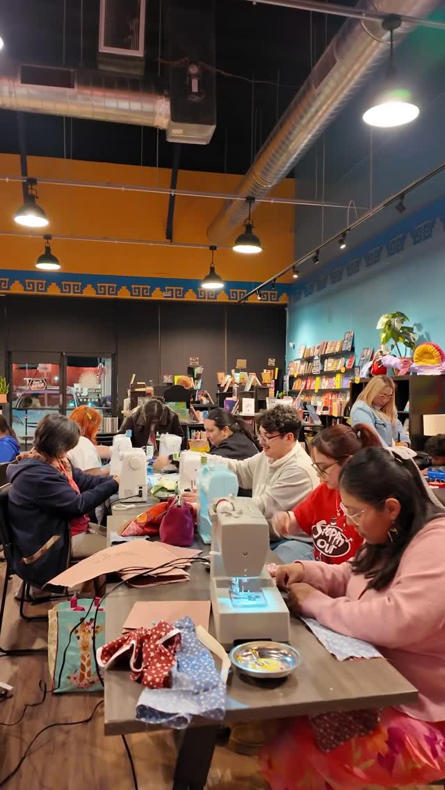 1,105 likes — sewing club mid-action
 1.9× — heritage on stage
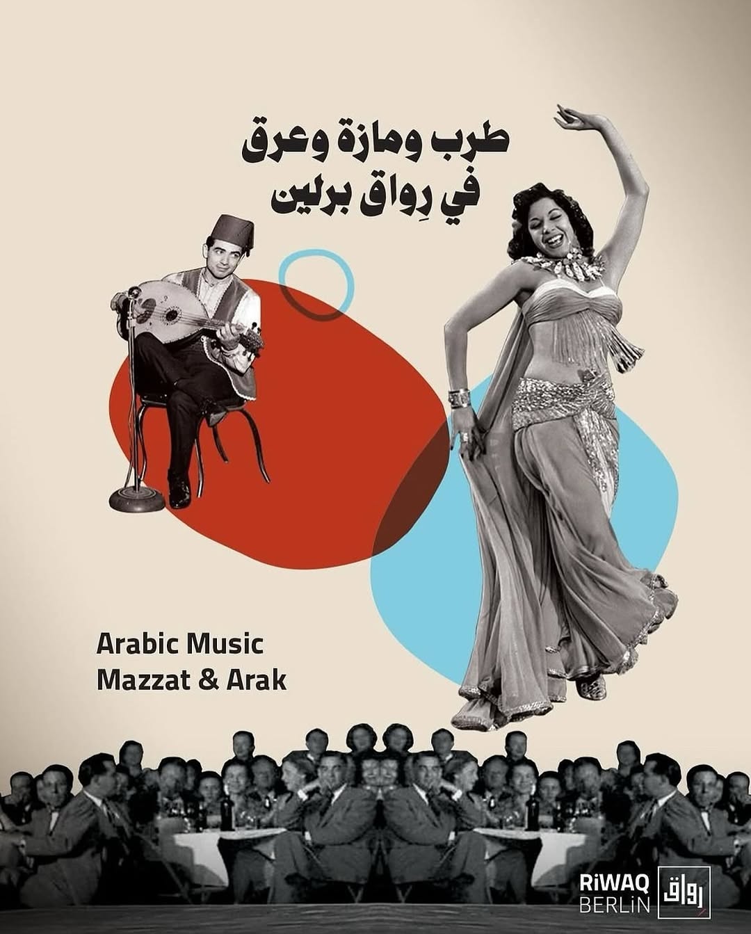 4.2× — retro طرب collage
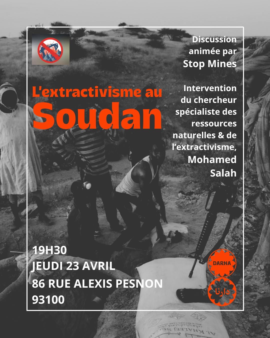 3.2× — saturated field, giant type
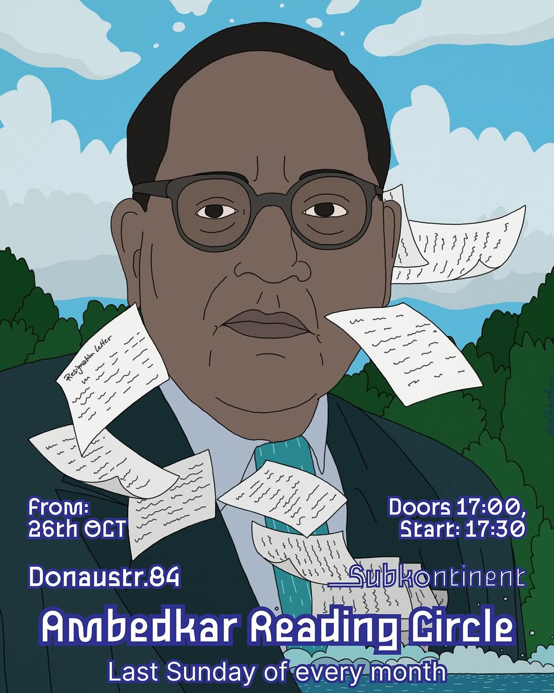 2.2× — bespoke Ambedkar illustration
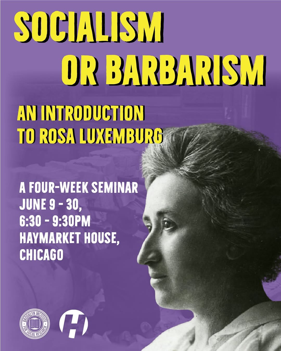 1.6× — archival B&W figure
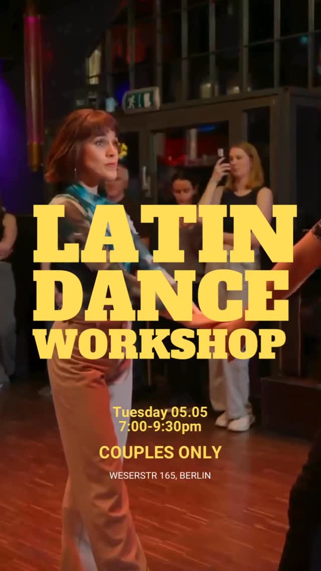
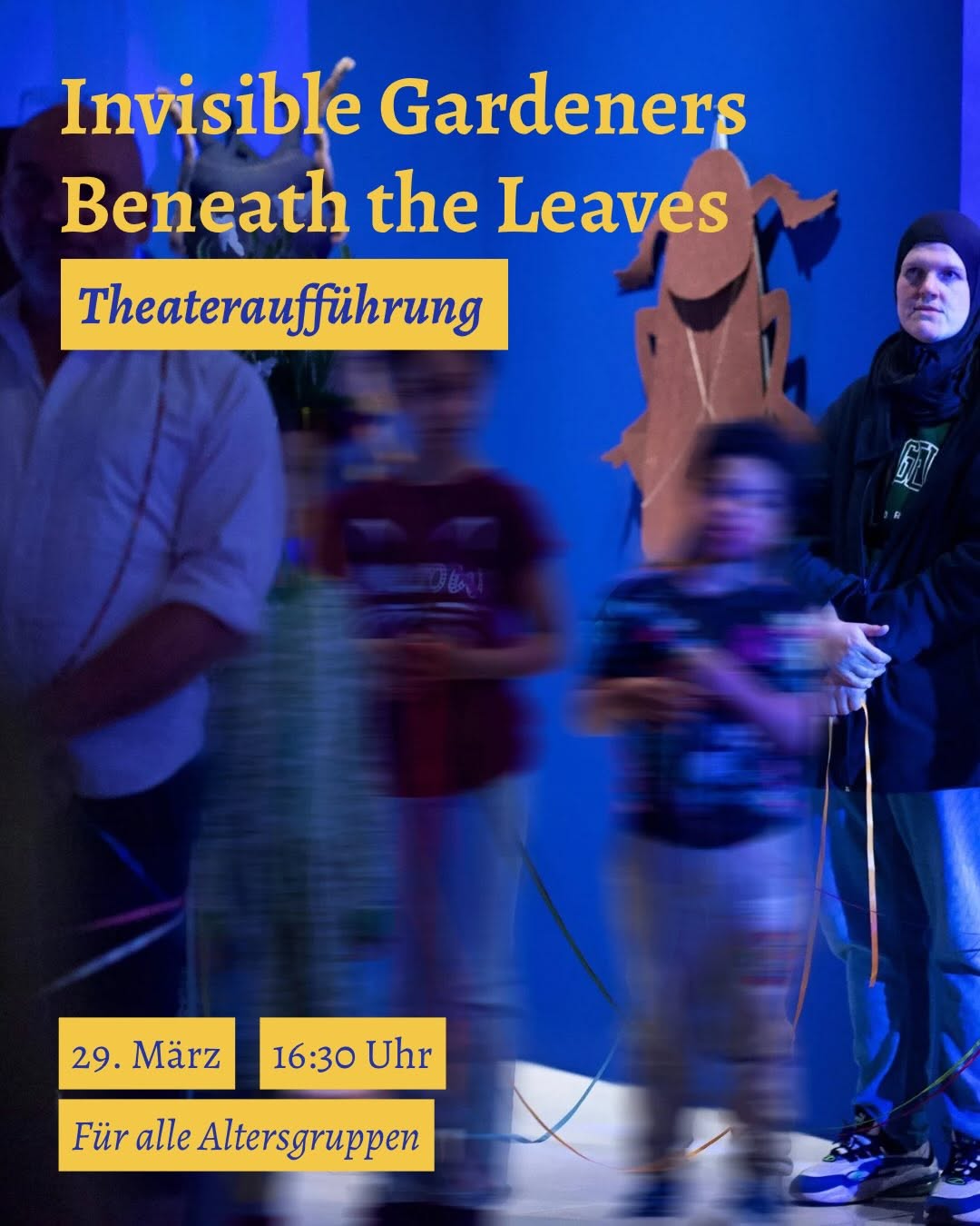
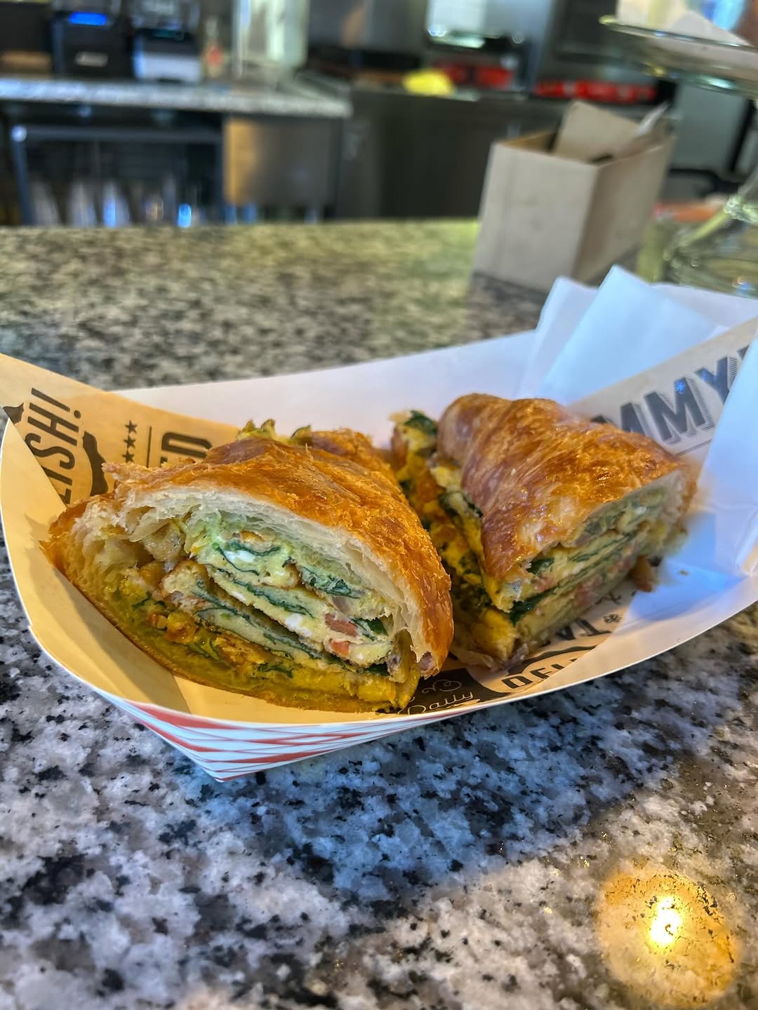 object, no people — croissant engagement-bait, ⅙ of average✕
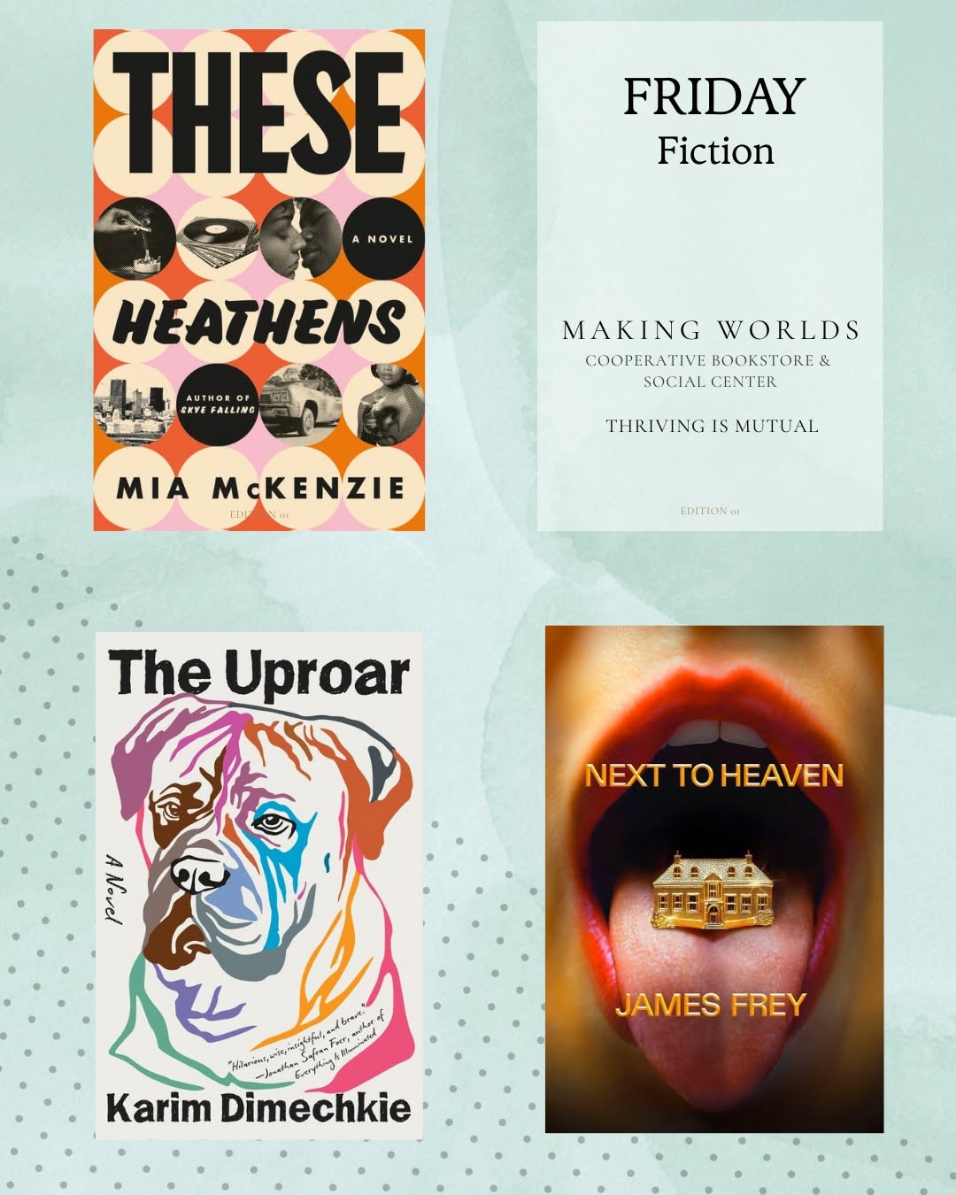 anonymous series — #fridayfiction, book without a person: 3 likes✕
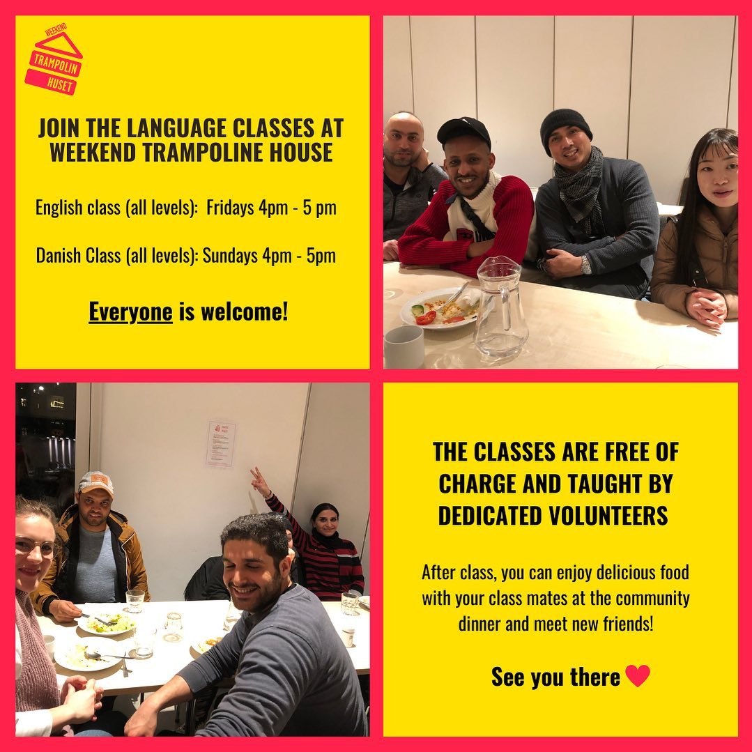 schedule on the grid — the weekly program listing: 14 likes✕
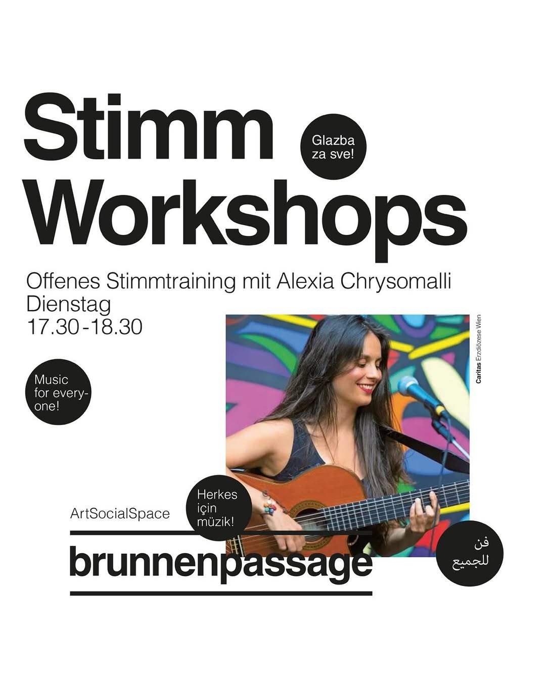 reminder template — “TOMORROW: workshop”, no new material: 11 likes✕
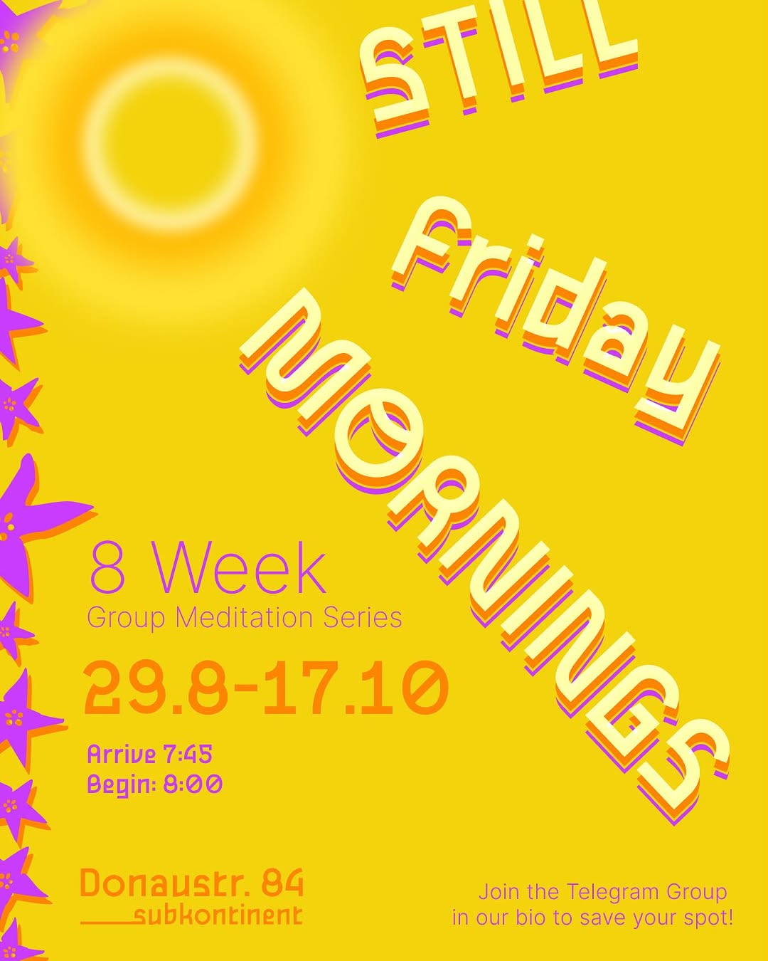 low contrast + wellness-vague — yellow on yellow, bottom of the page✕
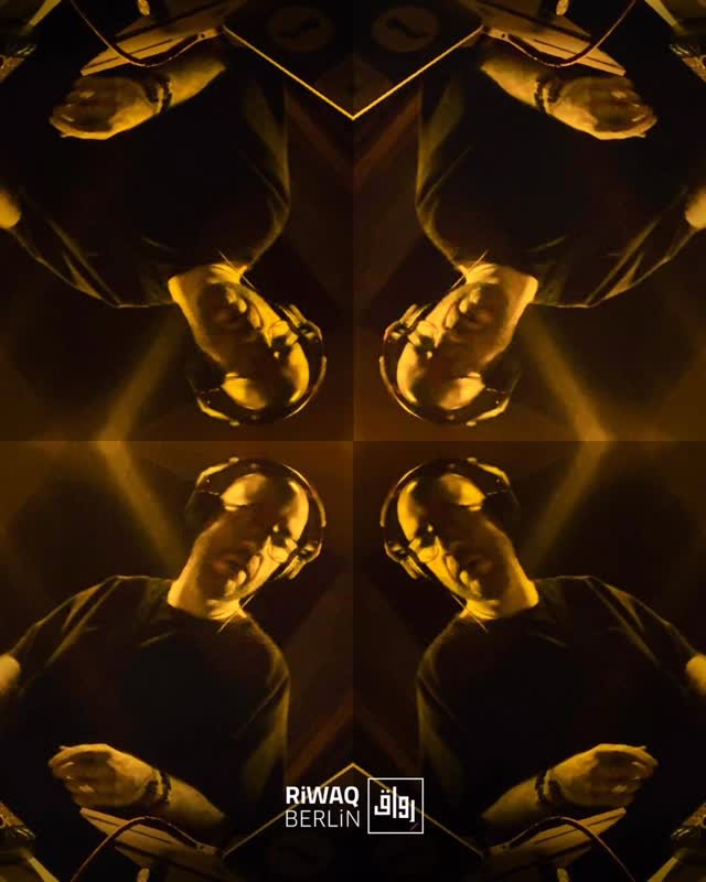 gimmick edit — kaleidoscope-mirrored DJ still: 16 likes from 11k✕
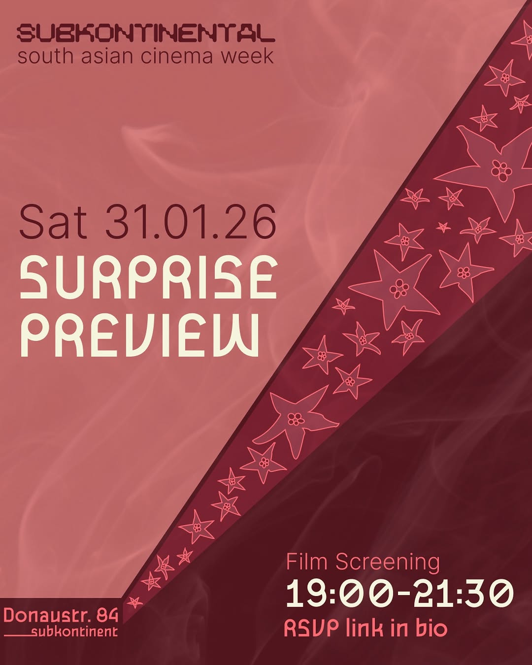 vague tease — refused to name the film: 23 likes✕
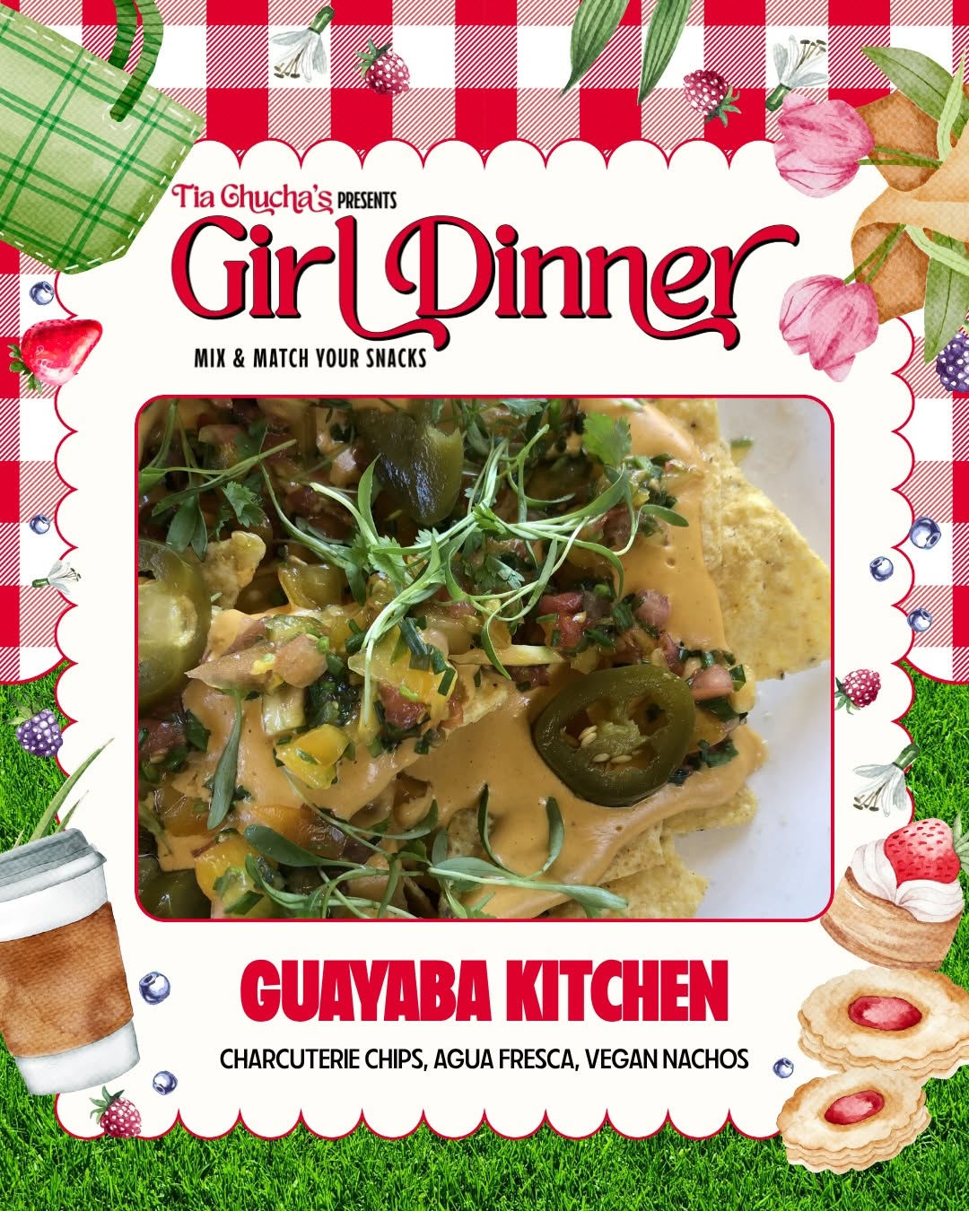 clip-art collage — borders, 4+ fonts, nobody in frame: half average✕
abend
Datum · 19:00 Uhr
Anmeldung erforderlich · 5€
Ort · Info · Link in Bio
The ten rules in full — evidence links, palette table, type spec
The two grammars.
Every repeat winner in the image read commits fully to one of two visual modes; nearly every underperformer sits between them.
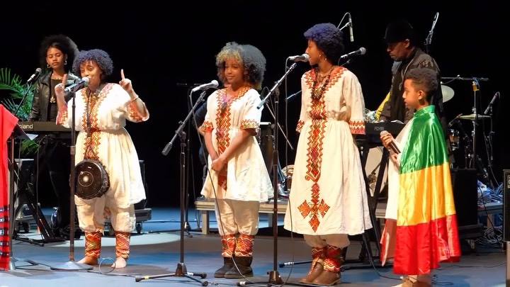
- Photo grammar (the default for a space-venue like majal): a real photograph of the own room mid-use — candid, vertical, shot from inside the activity (audience POV, table level), warm tungsten or golden light, bodies and hands mid-action. Text on the image: at most a small dual-script lockup or a four-word title. Riwaq's full room (4.8×), jiwar's "feel like home" music moment (4×), Tía Chucha's sewing club (1,105 likes). Every zero-text photo in the image read is a winner; not one underperformer is a clean photo.
- Poster grammar (when there is no photo): total design instead — one flat saturated color field, giant display type as the visual itself, one or two accent inks, and one bespoke element made for this event: custom illustration, archival B&W photo, collage. DARNA's talk+dinner poster (3.2×), Subkontinent's Ambedkar launch (2.2×), Haymarket's Rosa-Luxemburg seminar (1.6×), Riwaq's retro طرب collage (4.2×). DARNA proves a face-free feed can work — if every poster is individually art-directed.
- The middle kills. A photo with an info block dumped on top, or a fill-in-the-blank template where only the date changes: each half cancels the other and the audience reads "ad". jiwar's Latin-dance flyer (55 likes from 16.5k), Spore's workshop template (42 from 33k), DARNA's pale brunch card (0.6×), Casino's weekly schedule carousels (2–6 likes from 8k). Test before posting: if the photo needs a text block to explain it, the photo can't carry the post — commit to one grammar or reshoot.
- Photo first, poster second. The top post of nearly every mixed feed is a photograph of the real place or real people; flyer-only feeds plateau low unless they go full poster grammar. Default post = photo + caption; a designed graphic is the exception, with a reason and a bespoke element.
- People, not necessarily faces. One or two large expressive faces still lead the top posts (Riwaq, Uncle Bobbie's, Brunnenpassage) — but the image read shows mid-action bodies count too: hands drumming, sewing, tearing bread, folding paper on a carpet. Roughly two-thirds of the 66 winning images contain people; most underperformers contain none. What never works: washed-out crowd filler and faces buried under text.
- Warm and saturated, never pale. Not one of the 66 winning images is pastel. Winners are tungsten interiors, golden hour, or deep poster fields; pale low-contrast cards are the signature of the weakest posts (the locked primary trio is warm for this reason; the designer builds the supporting tones on it — see the Design Brief). Working palette sampled from the winners, below.
- A system, never a fill-in. One disciplined recognizable look, yes (Barzakh's cream/blue, Subkontinent's star-doodles + duotones) — but every reused fill-in template in the image read sits on the loser side: Making Worlds' mint book-grid (3 likes), DARNA's flower logistics card (0 likes). The system is colors + type + motif; the content of each post is made fresh.
- Dual script is part of the design. Heritage script appears on the winning images of 8 of the 11 venues in the image read — jiwar's yellow AR/EN lockup stamps 6 of its 7 winners; Spore set one title in four scripts; Brunnenpassage rings posters with multilingual badges. The مجال / majal lockup (D5) plays this role: small, constant, on the image — not in the caption only.
- Type-as-image = conviction only. The statement card — one flat brand-color block, white serif text, nothing else — is a proven format at Tía Chucha, Spore (2,652, 8× norm) and Trampoline House, including their strongest conflict-response posts. Reserved for identity and practice per the §4 channel rule; never for logistics.
- The storefront is a recurring character. Shoot it in good light, lights on, across seasons (Uncle Bobbie's winter storefront; Sankofa's golden hour, 7×) — one beautiful exterior can out-earn months of flyers.
- Hand-made and archival over stock polish. Brush lettering, illustration, real rooms read as community — and archival/B&W imagery recurs in winners across the whole set (Sankofa's Malcolm X collage, Subkontinent's Manto photo, Haymarket's Rosa Luxemburg, Riwaq's Egyptian-cinema collage). majal's own photo albums, Verein history and movement calendar are this ingredient. Never: system-font text on a stock background, 4+ typefaces, info-collages, or merch/menu close-ups without people — the same food that dies as Sankofa's croissant close-up works at jiwar only because hands and tea glasses are in frame.
- Silent image, speaking caption. The strongest images carry near-zero baked-in text — but never post wordlessly: at least two sentences of human context in the caption (Bavul's empty-caption feed: 0.4% engagement), plus alt text per the accessibility block above.
- Templates to build — the four deliverables of the Design Brief (event announcement, recap frame, statement card, book-quote card), built by the designer as a system per rule 4, no dedicated story templates; until they land, photo + caption carries the feed — which the dataset says is the stronger mode anyway.
Working palette — sampled from the winning images
(not the brand palette — the primary trio is locked from the logo: #E37A5C terracotta · #2F6A58 deep green · #EDE5CD cream; this table is what demonstrably works on the feed — the evidence base for the supporting tones and rotation logic the designer builds):
| Tone | Where it comes from | Use | |
|---|---|---|---|
#C9822F | tungsten amber | jiwar's room light, Riwaq's evenings | the light photos are shot in |
#B4502E | terracotta | kilims, clay, brick across the set | photo pole & poster accent |
#8E2B2B | kilim red | Riwaq's rugs, DARNA's flag red | grounding accent |
#6E7F49 | olive | jiwar's olive tree, Making Worlds' sage | calm secondary |
#F2E7D3 | warm cream | walls, paper poster grounds | background, statement-card ground |
#2B4EA2 | cobalt | DARNA's best posters, Haymarket's navy | poster field |
#1F6B4C | forest | DARNA, Subkontinent duotones | poster field |
#C65A1E | burnt orange | Subkontinent pairs, Sankofa gradients | poster field / accent |
#B0347C | magenta | Subkontinent's loudest pair | rare loud accent |
#F3C93F | sun yellow | jiwar's lockup, Spore's program poster | lockup & highlight |
#1B1B1B | ink | every statement card | text on cream; never pure black on white |
Rule of thumb from the image read: photos live in the warm top half of this table; posters take one field color from the bottom half plus one or two accents; pale mixes of the middle are exactly the losing pastel zone.
Type — interim only, until the designer chooses
(the requirement is fixed in brand §7: every script must read native — Arabic and Farsi may use different typefaces — Farsi glyphs (پ چ ژ گ) mandatory, faux-oriental display faces banned; the actual faces are the designer's call):
- Interim workhorse: IBM Plex Sans Arabic + IBM Plex Sans (free, sober, sibling designs) — for anything we must post before the design phase delivers. Not a proposal to the designer.
- Hygiene: max two typefaces per graphic (4+ fonts is a marker of the losing templates), one huge title + one small info line, WCAG AA contrast in every combination (brand §7).
Staying out of the costume-change trap.
The recurring failure of venues like ours: every post gets a new "outfit," so recognition never compounds. Six cheap rules:
- Lock the templates before opening, not per event. An event changes photo, title, date — never font, palette, layout. DARNA's menu cards prove a volunteer team can hold a system; Uncle Bobbie's shows the alternative — a new costume per flyer.
- One motif that survives everything. The مجال / majal lockup plus one recurring gesture — every asset, same corner, same size (Subkontinent's star-scatter keeps even wild one-offs on-brand).
- A written partner-material rule. Partner flyers are never posted raw — restyled or framed in the majal template. Even disciplined feeds slip when others supply the art.
- Fonts travel into reels. A strong poster system next to default iOS captions loses the brand in the furthest-reaching format (DARNA's video portraits). Whoever cuts reels gets the brand font installed on day one.
- One gatekeeper, not one designer. Anyone posts from templates; one rotating person holds veto on anything off-template (Refuge's discipline vs flyer chaos — both small teams).
- Seasonal change as the sanctioned outlet. Rotate one accent per season/program cycle (Missy's per-issue color), template untouched.
The template set + these rules ship together as part of the brand kit (roadmap phase 4). The visual evidence lives in Graphic Research.
Community
- Response times: a stated, realistic target (DMs/comments ~24h weekdays; access and booking questions same-day). Slow-but-real beats fast-and-fake.
- Criticism: reply once, in public, in plain human voice; never delete criticism; move back-and-forth to DM after one reply (also the crisis rule — Crisis Communication).
- Reposting & consent: repost with permission; identifiable people require consent (Recht am eigenen Bild / DSGVO). Keep a simple record.
- Collaboration: co-hosts and authors are tagged and credited as partners, not décor; never platform against the values (§1). Name the humans (D12).
Safer space & moderation
The org-level policy lives in the Safer Space & Code of Conduct; the channels enforce its online edge.
- Published netiquette: a short pinned note on each channel — what the space is, how we talk, what isn't welcome.
- Reply: genuine questions, good-faith disagreement, criticism of us.
- Hide/delete: hate speech, slurs, doxxing, spam. Never delete: criticism, awkward questions, complaints.
- Nobody moderates a pile-on alone; loop in a second person.
- Online and on-site are one incident with two surfaces — same policy, same reporting path.
publish the netiquette + moderation thresholds, and name who's on moderation on a given day.
Operations & measurement
- Responsibilities — name people, not roles: who shoots, who writes (per language), who posts, who answers DMs, who holds the passwords (shared password manager, 2FA, recovery owned by ≥2 people). Day-posts are free within the rules; statements in majal's name need a steward.
- Planning: a light monthly session (batch recaps, the digest) — not a rigid calendar.
- Measurement — deliberately light: qualitative signal only (are recaps landing, are the right people showing up); a 20-minute social review inside the 6-month brand review.
once venue revenue exists, track inquiries/bookings/repeat clients for that stream only. Not before.
Deliberately skipped
Vanity-metric dashboards · follower goals · daily quotas · paid ads (until there's a reason) · a separate venue brand · being on every platform.
Inherited from brand.md
Pillars (§5) · description ladder & epithet set (§6 / D10) · voice and language rules (§4 / D6 / D7 / D11) · the program-is-the-statement rule (§4) · lowercase "majal" (D4) · lockup (D5) · name metaphor (D2) · visual & photography rules (§7) · membership framing (§10 / D20) · venue-hire gate (D21, D22) · authorship & press contact (D12).
Open to decide here
S1 channel set · S2 netiquette + moderation roster · S3 (deferred) venue metrics · the per-language writer/approver rotation · the spokesperson (= D12 press contact) · response-time targets.
majal — Design Brief
v0.3
The project in three lines
- majal (مجال) — "room to move" in Arabic/Farsi. Café + multilingual bookshop + event space + small media/music studio. Berlin-Neukölln, collective-run. Six languages: AR · DE · EN · FA · FR · IT.
- The feed must feel dynamic / trendsetting and warm / like home — at the same time. That tension is the brief.
- Everything you design will be filled in by non-designers, in six languages, for years. Robust beats spectacular.
The job — Instagram first, print later
We want a living system, not frozen templates: fixed elements that make every post recognizably majal (the mark, the type voice, the layout bones), plus deliberate room for change — colors that rotate over time, formats that evolve. Never the same card twice, never a feed that looks random.
Deliverables — the post templates, in order of importance (hover the linked posts for real examples):
- Event announcement — the main format. Post-size, bilingual, a photo variant and a flat variant. Logistics live in the layout, never in headline graphics. Refuge's flat type posters are a good model.
- Recap frame — a small, always-the-same visual marker for photo posts — a corner logo chip, a colored border, a little sticker: something that says "this is majal" without covering the photo. The after-the-event post is our highest-performing genre: Riwaq's full room, Jiwar's music night.
- Statement card — purely typographic: one sentence fills the tile on a flat ground, dual-script. No imagery — the type is the image.
- Book-quote card — a sentence from a book on our shelves, author cited. Different from the statement card: this one may carry visuals — the book itself, the shelf, an illustration.
- Profile assets — the profile picture (logo v2, see below) and highlight covers.
- The mini-kit — color tokens, type spec, and a one-page photo style guide, so the system survives after you.
These templates carry all our content — recaps, staff picks, place-news, solidarity spotlights, joy posts — details in Social. No dedicated story templates for now — posts plus hand-written story text carry us.
Three survival rules
Rule 1 — non-designers fill it
Every template gets filled by whoever is on shift, in any of six languages, without breaking. If it needs a designer to stay beautiful, it's the wrong template.
Rule 2 — partner material gets reframed
Co-hosts send finished flyers. They are never posted raw — restyled into our system, or framed inside it (our border, our type for date/info). The system needs that frame.
Rule 3 — the brand font travels into video
Whatever type you choose must work as reel/story captions too — the research shows every venue loses its brand exactly there, falling back to default app fonts.
Fixed — don't reopen
- Name: majal — lowercase, always, even at sentence start.
- Logo:
We need a logo v2 from you: (1) an Instagram profile picture that works — the wordmark is too wide for a small circle, and the current round container ends up as a circle sitting inside Instagram's circle; (2) more contrast — terracotta on cream is too soft at small sizes; (3) drop the arch container — the arch is not a brand device, we've dropped it everywhere.
- Handle + domain: @majal.community · majal.community — one string everywhere.
- Type constraints: every script must read native — faces designed for Arabic and for Farsi, not Latin fonts with bolted-on glyphs. Arabic and Farsi can be different typefaces. No faux-oriental Latin display faces. Max two typefaces per graphic.
- Photography principles: the real room and real people · warm light · unposed as the default — people mid-conversation, mid-pour, mid-page · posed portraits are welcome when they're portraits — staff, hosts, event makers, authors — what we avoid is the stiff group line-up · dignity and consent · never stock, never migration/poverty clichés.
Your call — explore
- Palette. The logo trio are the primary colors —
#E37A5Cterracotta ·#2F6A58deep green ·#EDE5CDcream — the base, not a cage. Build the supporting tones and card grounds around them, and design the rotation logic: accents should change over time so the feed never gets boring, but the change must feel authored, not random (per season, per program cycle — your proposal). The palette job includes photos: define a photo treatment — one consistent warm tone, as a reusable preset or Canva adjustment settings — so every photo sits in the same color world as the cards. What the research says: warm saturated palettes win; pale low-contrast cards are the signature of weak feeds. WCAG AA contrast in every text/background combination is the one hard constraint. - Bilingual layout logic. Probably two scripts on one asset; the hierarchy and how they share space is yours. The two best models we found — hover the names to see the posts: Jiwar — Latin caps interlocked with large Arabic calligraphy at equal scale; DARNA — one shape, two scripts (twin rosette seals).
- The text faces. Your call entirely. We lean toward different faces for Arabic and Farsi if that's what native readers respond to; run your picks past our native readers. The constraints in Fixed (read native, max two per graphic) are the only limits.
References — start here
Everything visual we collected lives in Graphic Research — 14 Instagram accounts read image by image, distilled into 7 cross-cutting trends with real example posts. Start with the trends, then the map of where every account sits on the warm↔dynamic / photo↔graphic axes.
Practical
- Tooling: Canva. Templates are delivered as Canva files the collective can maintain.
majal — Safer Space & Code of Conduct
How to read this
This is one policy with five audiences: guests in the café and shop, people at our events, people in the recording studio, people on our online channels, and organizers who hire the room. The values are the same for all of them; the specifics differ. A short one-page version (the "in brief") is displayed in the space and pinned on our channels; this is the full text behind it.
It is published in all six majal languages — Arabic, German, English, Farsi, French, Italian — and in plain language. If you need a version you don't see, ask any staff member. (Oyoun publishes its awareness policy in eight languages including Arabic and Farsi — six is our floor, not a stretch.)
Who we are, and "safer" not "safe"
majal is a feminist, anti-racist café, multilingual bookshop, event space and small recording studio in Neukölln, run by a collective and a gemeinnütziger Verein (brand.md §1).
majal is a public space, so we can never promise it is a completely safe space. What we commit to is making it a safer space — safer than the everyday world, built and maintained on purpose, together.
Safer Space — DE: „majal ist ein Safer Space: kein vollständig sicherer Raum, sondern einer, an dem wir aktiv und gemeinsam daran arbeiten, sicherer als die Alltagswelt zu sein." EN: "majal is a Safer Space: not a completely safe space, but one where we actively and collectively work to be safer than the everyday world."
Safety is not the same as comfort.
It is often uncomfortable to challenge ignorance and oppression. Safety is when people's dignity and bodily integrity are affirmed — also during difficult conversations. We protect safety, not comfort. (framing from Bluestockings.)
This is a living document. Our understanding will keep changing; so will this text.
Where it applies
This policy applies to everyone in majal's spaces and in connection with majal — visitors, members, staff, volunteers, artists and speakers, studio users, sponsors, and anyone who hires the room — across the café and shop, events, the studio, our online channels, and one-on-one communication tied to majal. Hiring the space, performing, or attending an event means agreeing to it.
What we expect of everyone
- Consent first. Ask before physical contact — including hugs. Only a clear yes is a yes; no means no. („Nur ein klares Ja heißt Ja.")
- Don't assume. Don't assume anyone's gender, pronouns, sexual orientation, race, religion, language or background. Use the names and pronouns people ask you to use.
- Make room. Notice how much space you take up — "step up" when you've been quiet, "step back" when you've been heard. Don't talk over people.
- Challenge the behaviour, respect the person. Assume good faith unless there's reason not to; that lets people learn. If someone tells you something you did caused harm, listen first and don't get defensive — intention doesn't always lessen impact.
- Mind the languages. Six languages live here; don't use a language to exclude, mock, or talk about someone present.
What we don't tolerate
We do not tolerate discrimination, harassment or violence — in any of our languages — including:
- Racism in all its forms — anti-Black racism, antisemitism, anti-Muslim racism, anti-Roma and Sinti racism, anti-Asian racism, and racism against migrants and refugees;
- Sexism and misogyny, homophobia, transphobia, cissexism, queer-hostility;
- Ableism, classism, fatphobia, ageism, lookism, colourism;
- Trans- or sex-work-exclusionary ideologies.
And specifically, as harassment: unwelcome sexual attention or contact; deliberate misgendering or use of a rejected ("dead") name; slurs; threats, intimidation, stalking; harassing or non-consensual photography/recording; doxxing or publishing someone's private information; sustained disruption of events or conversation; non-consensual outing.
Discrimination can be unintentional or unconscious.
We take perceived discrimination seriously too — the point is the harm, not whether it was meant. (named-list modelled on She Said; "perceived discrimination" from Oyoun.)
How we understand harm — Definitionsmacht
Two principles, borrowed from the Berlin Awareness tradition, decide how we respond:
- Definitionsmacht (the affected person defines it). Whether a boundary was crossed is decided by the person affected — not by a bystander, not by "both sides." It is not the intention that counts, but the effect.
- Parteilichkeit (we take sides). We are not neutral mediators. We believe people who are affected and stand in solidarity with them. Their safety comes before the comfort of the person who caused harm.
DE: „Ob eine Grenze überschritten wurde, bestimmt die betroffene Person. Wir glauben Betroffenen und stehen solidarisch an ihrer Seite." EN: "Whether a boundary was crossed is decided by the affected person. We believe those affected and stand in solidarity with them."
Harm is not all the same.
Not all harm is violence, not all conflict is abuse, not all hurt is intentional. For everyday harm we "call in" — naming what hurt and how to do better. For violence, the safety of the affected person comes first, always.
Criticism, disagreement and good faith
A safer space is not a space without disagreement, and criticising majal is always welcome — we will never hide or delete a comment, or push someone out, simply for disagreeing with us or criticising us.
The following are not harassment and will never be treated as such:
- setting a boundary ("leave me alone," "I'm not discussing this with you");
- criticising racist, sexist, queer-hostile or otherwise oppressive behaviour or assumptions — including ours;
- communicating in a "tone" someone doesn't find congenial.
At the same time, we reserve the right to reject a complaint we believe is made in bad faith — for example, a report meant to silence legitimate criticism. (criticism-protection + bad-faith clause from Geek Feminism / GNOME.)
Awareness — who to turn to, and what happens next
How to reach us.
Speak to any staff member, or to the awareness team at events (at events the team is visibly marked — → confirm the marker, e.g. coloured vests or a badge — and there is a quiet Ruheraum / retreat corner you can go to). You can also write to → confirm mailbox: awareness@majal.community — anonymously if you prefer, and also after the fact. → confirm: whether we adopt a discreet codeword scheme (the Berlin standard is "Ist Luisa hier?", staff-trained).
What we promise.
- We believe you. Your perception is not put on trial.
- Confidentiality (Vertraulichkeit). What you tell us is treated confidentially. An anonymous report stays anonymous.
- You decide. We take no step about what happens next without your consent. You set the pace.
- Support. We listen, we don't demand justification, and we can point you to specialist services — → confirm local referrals, e.g. LesMigraS, ReachOut Berlin, the Antidiskriminierungsstelle.
Consequences
Behaviour that breaks this code has consequences. We work up a ladder, and the person is told why at each step:
- A conversation — we name the behaviour and explain why it's a problem.
- A warning — a clear request to stop or change, with consequences named.
- Asked to leave the event or the space.
- A ban (Hausverbot) — temporary or permanent, on the basis of our Hausrecht.
Bright line
any physical or sexual assault results in immediate removal from the space, and may be reported to the authorities. (ladder = Contributor Covenant + Safe the Dance; assault line = Bluestockings.)
Anyone asked to stop is expected to comply immediately. A ban rests on behaviour, never on who someone is — that would itself be discrimination (and is limited by the AGG).
Online Space
Our online rules are the same values, applied to comments and messages (the operational detail lives in the Communications plan's moderation rules):
- We welcome discussion, questions and criticism — and we do not delete a comment just because it disagrees with us. When you disagree, challenge the argument, not the person.
- We hide or delete: racist, antisemitic, anti-Muslim, sexist, queer- or trans-hostile, ableist or otherwise discriminatory comments; threats, harassment, doxxing; spam and advertising. Repeat offenders may be blocked. Illegal content we report to the platform and, where necessary, to the authorities.
- When we remove something, we may leave a short note saying a comment was removed for breaking these rules — so moderation is visible, not silent. (escalation ladder + transparency note from Amadeu Antonio Stiftung; "argument not author" from Goethe-Institut.)
Online and on-site are one space.
Harassment at an event can surface in our comments; a pile-on online can show up at the door. We treat them as one situation with two surfaces (crisis handling: see the Crisis Communication plan).
Access — and being honest about it
We want majal to be as accessible as we can make it, and we would rather tell you exactly what to expect than promise more than we can keep. (honesty principle from Oyoun & Wellcome Collection.)
- Getting in — → confirm the real facts: e.g. "the café is reached step-free from the street," or "there is one ~Xcm step and a portable ramp — please ask." Same honesty for the toilet and any lift.
- All-gender toilet — → confirm availability and whether it's step-free.
- Stille Stunde / Quiet Hour — a fixed low-stimulation hour (no music, dimmed lights) for anyone who finds a busy space overwhelming (set the weekday/time).
- Content notes — at events, we flag in advance where a topic may be distressing, so you can decide for yourself whether to attend. We say "content note," not "trigger warning."
- Scent-aware — please come as scent-free as you can; avoid perfume and strongly scented products. We know a fully scent-free room isn't always possible — do what you can.
- A quiet corner to step away to.
- Money is not a barrier — Soli pricing, pay what you can; no one is turned away for lack of funds.
- Language & plain language — this policy is available in all six languages and in einfache Sprache; ask for the version you need.
For organizers who hire the space
majal rents the room to external organizers (brand.md §3, §10 / D21–D22). Hiring it comes with this code attached. By booking, you agree that:
- majal's values and this Code of Conduct apply to your event in full.
- You are responsible for the conduct of your speakers, participants and guests, and for making sure they can see and understand this policy — share it in your invitation and display the short version at your event.
- You name one person responsible for the event and present throughout.
- We reserve the right to refuse or cancel any booking we feel conflicts with our values — and we especially welcome events that uphold them.
- Accepting a booking does not mean majal endorses the views or activities of the organizer.
- Confirming the booking confirms you have read and accept these conditions.
(model: UK Quaker "ethical letting" terms — Horsham, Edinburgh, Colchester; organizer-responsible-for-guests from Univ. of Dundee; "must display & brief" from Edinburgh Student Housing Co-op.)
Living document & review
Sources & models
Neukölln peers: She Said (feminist bookshop — "safer not safe," enumerated -isms, Quiet Hour), Oyoun (decolonial cultural centre — multilingual awareness, honest accessibility, anonymous awareness@). Bookshops: Bluestockings (safety≠comfort, step up/step back, assault bright line), Firestorm. Berlin Awareness: b-aware, rundum.club, fzs, MW:M / Most Wanted Music, Safe the Dance, Diversity Arts Culture Berlin; concepts — Definitionsmacht, Parteilichkeit, Hausrecht, FLINTA\*, "Luisa ist hier." Codes of conduct: Contributor Covenant (consequence ladder), Berlin Code of Conduct, Geek Feminism / GNOME (criticism protection + bad-faith clause). Online moderation: Amadeu Antonio Stiftung (hide→delete→report→police + transparency note), Goethe-Institut, Amnesty, DOMiD. Access: Oyoun, Wellcome Collection, QWOCMAP (scent), Almeida (content notes), Sins Invalid. Rental: Quaker meeting houses (Horsham, Edinburgh, Colchester), Edinburgh Student Housing Co-op.
majal — Crisis Communication
Its own document because for a political space in Berlin a crisis is not hypothetical — the cautionary case is in the Brand Definition (Oyoun losing Senate funding in a politicized conflict). It inherits the voice and the single-spokesperson rule from the Brand Definition (D12) and shares its reporting path with the Safer Space & Code of Conduct.
What counts — the tiers
Name the kind of crisis first; the response follows from the tier.
- Operational — a cancelled event, a power cut, a burst pipe, an act that doesn't show. Annoying, not a crisis: fix it, tell people plainly, move on. No crisis machinery.
- Reputational — a serious complaint, an accusation against the space or a member, an online pile-on / shitstorm.
- External-political — a funding attack, a press hit-piece, organized harassment over a stance or a booking.
- Safety — harassment, violence or an incident in the room or at an event. People first, communication second.
The first hour — what actually happens
The same sequence every time, so nobody has to improvise under fire:
- Whoever sees it first says it internally — in the stewards' channel, with a screenshot or a one-line account. Nobody replies publicly. Not even to defend us. Especially not to defend us.
- Spokesperson + one steward (not the whole collective) look at it and name the tier.
- Scheduled posts are paused. A cheerful book post landing mid-storm reads as tone-deafness.
- Choose the track: handle quietly (most tier 1–2) or respond publicly (see the playbooks below). Public response has one author — the spokesperson.
- If anyone was harmed (tier 4): the awareness team leads and the affected people are contacted first — before anything is posted. Comms follows the room, never the other way around.
- Document from the start: screenshots, times, account names. Cheap now, impossible later.
Offline crisis — an incident in the room
The Safer Space process leads: awareness team, Definitionsmacht, consequences. Crisis comms is only the channel-facing half:
- Example — an incident at a reading becomes public: an attendee posts about being harassed at our event. We do not deny, minimize, or demand proof in public. One reply: we've seen it, we take it seriously, we're in contact with the people affected, and we act by our code of conduct. Then the work happens off-channel. No detail about persons, ever — protecting the affected person outranks defending the space.
- Example — we had to remove someone: we don't post about it. If asked publicly: "we enforce our code of conduct; we don't discuss individuals." One sentence, every time, no variations to parse.
- What we never do: fight witnesses' accounts, post our own "version of events," or let the comment section run the investigation.
Online crisis — the shitstorm playbook
Online is a different animal: it has no room to read, it rewards speed over truth, and it burns out if not fed. The playbook:
First: classify.
Open the accounts. Are these neighbors, guests and partners with a real grievance — or accounts with no connection to the Kiez, piling on from a quote-post? The two get opposite treatment.
- Legitimate criticism (someone we serve, with a point): answer once, honestly, in plain language. If we were wrong, say so and say what changes — a real mistake plus an honest correction usually ends the story. Thank the person. Done.
- Bad-faith pile-on: don't feed it. No arguing in comments — every reply is fuel and lifts the post in the algorithm. One public statement maximum, on our own channel, at our own pace — the mob's clock is not our clock. Most storms starve within 48 hours if nothing new is thrown on the fire. Silence while we verify is not guilt; it's diligence, and our statement can say exactly that.
- False accusation: one factual correction with evidence, posted once in the one official place. No back-and-forth, no thread. Repetition makes the accusation the headline.
- A partner or booked act turns out to be a problem (the rental-values gate, D22, failed or was blindsided): short, factual separation — what we learned, what we're cancelling, one sentence of values. No drama, no lengthy justification.
- Comment hygiene: limit or lock comments only on the affected post and only if it's flooded. Delete only what breaks the published netiquette — and screenshot before deleting; silent deletions become their own storm. Never delete mere criticism.
- DMs: move real conversations to DM/email after one public reply. Never conduct the case in a thread.
Roles
- A single spokesperson per incident = the designated press contact (D12), so this doesn't contradict the flat collective.
- The spokesperson decides with one other steward, not the whole collective in real time. The collective debriefs after, not during.
- A clear escalation chain, and one person reachable after hours during a live event.
- Lawyer, police, insurance: tier 3–4 calls, made by the spokesperson + steward pair.
Prepared in advance
So nothing is written under fire:
- Holding statements, pre-drafted. Operational: "Heute muss X leider ausfallen — Infos folgen, Tickets behalten ihre Gültigkeit." Accusation: "We've seen the posts about X. We take this seriously, we are speaking with those affected first, and we will respond properly — not in the comments." External-political: a values sentence + "we'll respond in full at [website]."
- An emergency contact list — stewards, lawyer, key partners, awareness team.
- The published netiquette pinned on every channel — it's the legal-legitimacy basis for every comment we later remove.
- Account security: shared password manager, 2FA on everything, recovery owned by ≥2 people — a hijacked account mid-crisis is the nightmare version.
Channel rules in crisis mode
- Pause scheduled posts, all channels, first minute.
- One official statement location — the website, mirrored once to the lead channel; everything else links there. One text, one place, no per-channel improvisation.
- Stories and Telegram stay factual-logistical only ("tonight's event still happens") — no crisis commentary in ephemeral formats.
Aftermath
- A short debrief within a week: what happened, what worked, which template was missing, who burned out.
- Update this plan and the holding statements with what the incident taught.
- Return to normal posting deliberately — first post back is warm and ordinary (the room, a book, a face), not a meta-post about the crisis. Don't let the crisis become the feed.
Das Konzept
Originaltext aus konzept0.md — die Grundlage für die Brand Definition und die Venue Matches.
Auf einen Blick
1. Vision
Seit einigen Jahren planen wir gemeinsam, einen Ort und Verein für kulturellen Austausch zu eröffnen, der verschiedenen Gruppen und Communities in der Nachbarschaft Raum für Begegnung, Diskussion und kollektive politische Bildung bietet.
Wir sind ein kleines Kollektiv von Community-OrganisatorInnen und im Prozess der Gründung eines Vereins für Kultur und Literatur. Wir möchten einen kulturellen Raum aufbauen, der ein Café, eine mehrsprachige Buchhandlung und einen Ort für Veranstaltungen miteinander verbindet. Unser Ziel ist es, einen offenen und zugänglichen Treffpunkt zu schaffen, an dem Menschen aus der Nachbarschaft und darüber hinaus zusammenkommen, sich austauschen und sich mit Literatur, Kultur und politischen Themen auseinandersetzen können.
Der Raum versteht sich als sozialer und kultureller Treffpunkt mit einem besonderen Fokus auf Literatur, die internationale, feministische und gesellschaftskritische Perspektiven vertritt. Er soll nicht nur ein Café oder eine Buchhandlung sein, sondern auch eine Plattform für Dialog, Lernen und gemeinschaftliche kulturelle Praxis.
Berlin hat eine lange Tradition selbstorganisierter Kulturorte. Mit diesem Projekt möchten wir zu dieser Tradition beitragen und einen offenen, zugänglichen und im Kiez verankerten Ort schaffen, der kulturelle Vielfalt sichtbar macht und Austausch zwischen unterschiedlichen Communities ermöglicht.
2. Der Raum und seine Rolle in der Nachbarschaft
Der Raum im Erdgeschoss bietet die Möglichkeit, einen offenen und niedrigschwelligen Treffpunkt im Kiez zu schaffen. Offene, bezahlbare und gemeinschaftsorientierte Kulturorte werden in vielen Teilen der Stadt immer seltener, während der Bedarf nach solchen Orten weiterhin wächst.
Besonders wichtig ist uns, dass der Raum barrierearm und für Menschen mit unterschiedlichen Bedürfnissen zugänglich ist. Die Lage im Erdgeschoss bietet dafür gute Voraussetzungen, und wir möchten darauf achten, dass Menschen mit Behinderungen den Raum möglichst selbstverständlich nutzen und an Veranstaltungen teilnehmen können.
Wir suchen seit einiger Zeit nach geeigneten Räumlichkeiten in Neukölln für unser Projekt, da wir selbst im Kiez wohnen, sozial verankert sind und ein Großteil unseres Netzwerks sowie unserer zukünftigen BesucherInnen ebenfalls hier lebt und aktiv ist. Umso mehr haben wir uns gefreut, diesen besonderen Raum besichtigen zu können.
Besonders schätzen wir auch, dass der Raum von der WBV genossenschaftlich vermietet wird. Diese Form des gemeinschaftlichen Eigentums passt sehr gut zu unserem Projekt, unseren sozialen Werten und unserer Vorstellung einer solidarischen und gemeinschaftlich gestalteten Stadt.
Unser Ziel ist es, eine einladende Atmosphäre zu schaffen, in der Menschen tagsüber und am frühen Abend Zeit verbringen können. Der Raum soll verschiedene Funktionen miteinander verbinden:
- ein Cafébereich, in dem BesucherInnen sitzen, lesen, arbeiten oder sich treffen können
- eine kleine Buchhandlung mit mehrsprachiger, politischer und kritischer Literatur
- ein flexibel nutzbarer Veranstaltungsbereich für Lesungen, Diskussionen und kulturelle Veranstaltungen
- Ein kleines Tonstudio, das uns erlauben wird, Veranstaltungen und Diskussionen aufzuzeichnen sowie Podcast-Folgen zu den Büchern unserer Buchhandlung aufzunehmen. Zusätzliche Aufnahmen in dem Tonstudio werden zudem eine weitere Einkommensquelle sein.
Wir glauben, dass ein solcher Ort ein wichtiger Treffpunkt für die Nachbarschaft werden und einen positiven Beitrag zum sozialen und kulturellen Leben im Kiez leisten kann.
3. Programm und Aktivitäten
Das kulturelle Programm soll vielfältig und offen gestaltet sein. Geplant sind unter anderem:
- Lesungen und Buchvorstellungen
- Filmabende mit anschließenden Gesprächen
- Vorträge und Podiumsdiskussionen
- Workshops und Skill-Sharing-Veranstaltungen
- kleine Konzerte und Performances
- Gedichtlesungen bzw. poetry slams und Geschichtenerzählungen (story telling)
- Ausstellungen zu sozialen und politischen Themen mit Bezug zur Nachbarschaft
- Sprach-Café und Lerngruppen
- Begegnungsort für die Nachbarschaft und gemeinschaftliche Veranstaltungen
Ein Teil der Veranstaltungen wird von unserem Kollektiv organisiert und über unseren Verein durchgeführt, andere können in Zusammenarbeit mit lokalen Initiativen, AutorInnen, KünstlerInnen und Community-Gruppen stattfinden.
4. Buchhandlung und Café
Die Buchhandlung soll Literatur anbieten, die in vielen kommerziellen Buchläden nur begrenzt vertreten ist. Der Schwerpunkt liegt auf mehrsprachiger und internationaler Literatur zu sozialen Fragen und Thematiken wie etwa Solidarität, Feminismus und Anti-Rassismus. Ein besonderer Fokus liegt auf mehrsprachigen Büchern, die die Vielfalt der Berliner Stadtgesellschaft widerspiegeln.
Unser Café wird von 10 bis 18 Uhr geöffnet sein und warme und kalte Getränke sowie einfache Snacks und eventuell auch einen Mittagstisch oder Kleinigkeiten wie Sandwiches, Salate und Quiches anbieten. Es soll ein ruhiger und offener Ort sein, an dem Menschen auch unabhängig von Veranstaltungen Zeit verbringen können.
5. Kollektive Struktur
Das Projekt wird von einem kleinen Kollektiv aus derzeit vier Personen entwickelt und perspektivisch von bis zu fünf Menschen getragen.
Wir haben unterschiedliche berufliche und kulturelle Hintergründe und sprechen verschiedene Sprachen (Arabisch, Deutsch, Englisch, Farsi, Französisch, Italienisch), haben jedoch alle Erfahrung in der Organisation von Veranstaltungen sowie in der Arbeit in gemeinschaftsbasierten Projekten und Initiativen wie einer Kreuzberger Gemeinschaftsküche, der Kiezkantine, und einem ökologischen und sozialen Projekt im Märkisch-Oderland, Solile e.V. Durch diese Arbeit verfügen wir über Netzwerke mit AutorInnen, KünstlerInnen, AktivistInnen und lokalen Organisationen, die zum Programm des Raums beitragen können.
6. Finanzierungsmodell
Die Finanzierung des Projekts soll auf mehreren Säulen beruhen:
- Einnahmen aus dem Cafébetrieb (Getränke, Essen und Snacks)
- Verkauf von Büchern
- Einnahmen aus Veranstaltungen
- private Darlehen von Unterstützer*innen
- Beiträge von Vereinsmitgliedern
- persönliche Ersparnisse der Kollektivmitglieder
- wir streben auch an auf Projekbasis Förderungen zu erhalten
Die privaten Darlehen und persönlichen Ersparnisse sollen insbesondere die Anfangskosten für den Aufbau des Raums abdecken, etwa für Einrichtung, technische Ausstattung und den ersten Buchbestand.
Unser Ziel ist es, ein langfristig tragfähiges Projekt zu schaffen, das sich durch diese verschiedenen Einnahmequellen stabil finanzieren kann.
7. Ausblick
Unser Ziel ist es, einen langfristigen kulturellen Ort zu schaffen, der einen positiven Beitrag zum Kiez leistet und Raum für Literatur, Diskussion, Begegnung und gemeinschaftliche Aktivitäten bietet.
Wir würden uns sehr freuen, das Projekt persönlich vorzustellen und gemeinsam zu besprechen, ob dieser Raum ein passender Ort für diese Initiative sein könnte.
1. Vision
For several years we have been planning together to open a place and a Verein (registered association) for cultural exchange — one that offers different groups and communities in the neighbourhood room for encounter, discussion and collective political education.
We are a small collective of community organizers, currently in the process of founding a Verein for culture and literature. We want to build a cultural space that combines a café, a multilingual bookshop and a venue for events. Our goal is to create an open and accessible meeting point where people from the neighbourhood and beyond come together, exchange ideas and engage with literature, culture and political topics.
The space sees itself as a social and cultural meeting point with a particular focus on literature that represents international, feminist and socially critical perspectives. It is meant to be more than a café or a bookshop: a platform for dialogue, learning and shared cultural practice.
Berlin has a long tradition of self-organized cultural places. With this project we want to contribute to that tradition and create an open, accessible place rooted in the Kiez that makes cultural diversity visible and enables exchange between different communities.
2. The space and its role in the neighbourhood
The ground-floor space makes it possible to create an open, low-threshold meeting point in the Kiez. Open, affordable, community-oriented cultural places are becoming rarer in many parts of the city, while the need for them keeps growing.
It is particularly important to us that the space is low-barrier and accessible for people with different needs. The ground-floor location provides good conditions for this, and we want to make sure that people with disabilities can use the space and take part in events as a matter of course.
We have been looking for suitable premises in Neukölln for some time, since we live in the Kiez ourselves, are socially rooted here, and a large part of our network and of our future visitors also lives and is active here. We were all the more pleased to be able to view this special space.
We also particularly appreciate that the space is rented cooperatively by the WBV. This form of communal ownership fits our project, our social values and our idea of a solidary, collectively shaped city very well.
Our goal is to create a welcoming atmosphere in which people can spend time during the day and in the early evening. The space is meant to combine several functions:
- a café area where visitors can sit, read, work or meet
- a small bookshop with multilingual, political and critical literature
- a flexibly usable event area for readings, discussions and cultural events
- a small recording studio that will allow us to record events and discussions and to produce podcast episodes about the books in our shop. Additional recordings in the studio will also be a further source of income.
We believe that such a place can become an important meeting point for the neighbourhood and make a positive contribution to social and cultural life in the Kiez.
3. Program and activities
The cultural program is meant to be diverse and open. Planned are, among others:
- readings and book presentations
- film evenings with discussions afterwards
- talks and panel discussions
- workshops and skill-sharing events
- small concerts and performances
- poetry readings, poetry slams and storytelling
- exhibitions on social and political topics related to the neighbourhood
- a language café and learning groups
- a meeting place for the neighbourhood and community events
Some events will be organized by our collective and run through our Verein; others can take place in collaboration with local initiatives, authors, artists and community groups.
4. Bookshop and café
The bookshop will offer literature that is only sparsely represented in many commercial bookshops. The focus is on multilingual and international literature on social questions and topics such as solidarity, feminism and anti-racism. A special focus is on multilingual books that reflect the diversity of Berlin's urban society.
Our café will be open from 10:00 to 18:00 and will offer hot and cold drinks as well as simple snacks and possibly a lunch menu or small dishes such as sandwiches, salads and quiches. It is meant to be a quiet and open place where people can also spend time independently of events.
5. Collective structure
The project is being developed by a small collective of currently four people and will in time be carried by up to five.
We have different professional and cultural backgrounds and speak different languages (Arabic, German, English, Farsi, French, Italian), but we all share experience in organizing events and in working in community-based projects and initiatives such as a Kreuzberg community kitchen, the Kiezkantine, and an ecological and social project in Märkisch-Oderland, Solile e.V. Through this work we have networks of authors, artists, activists and local organizations who can contribute to the program of the space.
6. Financing model
The financing of the project will rest on several pillars:
- income from the café (drinks, food and snacks)
- book sales
- income from events
- private loans from supporters
- membership fees of the Verein
- personal savings of the collective members
- we also aim to obtain project-based funding
The private loans and personal savings are intended to cover the initial costs of setting up the space, such as furnishing, technical equipment and the first book stock.
Our goal is to create a long-term viable project that can finance itself stably through these different sources of income.
7. Outlook
Our goal is to create a long-term cultural place that makes a positive contribution to the Kiez and offers room for literature, discussion, encounter and community activities.
We would be very happy to present the project in person and to discuss together whether this space could be the right place for this initiative.
Match Overview — 18 venues measured against das Konzept
Intellectual Café • Live Music • Bookstore…Sanctuary for ART in all its Expressions! 📍In the heart of Brooklyn 🕊️Sourced in North Africa
- Café + independent bookstore combo under one roof
- Multilingual and international cultural identity (Arabic, Sufi, North African, Jewish, Latinx, South Asian)
- Political and socially critical programming (Palestinian fundraisers, interfaith events, Sudan socials)
- Readings, live music, poetry, film screenings, workshops, language exchange (Hebrew–Arabic)
- Collective/community ethos, anti-institutional
- Neighborhood-embedded (Crown Heights), low-threshold
- Founded by a small group with diaspora organizing background
Branding & Identity
Feed Insights
Top Posts by Engagement
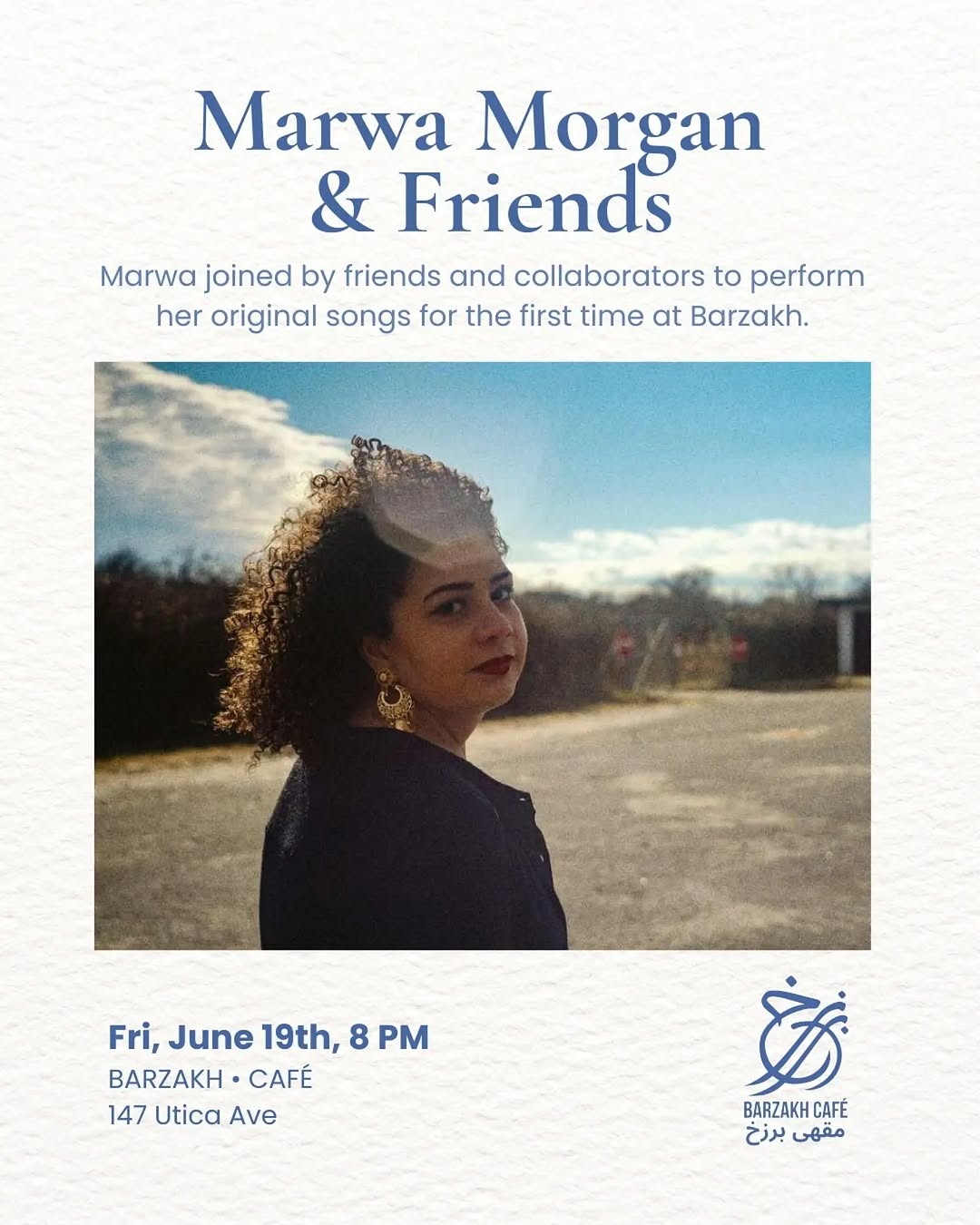
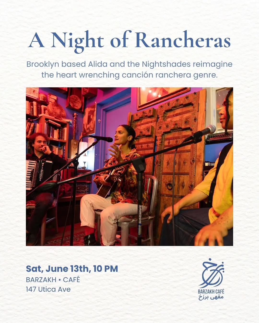
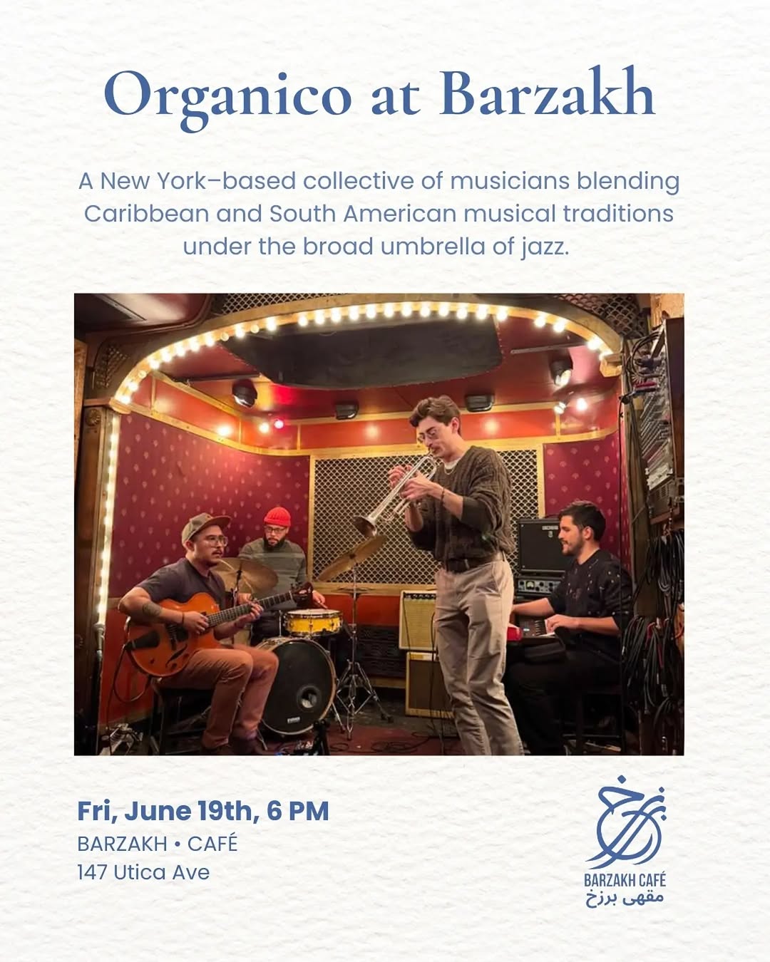
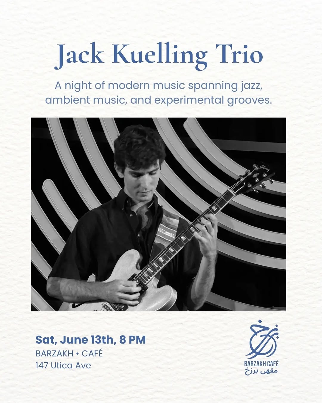
Booking! 👉🏿bavulkunstcafe@gmail.com 🧳 #bavulkunstkulturcafe 🧳 💌 #bavulkunstundkultur 💌 🎤 @popkorochor 🎤 🎭 @bavultiyatrokolektifi 🧳 #bavulcafeberlin 🧳
- Berlin, same city — directly relevant structural model
- Registered Verein (Bavul e.V.) — exact legal structure you're planning
- Café + event space + cultural programming
- Community choir, drawing club, readings, concerts, workshops
- Turkish diaspora, politically progressive, anti-racist
- Low-cost, community-funded
- Survived a closure threat via community solidarity
Branding & Identity
Feed Insights
Top Posts by Engagement
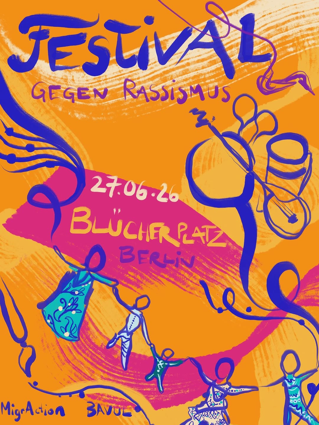
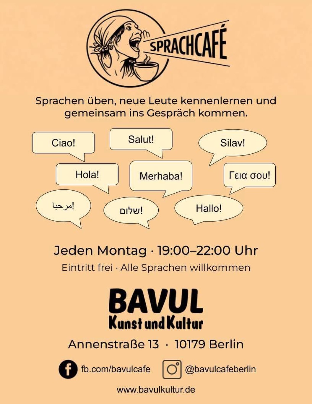
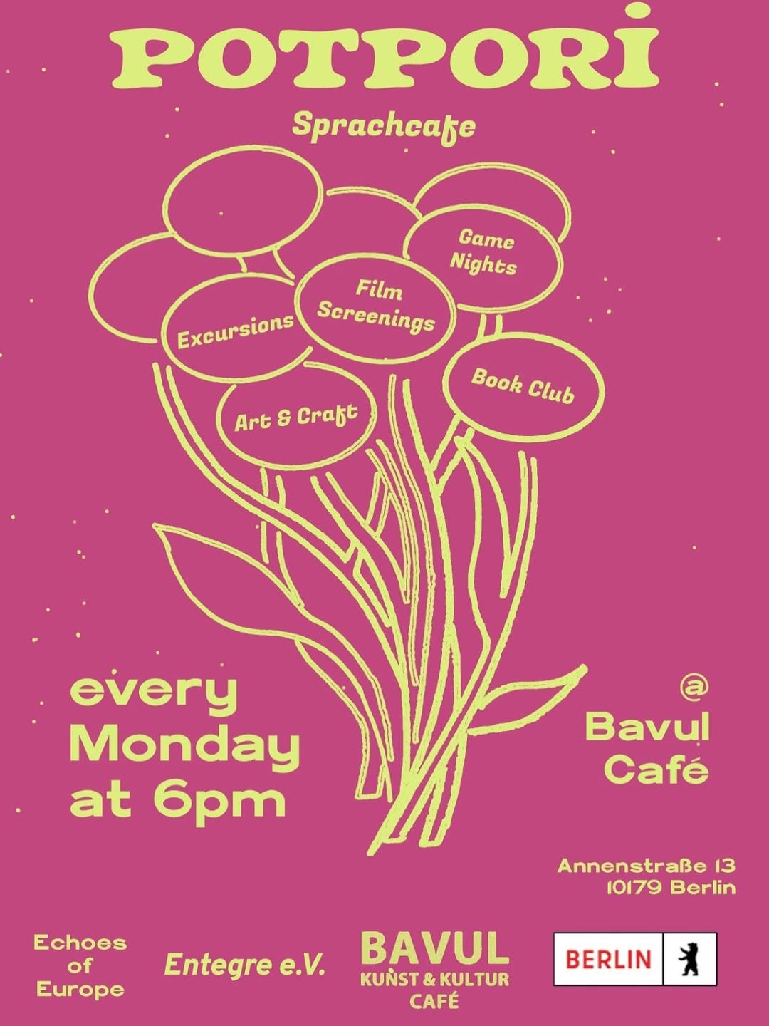
Brooklyn’s Intersectional Feminist Indie Bookstore & Coffee Shop. 👩🏽🤝👩🏿+☕️+🥐+📚 = JOY! Afro-Latine Woman Owned 🇵🇦
- Café + bookshop under one roof
- Explicitly feminist and intersectional literary focus — closest to your literature focus
- Book clubs, author events, film screenings, podcast
- Community-rooted, woman-led, anti-corporate
- Multilingual community (Afro-Latine)
- Crown Heights neighborhood — same block as Barzakh Café
Branding & Identity
Feed Insights
Top Posts by Engagement
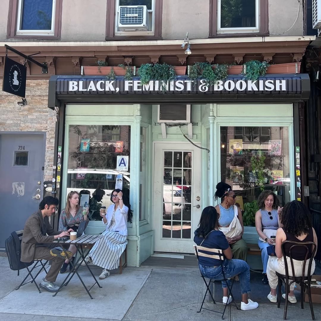
Interkulturelles Zentrum & Bildung. Sozial & Migrationsberatung in 7 Sprachen. Hier gibts unsere Events & Details aus dem Vereinsleben.
- Registered Verein — closest structural model in Germany
- Café + event space + community gathering
- Multilingual (Arabic, Turkish, Persian, French, Spanish) — mirrors your language profile exactly
- Kurdish film festivals, Arabic language courses, Palestinian solidarity, feminist events
- Low-threshold, barrier-free focus
- Neighborhood-embedded (Ehrenfeld, Cologne — equivalent to Neukölln)
- Programming: lectures, readings, film, workshops, language courses
- Running since 1987 — proof of long-term sustainability
Branding & Identity
Feed Insights
Top Posts by Engagement
Posts could not be scraped for this profile (rate-limited). Visit @allerweltshauskoeln directly.
ArtSocialSpace Brunnenpassage
- Ground floor community space in a migrant-majority neighborhood (Ottakring = Vienna's Neukölln)
- 400+ free/pay-as-you-can events per year
- Post-migrant aesthetics framework — closest to your cultural identity
- Turkish, Arab, Serbian communities — multilingual
- Performance, music, dance, film, exhibitions
- Academic/publication arm on migration + culture
- Publicly accessible, low-threshold
Branding & Identity
Feed Insights
Top Posts by Engagement
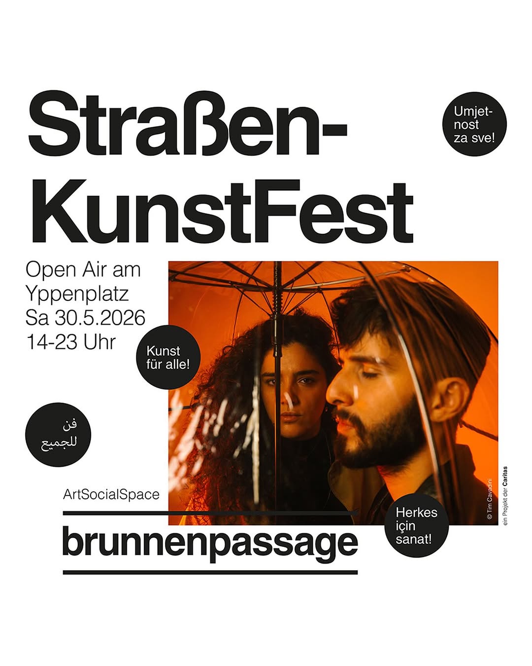
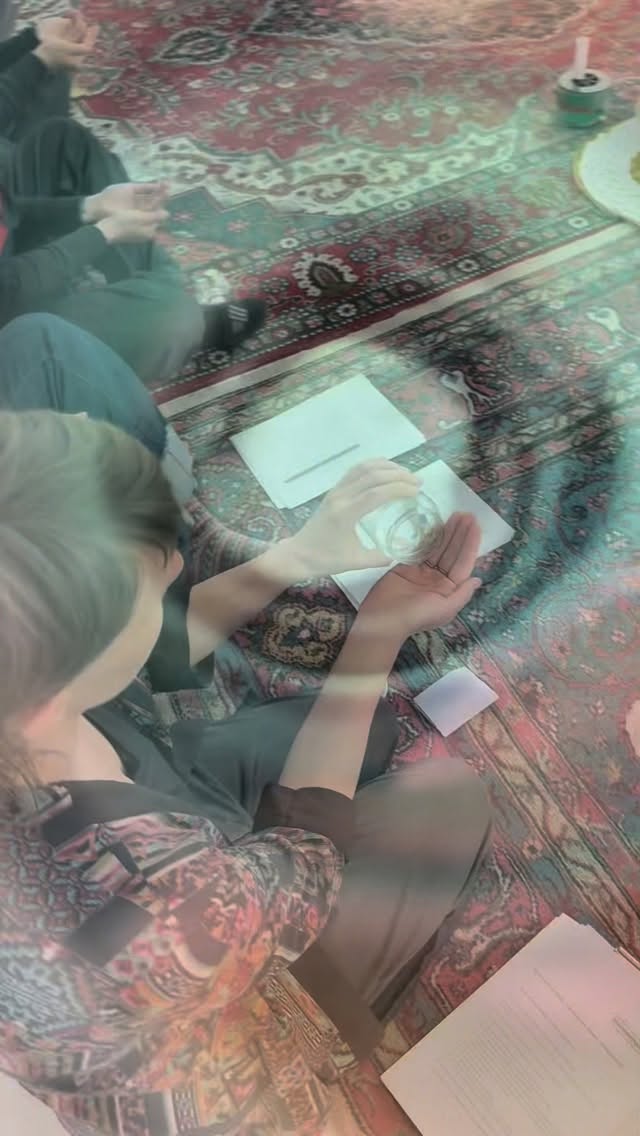
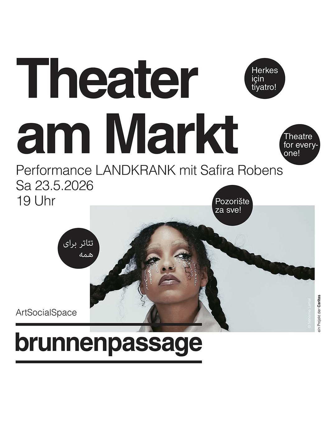
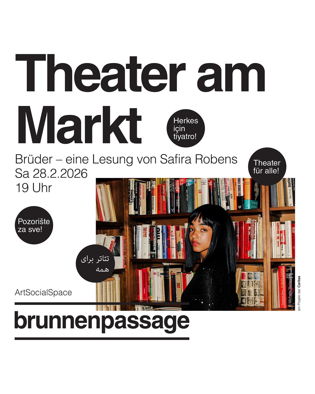
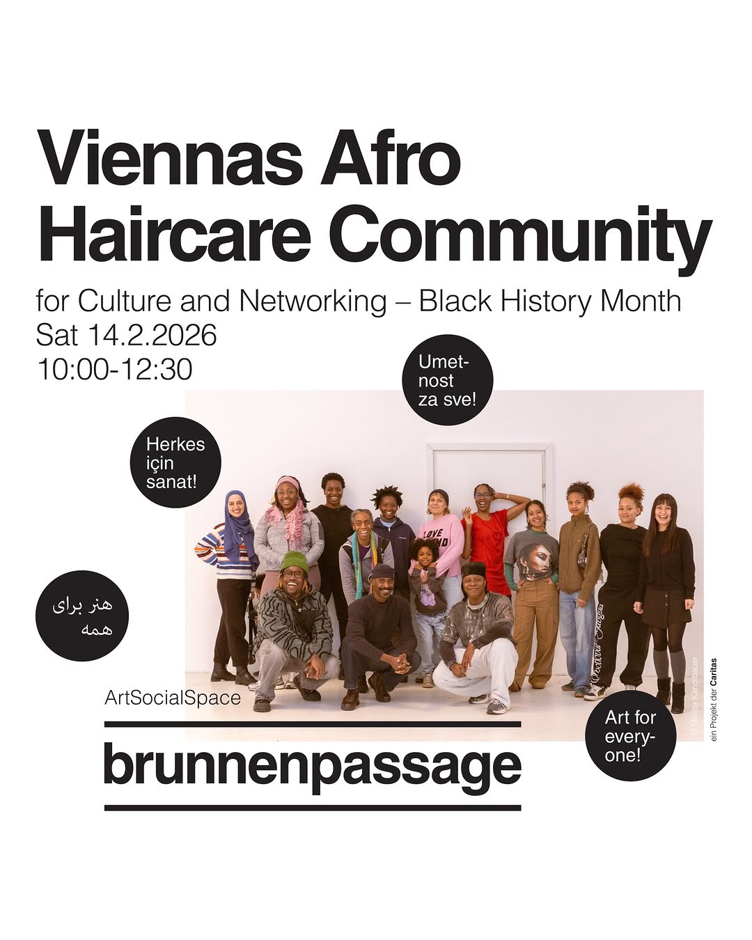
culture, politics, community
- Radical bookshop (Haymarket Books) + community event space
- Readings, poetry (Blue Hour series), film screenings, study groups, organizing retreats, workshops
- Political and socially critical orientation — solidarity, anti-racism, feminism
- Kitchen and garden — conviviality without full restaurant
- Regularly hosts South Asian and diaspora authors
- Community-governed, non-commercial
Branding & Identity
Feed Insights
Top Posts by Engagement
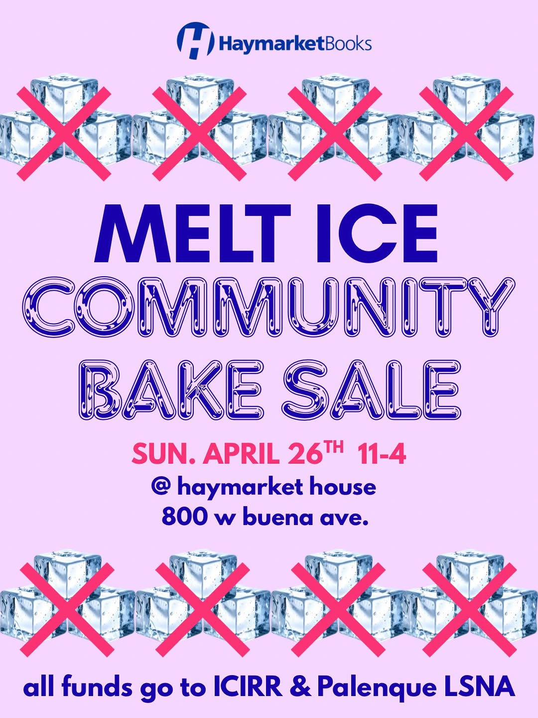
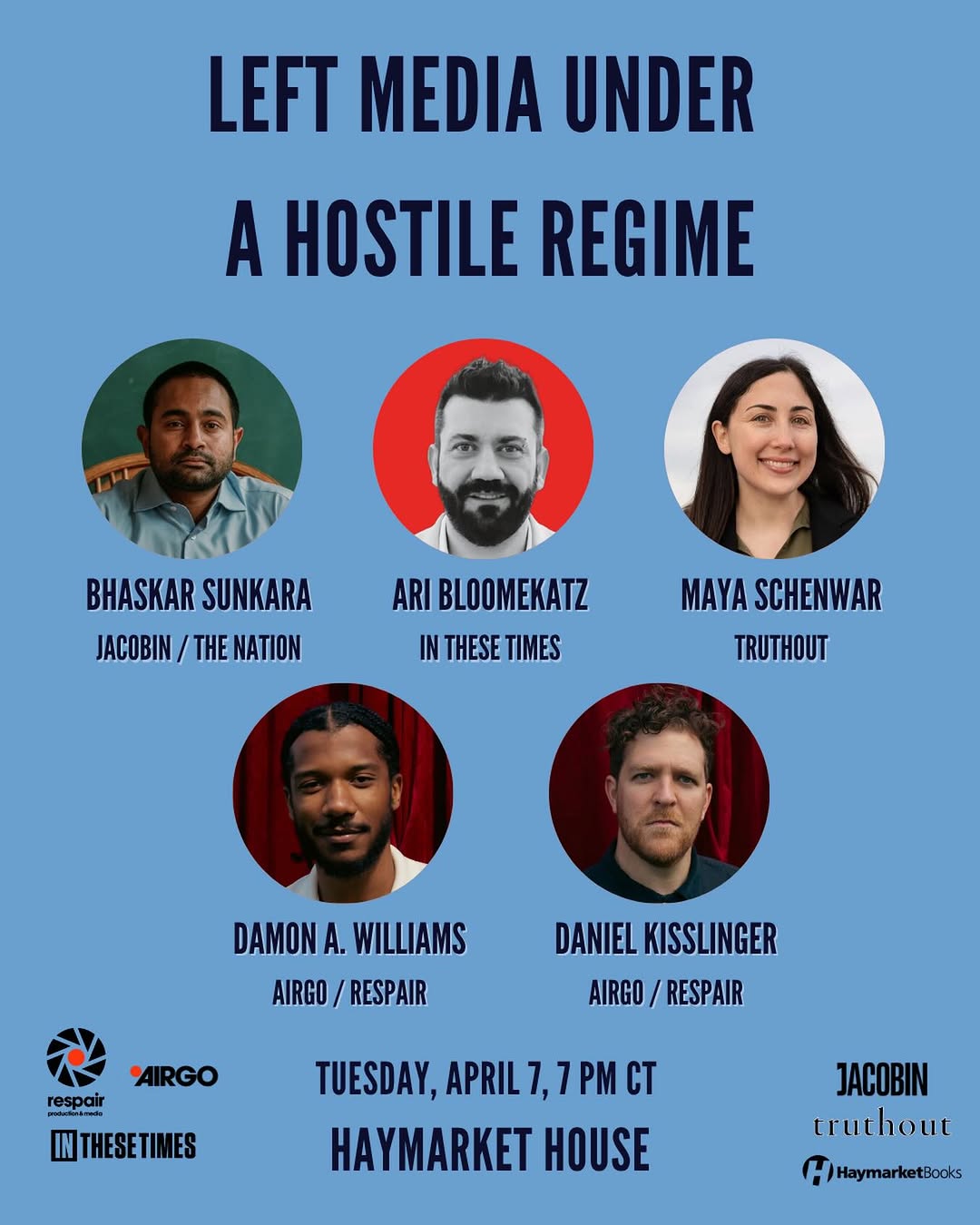
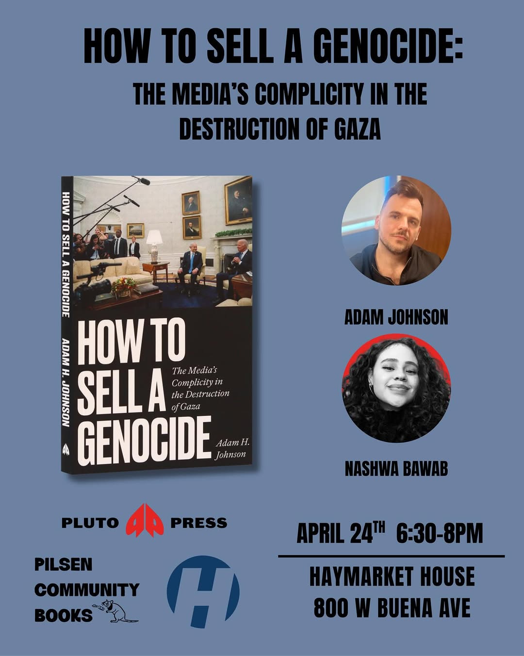
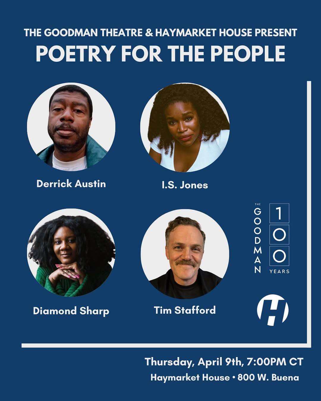
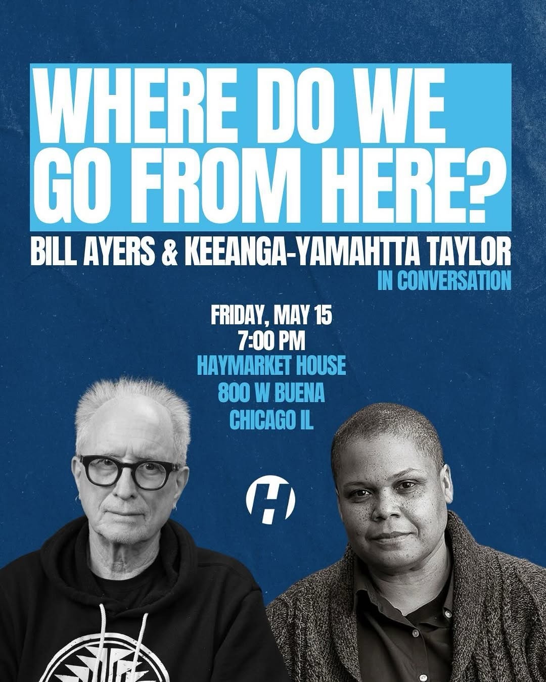
Cool People. Dope Books. Great Coffee. Open 7 days a week
- Coffee shop + bookstore under one roof
- Community events (author talks, discussions centered on education and justice)
- Neighborhood-embedded (Germantown)
- Expanding to 3,000 sq ft — shows growth model
- Free programming, open to all
Branding & Identity
Feed Insights
Top Posts by Engagement
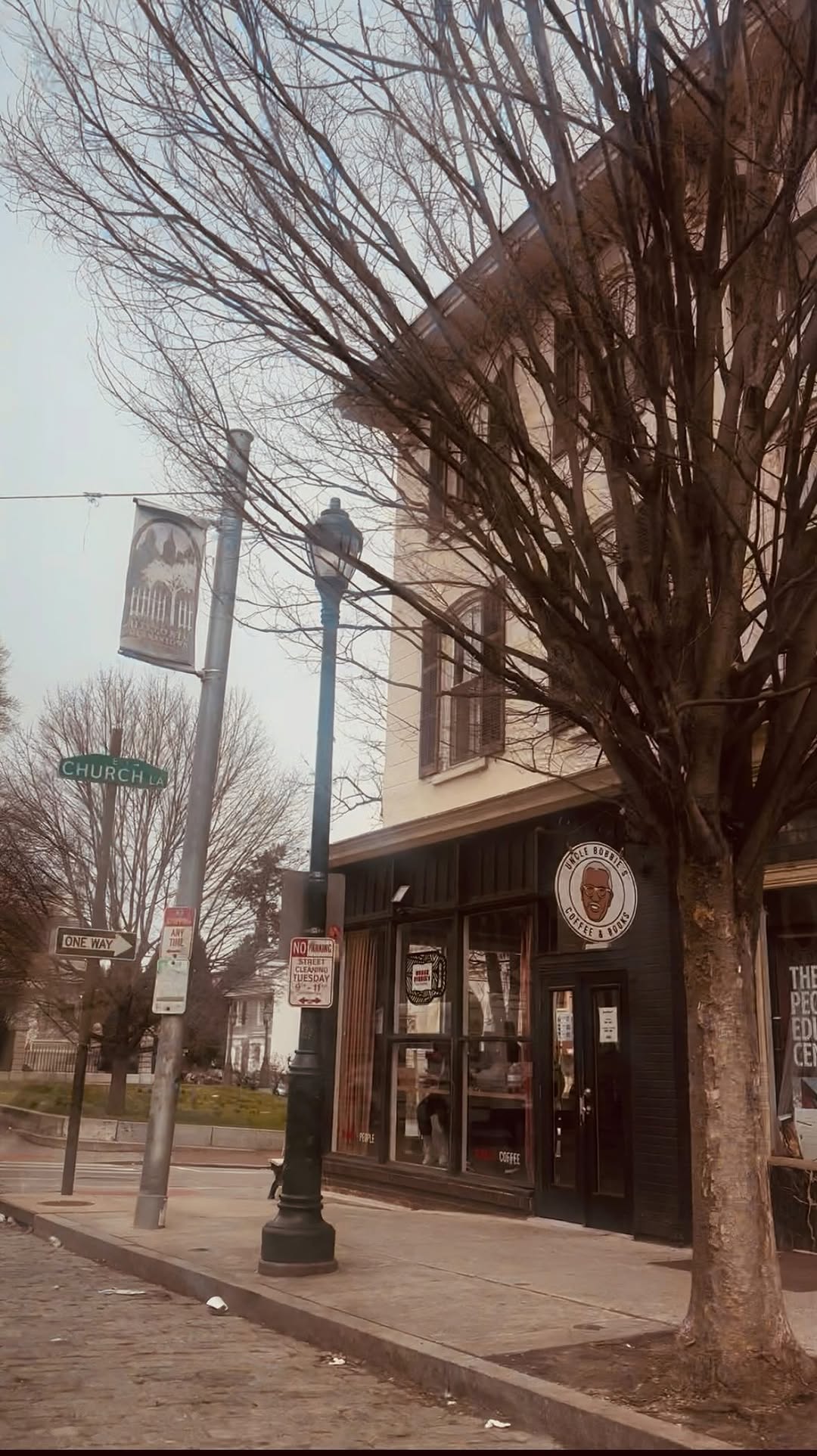

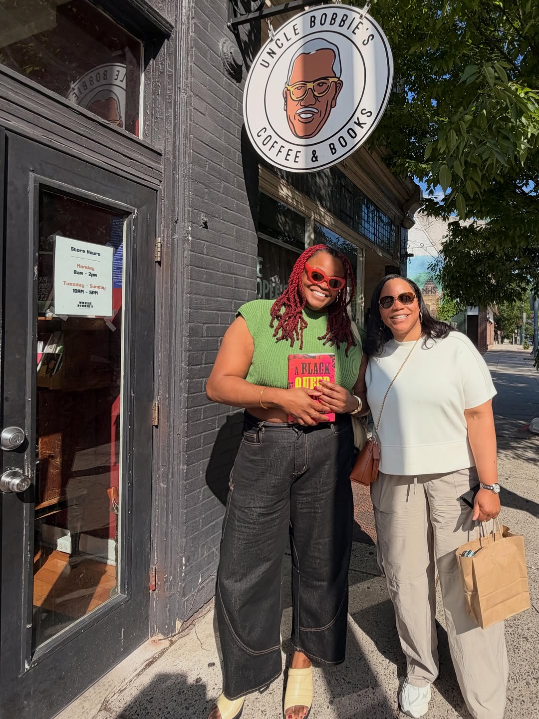
📚 Black owned/operated cultural center since May 11, 1997 📖 Books & DVDs by & about people of African descent.
- Bookshop + café + event space in one room
- Community film screenings, poetry workshops, book talks
- Diaspora-rooted (African/Black diaspora) with explicit political identity
- Located opposite Howard University — neighborhood-embedded
- Stage, projector, and outdoor patio for programming
- Community institution for 25+ years
Branding & Identity
Feed Insights
Top Posts by Engagement
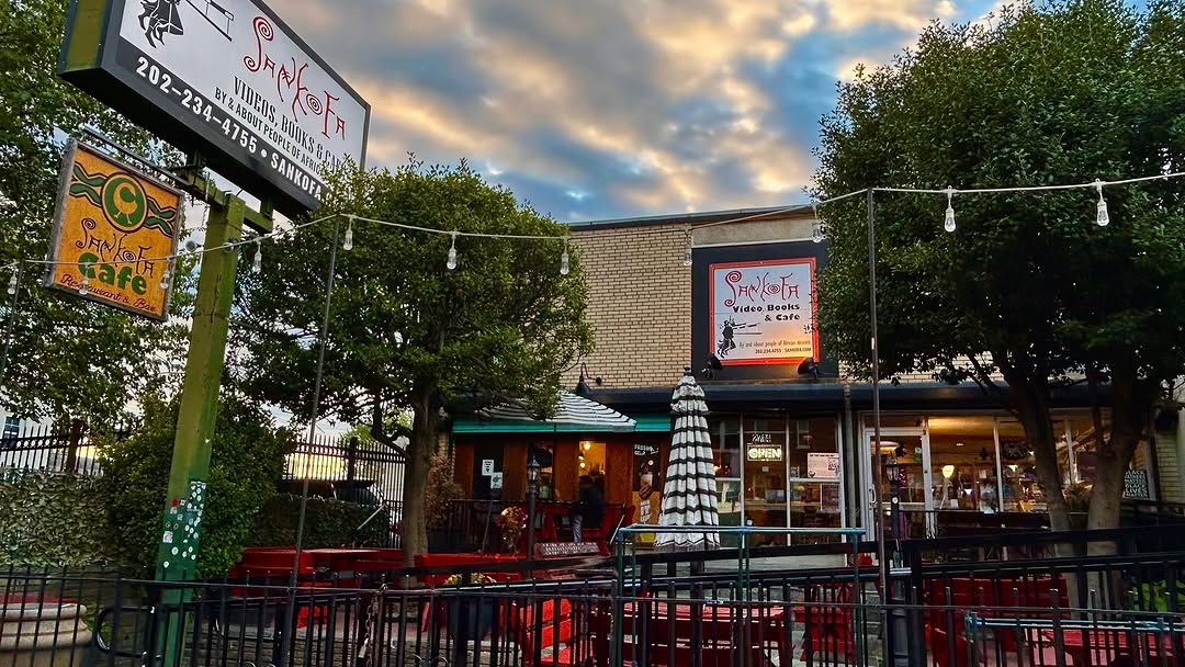
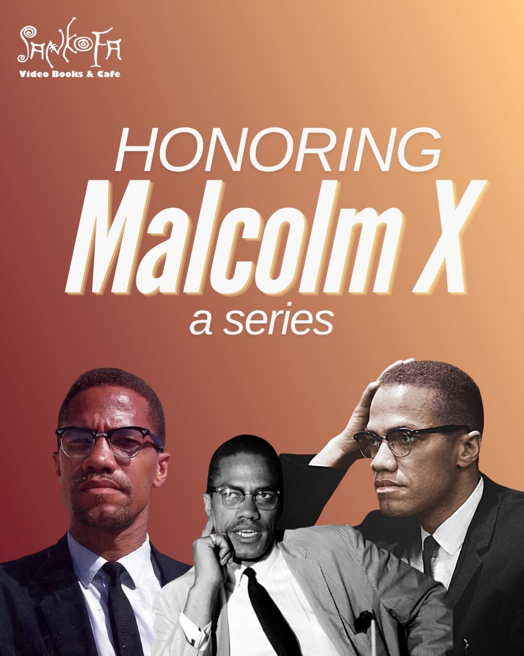
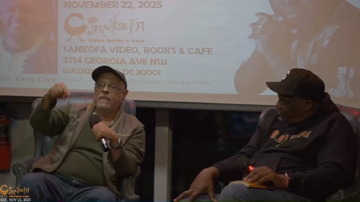
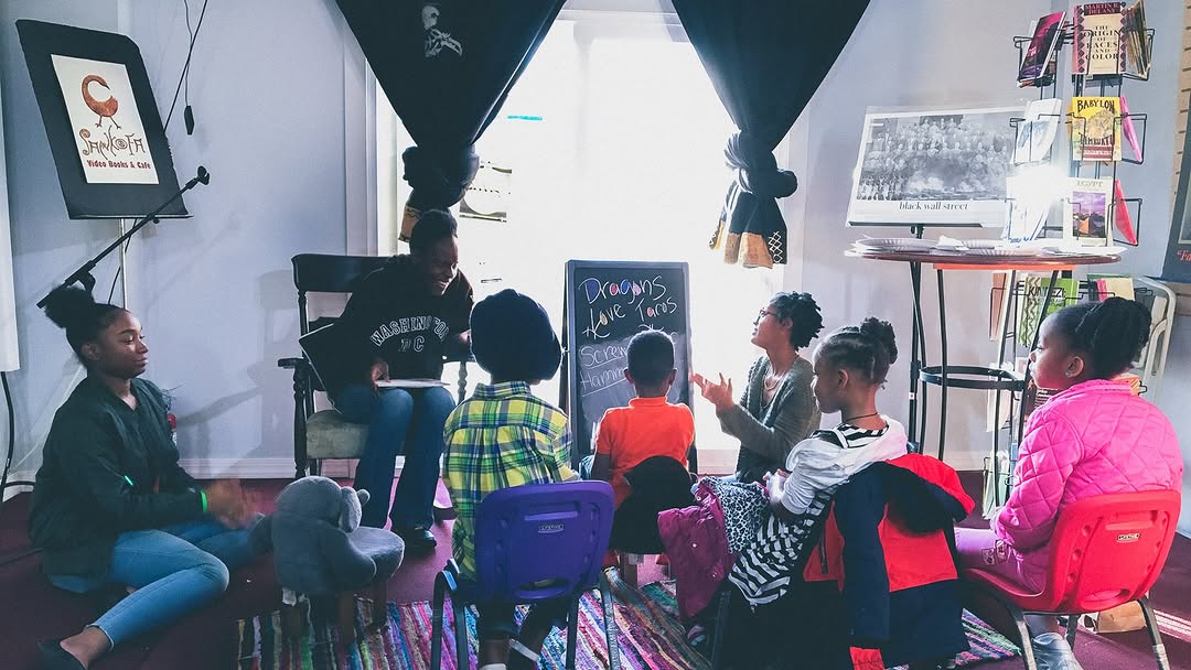

J I W A R is a space for creators & curious minds Workshops • talks • pop-ups Ideas & collabs → DM •Co-working and Café at JIWAR: Sun–Fri • 8am–6pm
- Berlin Neukölln — your target neighborhood
- Café + co-working + event space in one
- Arab/Levantine diaspora, multilingual
- Workshops, talks, open mics, pop-ups
- Community-built, anti-pretense, grassroots
Branding & Identity
Feed Insights
Top Posts by Engagement
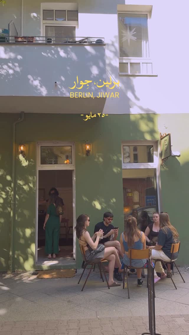
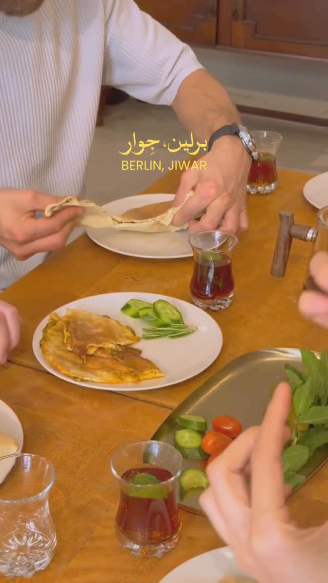
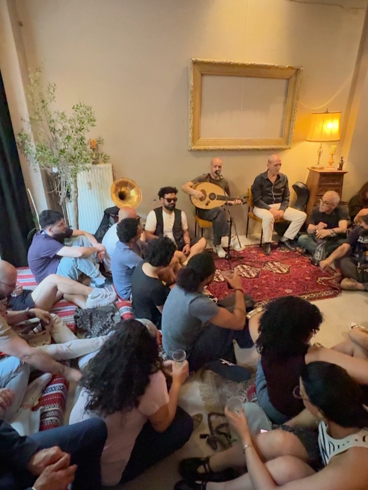
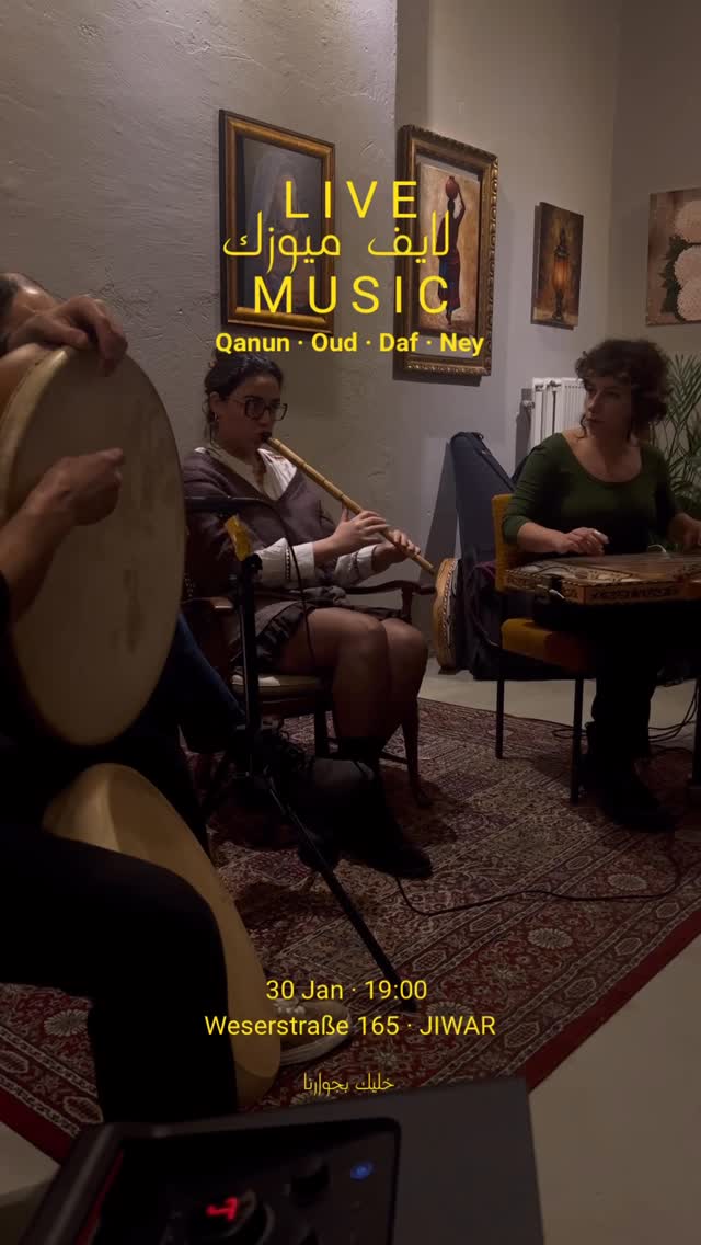
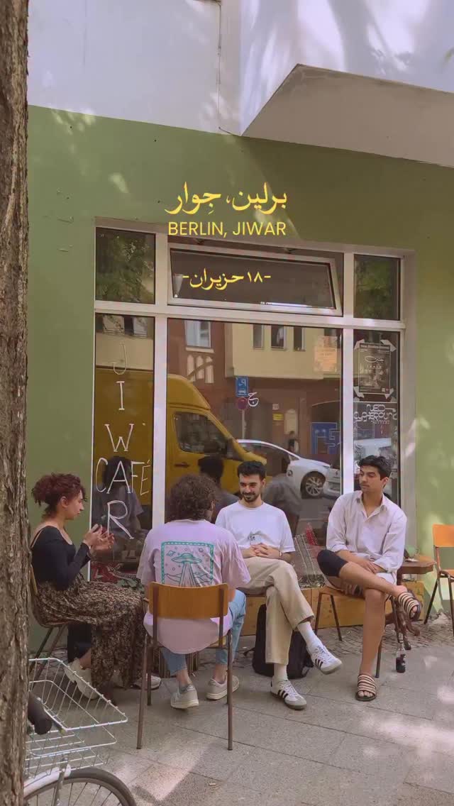
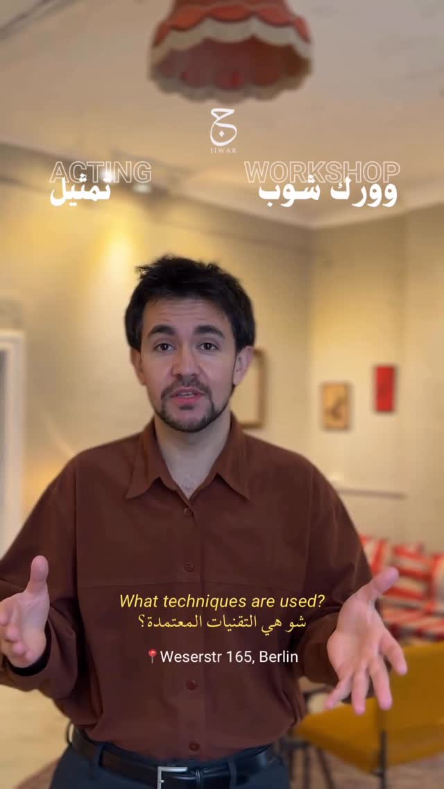
A space for critical & artistic engagements with South Asia. We play, support, organize, coalesce, welcome & reimagine. Links ⬇️ Donaustr 84NK Berlin
- Berlin Neukölln — same neighborhood (Donaustr. 84)
- Anti-colonial, diasporic, community-rooted South Asian project space
- Film nights, readings, community gatherings, 48h Neukölln participant
- Politically critical, non-hierarchical, free programming
Branding & Identity
Feed Insights
Top Posts by Engagement
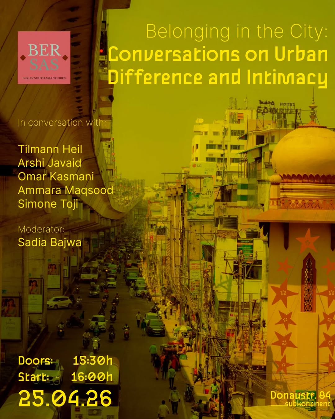

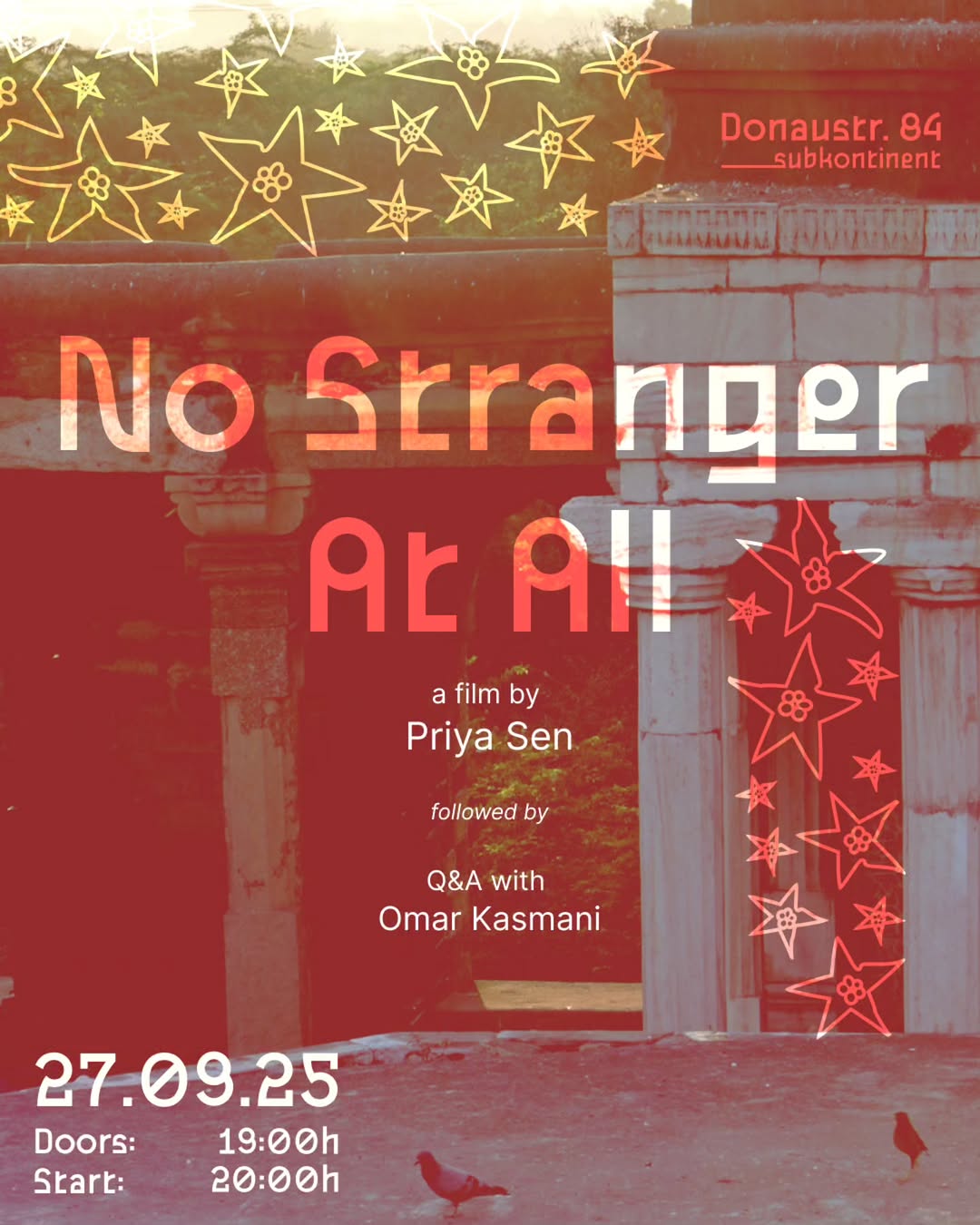
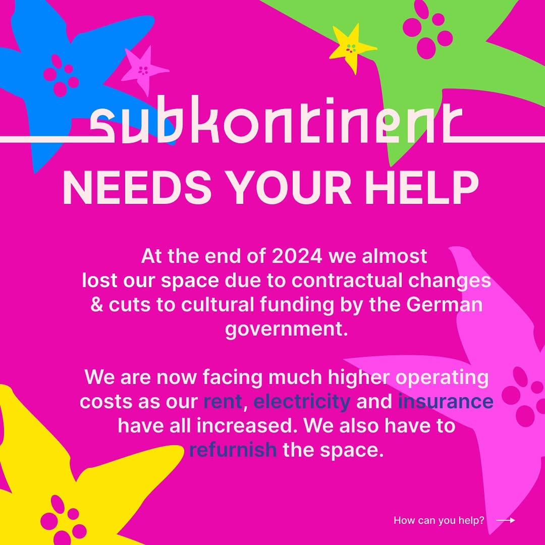
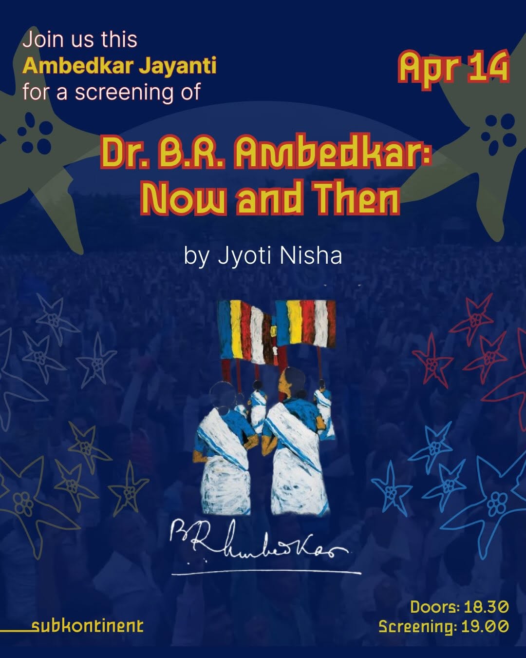

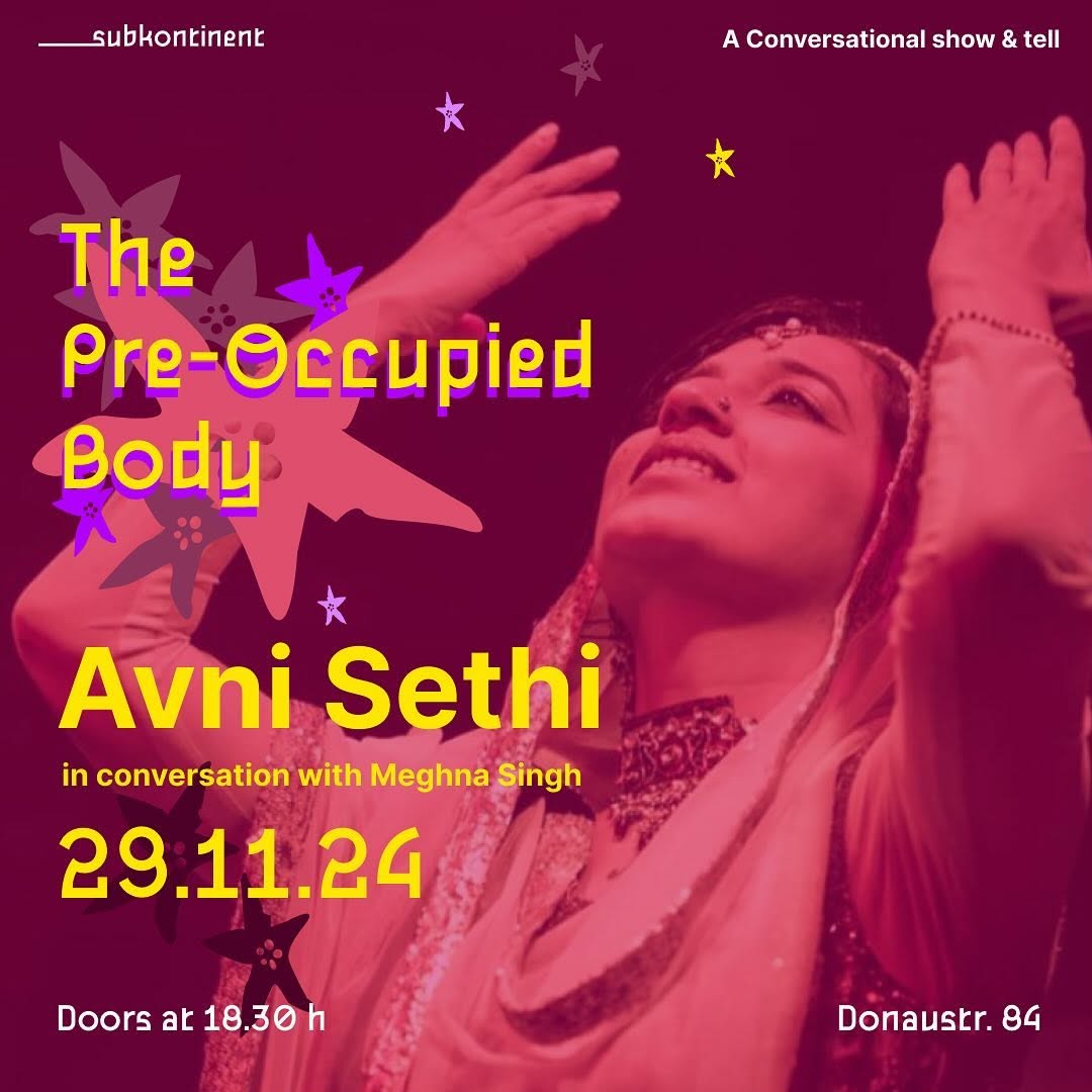
1/3 cafe, 1/3 clinic for collectivist experiences, 1/3 mutual aid gamble. We wanna hear from u but we can’t reply to DMs💖Write to: info@casinoooo.org
- Berlin Neukölln (Sonnenallee 100) — same neighborhood
- Anti-capitalist collective café + community organizing hub
- Multilingual help desk (German/Arabic/English), mutual aid, workshops
- Low-threshold, nobody turned away for lack of funds
- Community originally from migrant/diaspora backgrounds
Branding & Identity
Feed Insights
Top Posts by Engagement
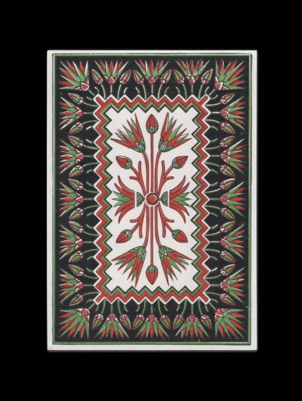
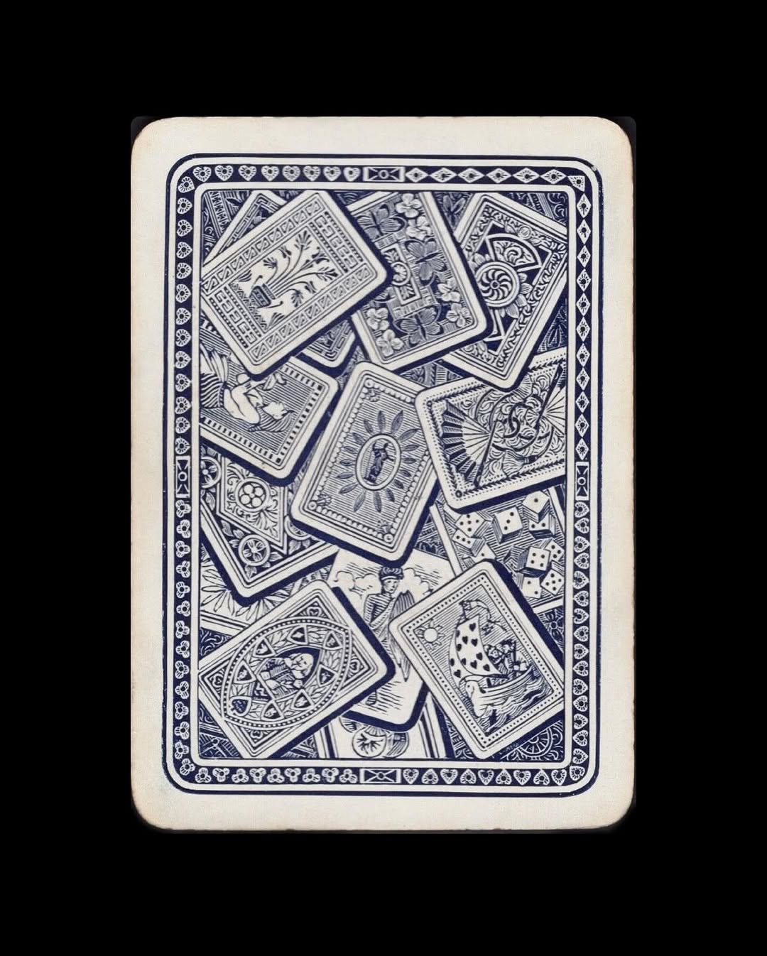
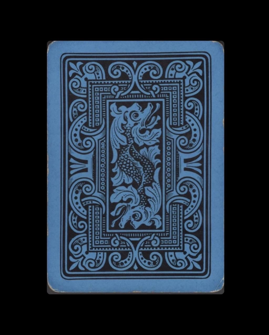
Storytelling, music, events and more in Amsterdam, the Netherlands.
- Diaspora-founded (Iranian refugee) community storytelling café
- 300+ events/year: storytelling, music, open mics, theatre, dance
- Language and oral culture as central programming pillar
- Started small, grew sustainably over 20 years
- Café-bar model with community first
Branding & Identity
Feed Insights
Top Posts by Engagement
Posts could not be scraped for this profile (rate-limited). Visit @mezrab_ directly.
Cultural center & independent bookstore "Where art & minds meet for a change" Open Tues-Fri 2pm-9pm, Sat 12pm-8pm, Closed Sun & Mon
- Independent bookstore + cultural center under one roof
- Bilingual (Spanish/English), serving an underserved community
- Free and low-cost programming: mural, music, dance, writing, healing arts
- Collective ethos, community-founded nonprofit
- Rooted in a neighborhood lacking cultural infrastructure
Branding & Identity
Feed Insights
Top Posts by Engagement
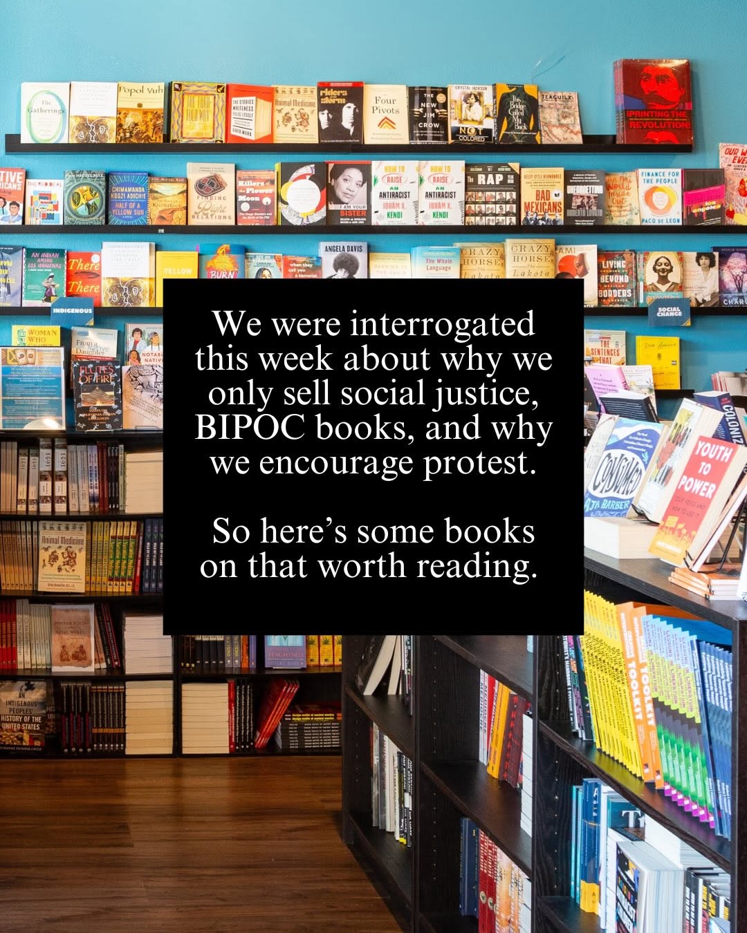
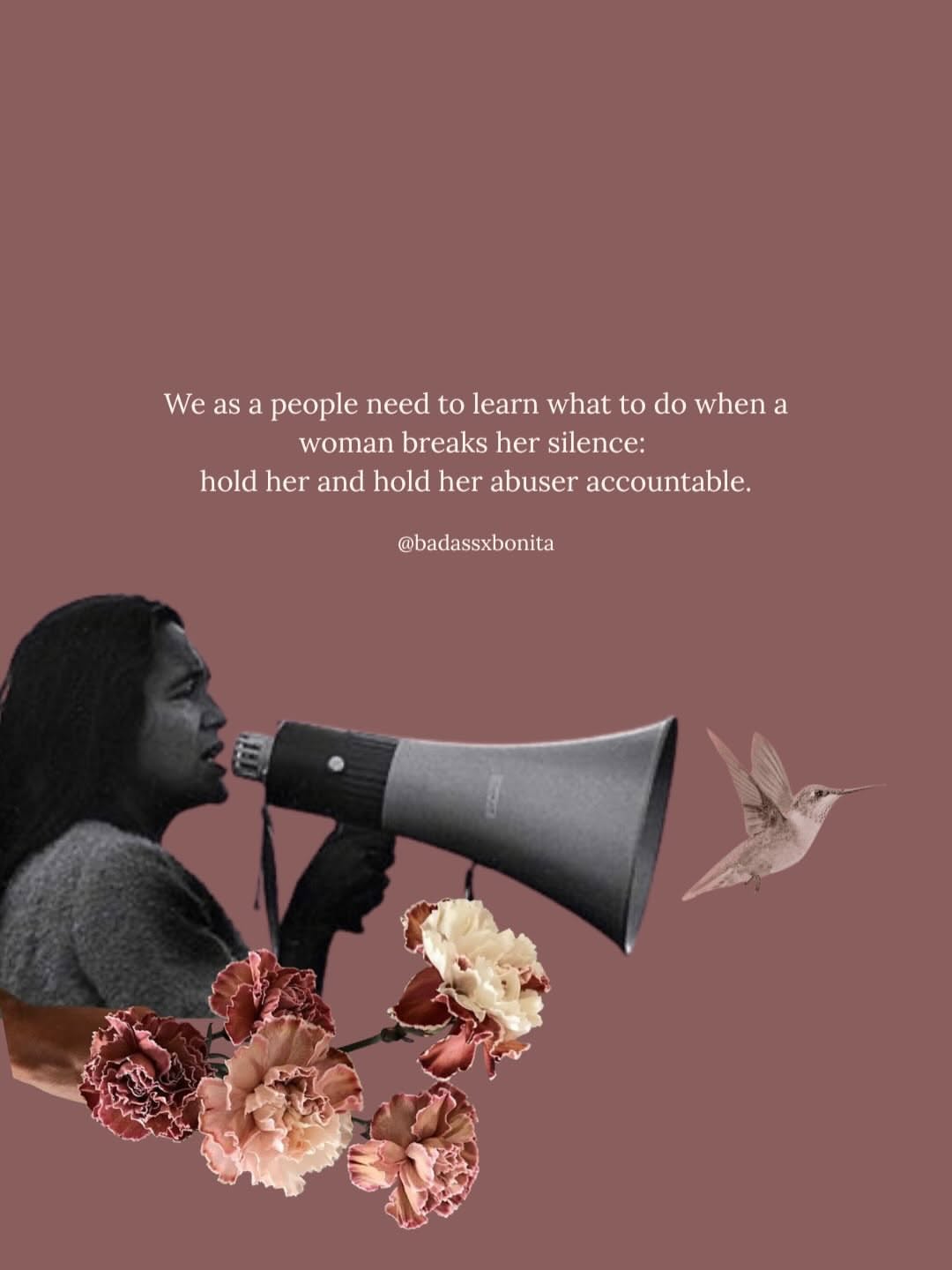
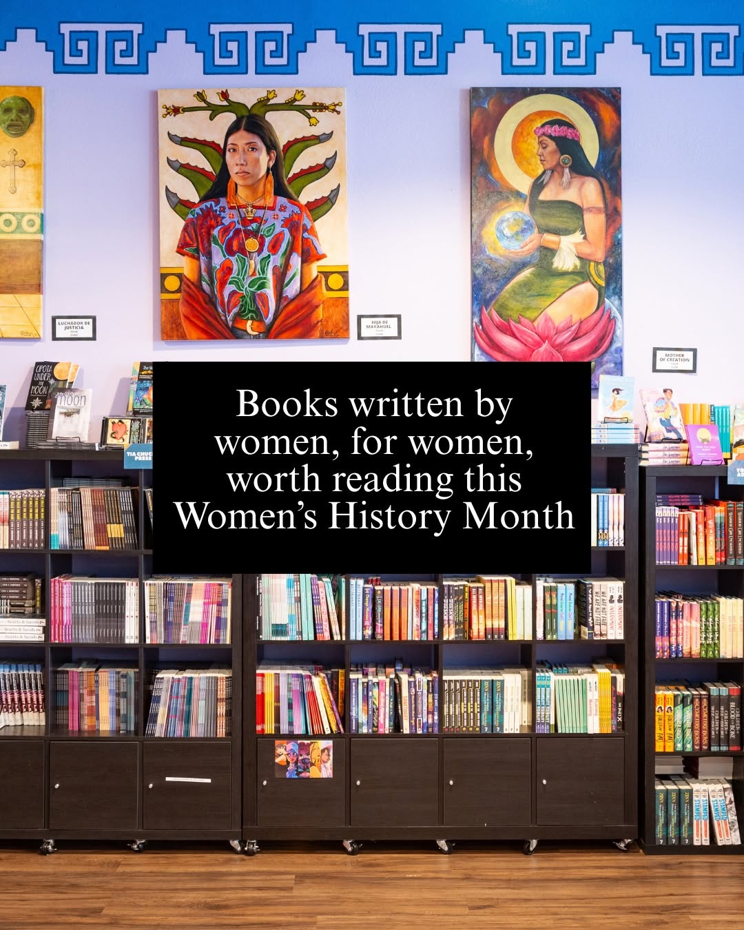
Trampoline House is a community center that offers legal counseling, activities, and community to refugees and asylum seekers in Denmark.
- Collective co-governance between organizers and community (asylum seekers)
- Community dinners, language classes, cultural programming
- Volunteer-run cooperative model
- transitioned to independent cooperative in 2024
- Documented in documenta fifteen — internationally recognized
Branding & Identity
Feed Insights
Top Posts by Engagement
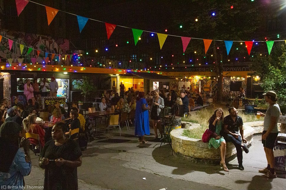
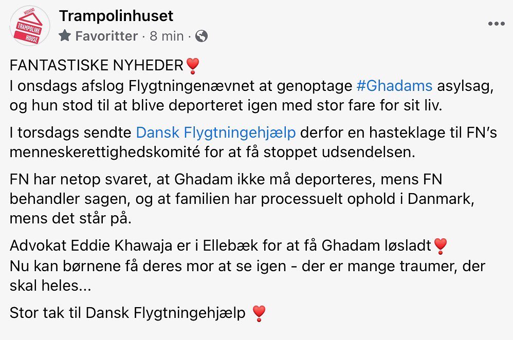
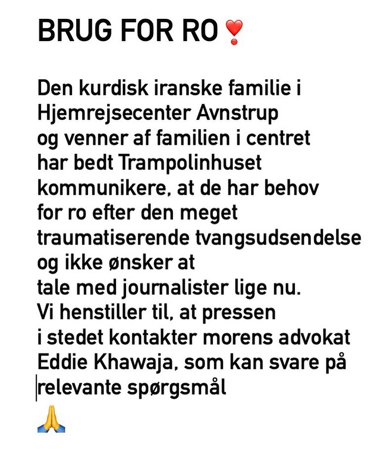
Making Worlds is a cultural center for collective study, community media and journalism, and cooperative movement building. No DMs please! Email us.
- Worker-cooperative bookstore + social center — nearest structural match
- Abolition, autonomy, ecological self-determination, Black/Brown/Indigenous liberation
- Writers' groups, book launches, fundraisers, documentary screenings
- Feminist and anti-racist literature focus
- Community-funded nonprofit
Branding & Identity
Feed Insights
Top Posts by Engagement

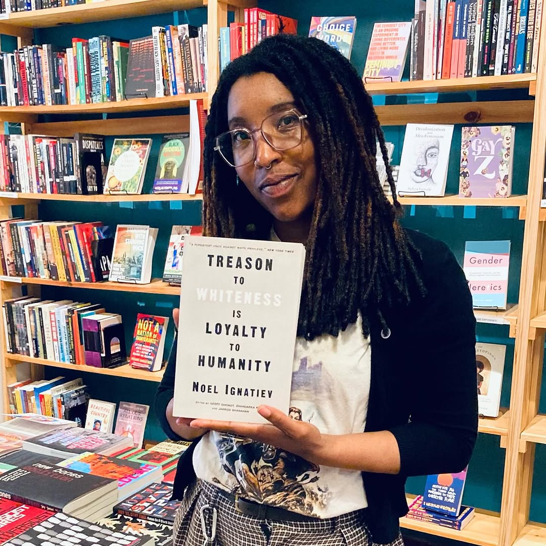
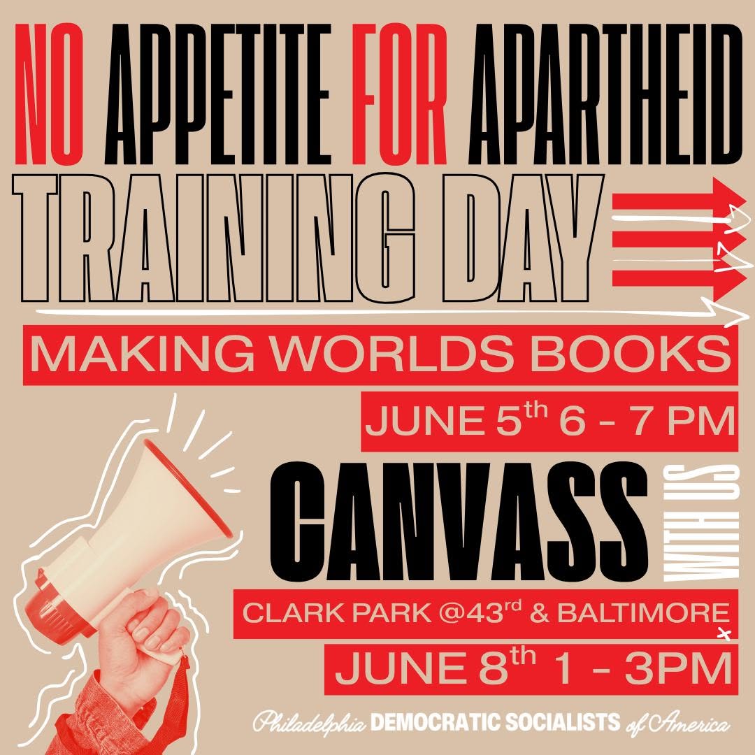
cuisine et révolutions ❤️🔥 طبخ و ثورات mar-mer-jeu-ven ✨ 10h-23h 👉 darnamontreuil@proton.me
- Cooperative café + activist space run by a cultural association
- Syrian/Arab diaspora, multilingual
- Motto 'cuisine and revolutions' — politically engaged
- Connects diaspora and local communities through food and programming
- Cooperative structure similar to your Verein model
Branding & Identity
Feed Insights
Top Posts by Engagement
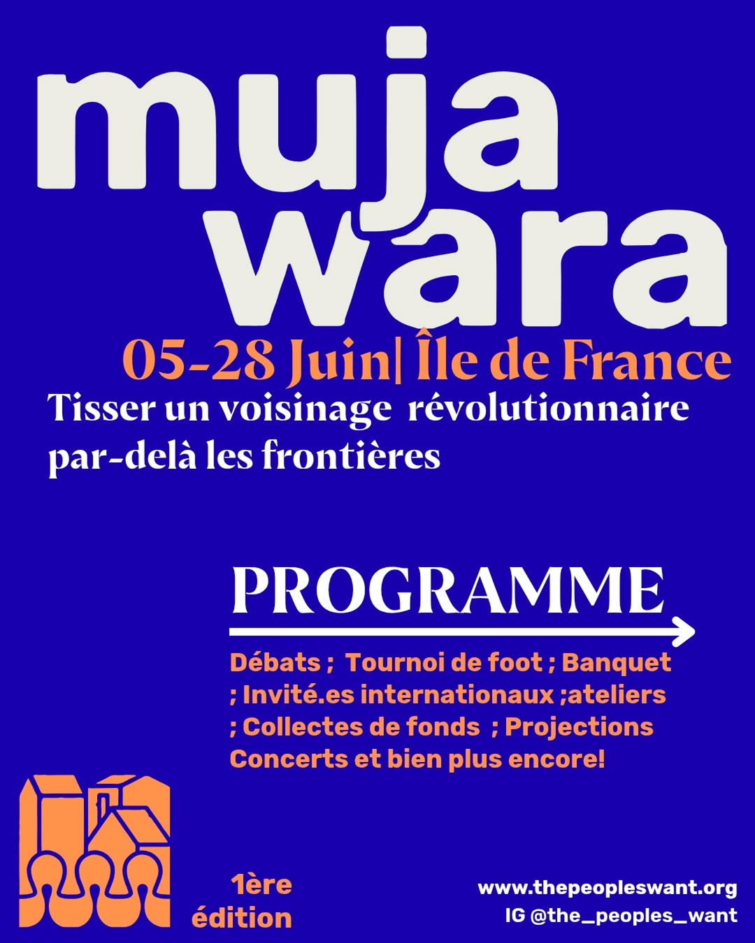
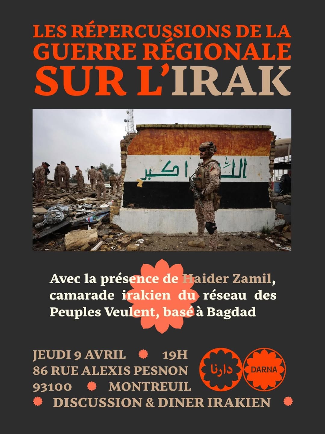
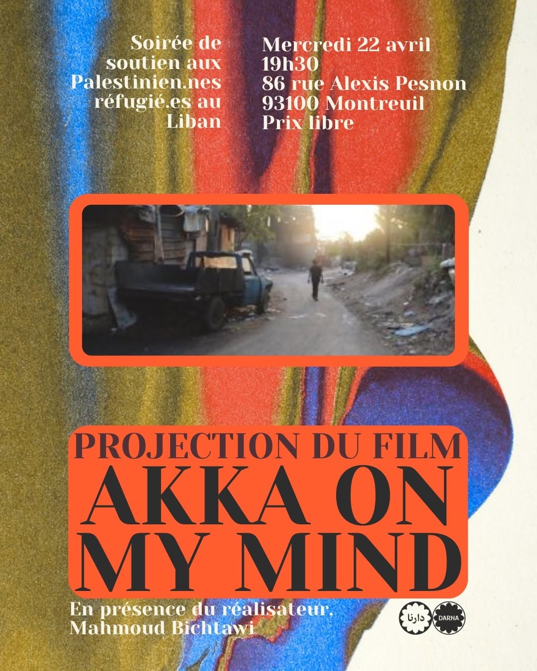
From Berlin, across many worlds — weaving common grounds through culture rooted in the everyday, ecosocial justice, and lived solidarities.
- Berlin Neukölln — same neighborhood
- Free programming, community-embedded
- Diaspora communities (Arab, Kurdish, Armenian), multilingual
- Workshops, film, panels, readings, learning circles
- Produces multilingual cultural tools
Branding & Identity
Feed Insights
Top Posts by Engagement
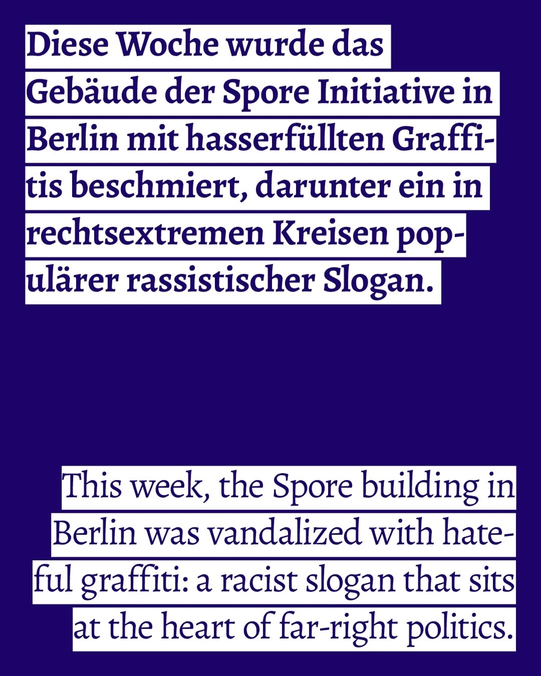
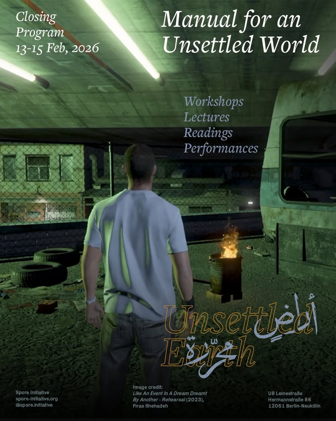
فضاء حرّ | Freiraum امتداد للسّرد والتعبير والبوح🌈🍉🍸 We open at 14:00 🥗Kitchen hours: 16:00-21:30 We close on Mondays
- Berlin, Kreuzberg — same city, similar neighborhood
- Arabic/multilingual (Arabic–German)
- Cultural events, music, storytelling
- Community gathering space, diaspora-rooted
Branding & Identity
Feed Insights
Top Posts by Engagement
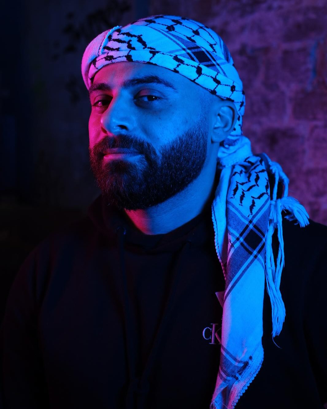
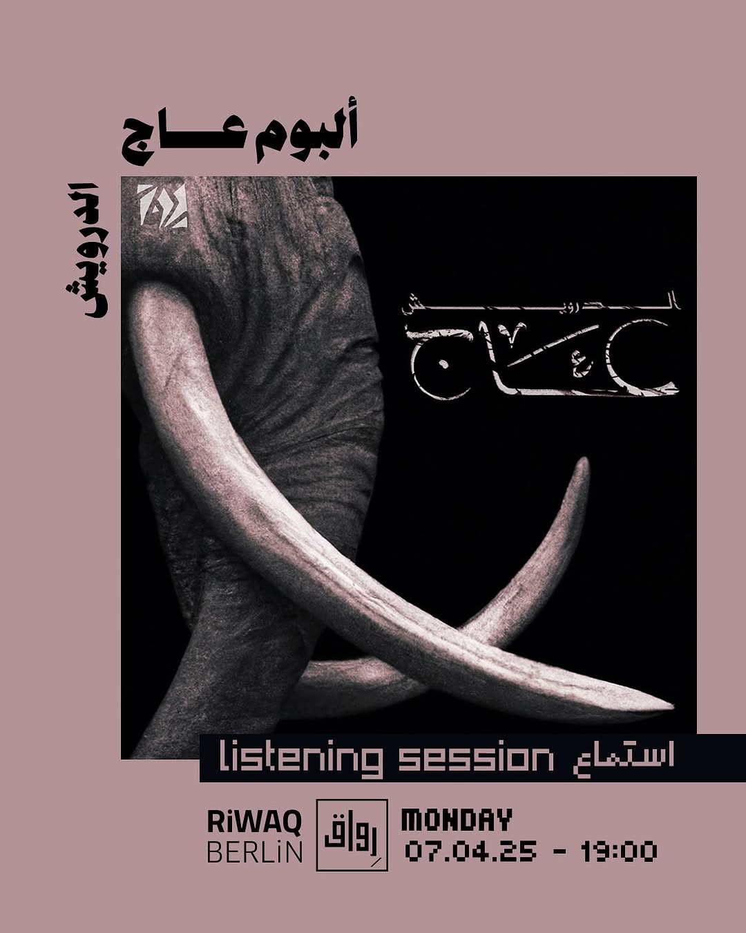
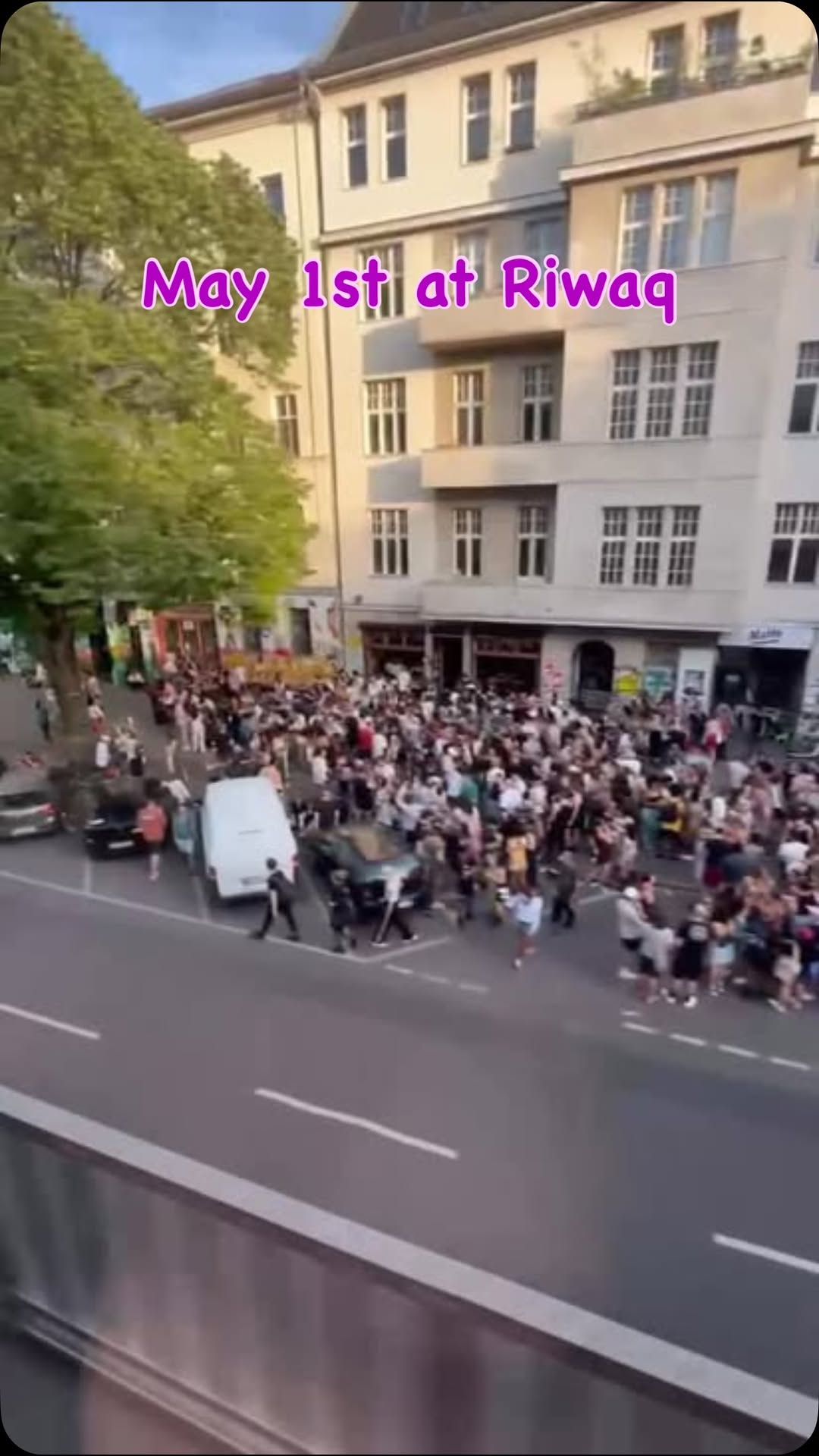
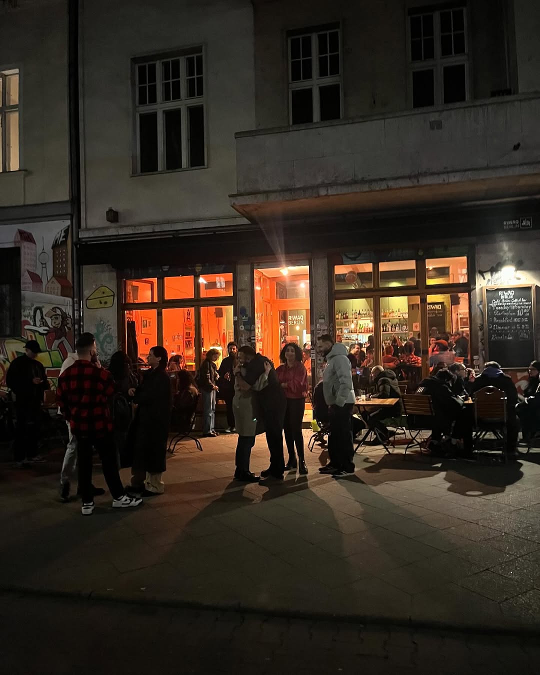
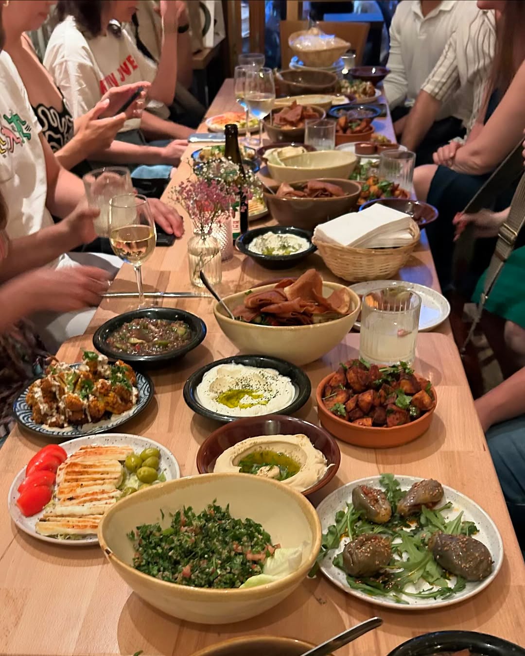
Visual trend research
The reference venues match majal's concept but are mostly weak in design. These 6 accounts are the opposite: chosen purely as graphic references — not venue matches — for how a feed can read as dynamic and trendsetting while still feeling warm, homey and connecting. Pure trend research; what majal takes from it is decided in the branding step.
Cross-cutting trends
The statement card is the shared engine
Almost every design-strong feed in the set owns one repeatable type-on-flat-color format: fluter fills the whole square with a single long quote in bold sans on navy, olive or orange; VETO screams first-name quotes on neon yellow; Missy dims a photo under a black gradient and stacks white type on it; Refuge sets grey grotesque on royal purple; DARNA proves the venue version — chunky cream grotesque on vermilion or cornflower, stamped with its rosette seal, maintainable by a volunteer team. Production-cheap, recognisable at thumbnail size, and serious and playful content share one grid.
One elastic mark beats a full design system
The single clearest pattern across references AND venues: ACUD's wobbly café logotype, Refuge's globe-smiley sticker, Missy's chrome M, Vartan's Perso-Arabic roundel, DARNA's twin scalloped rosettes, Uncle Bobbie's mascot roundel — human, warm, legible at any size — Jiwar's ج monogram, Barzakh's calligraphic seal. A charming, flexible mark stamped on unposed photos, A-boards and posters does more recognition work than any template system, and it is the one design asset every weak venue feed still gets right.
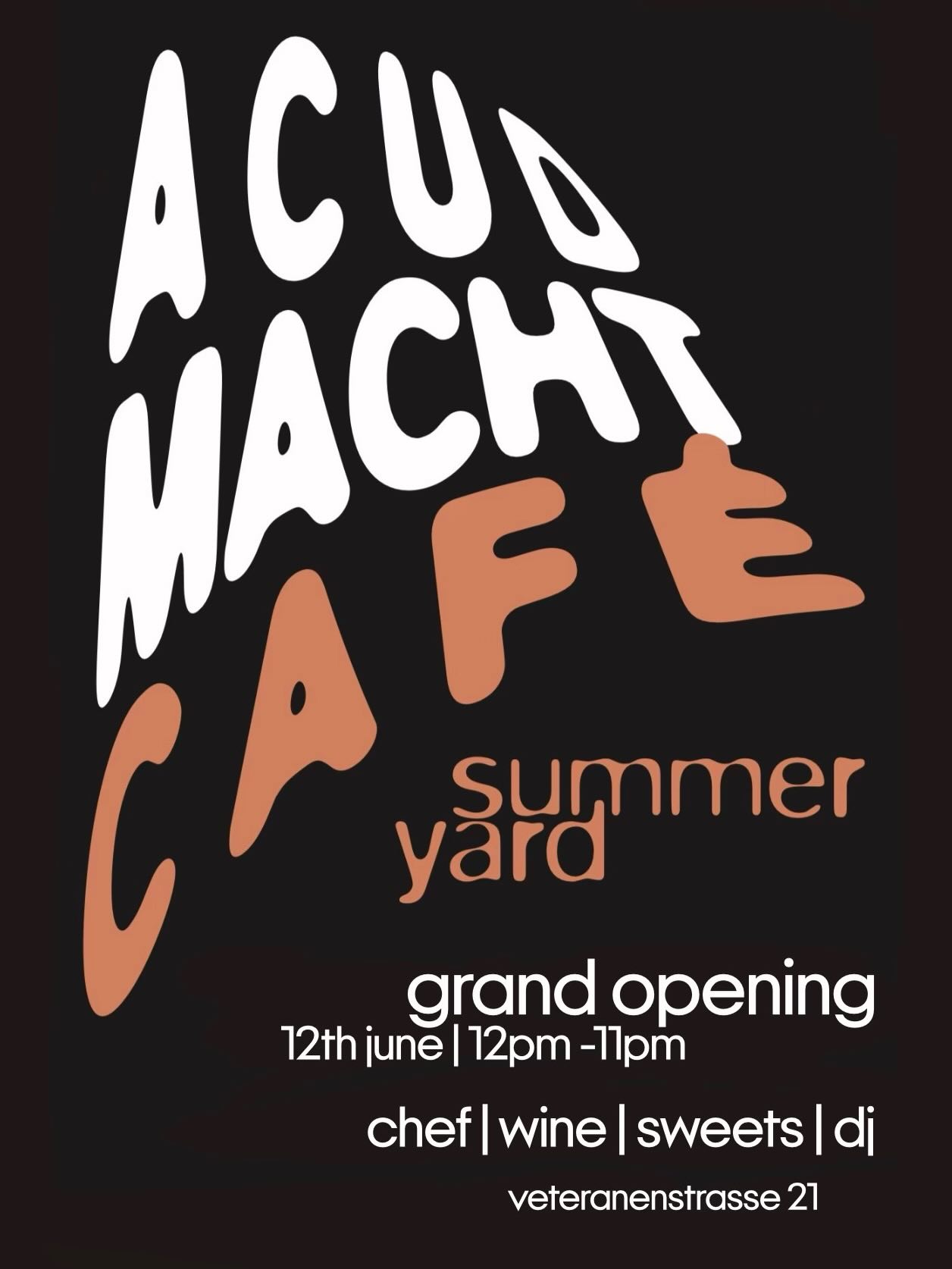
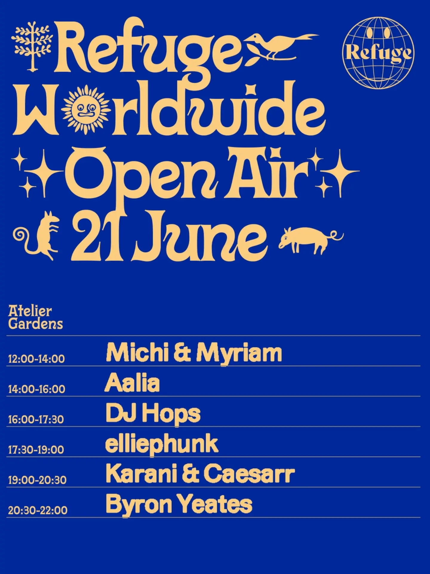
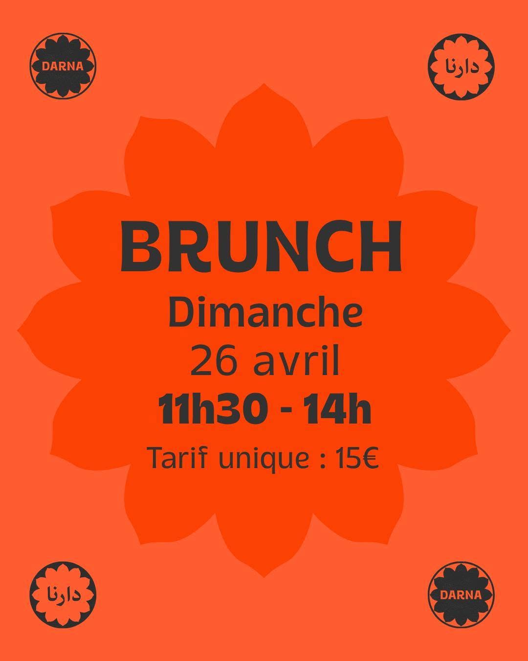
Two scripts, one identity
The venue set turns this from a single proof case into a proven pattern. Jiwar interlocks tracked-out Latin grotesque caps with large expressive Arabic calligraphy at equal scale (DABKE / دبكة) — Arabic as display type, not decoration. DARNA's twin rosettes hold دارنا and DARNA in the same shape at the same weight. Riwaq boxes RiWAQ and رواق into one lockup and writes captions Arabic-first. Vartan's geometric Perso-Arabic logotype and dense Persian posters, Subkontinent's Devanagari-inflected display lettering, Barzakh's calligraphic monogram — everywhere, native script used seriously is what separates rooted identity from themed decoration. The single most Majal-relevant finding in the research.
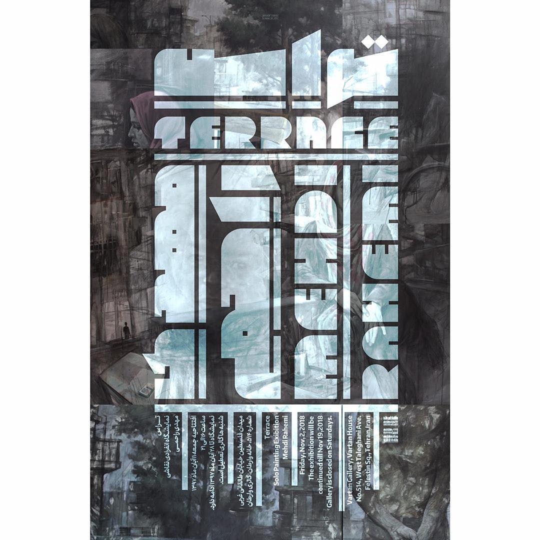
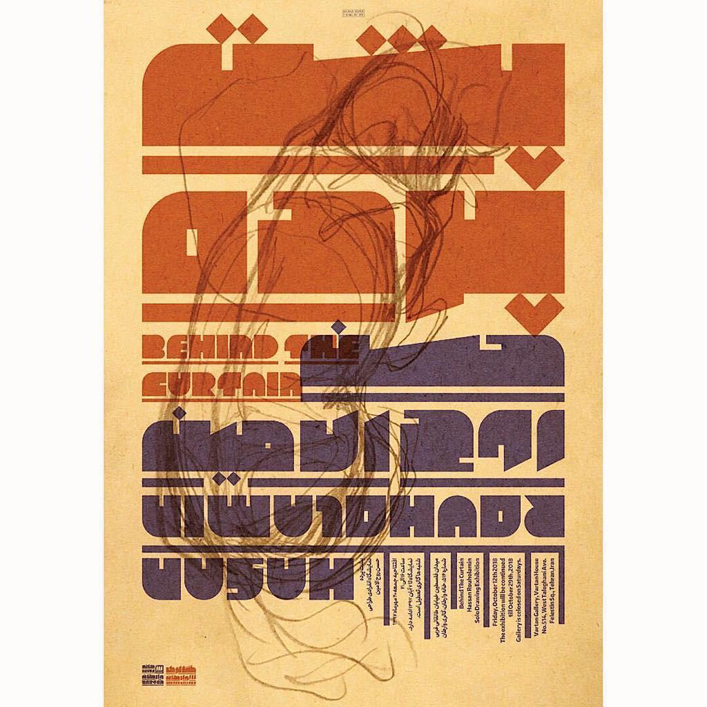
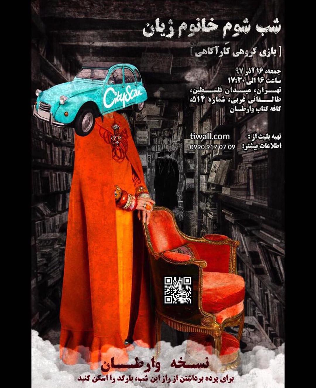
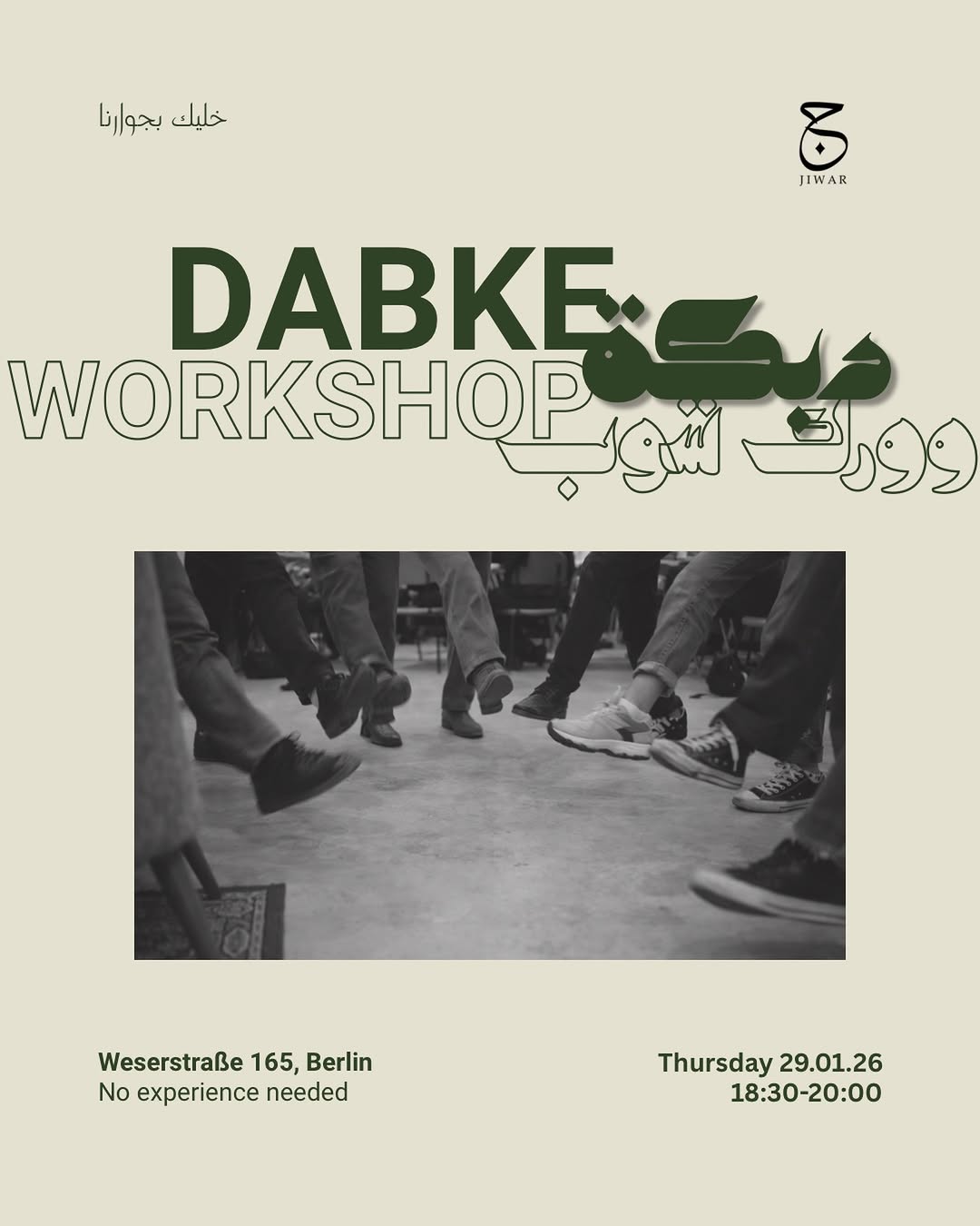
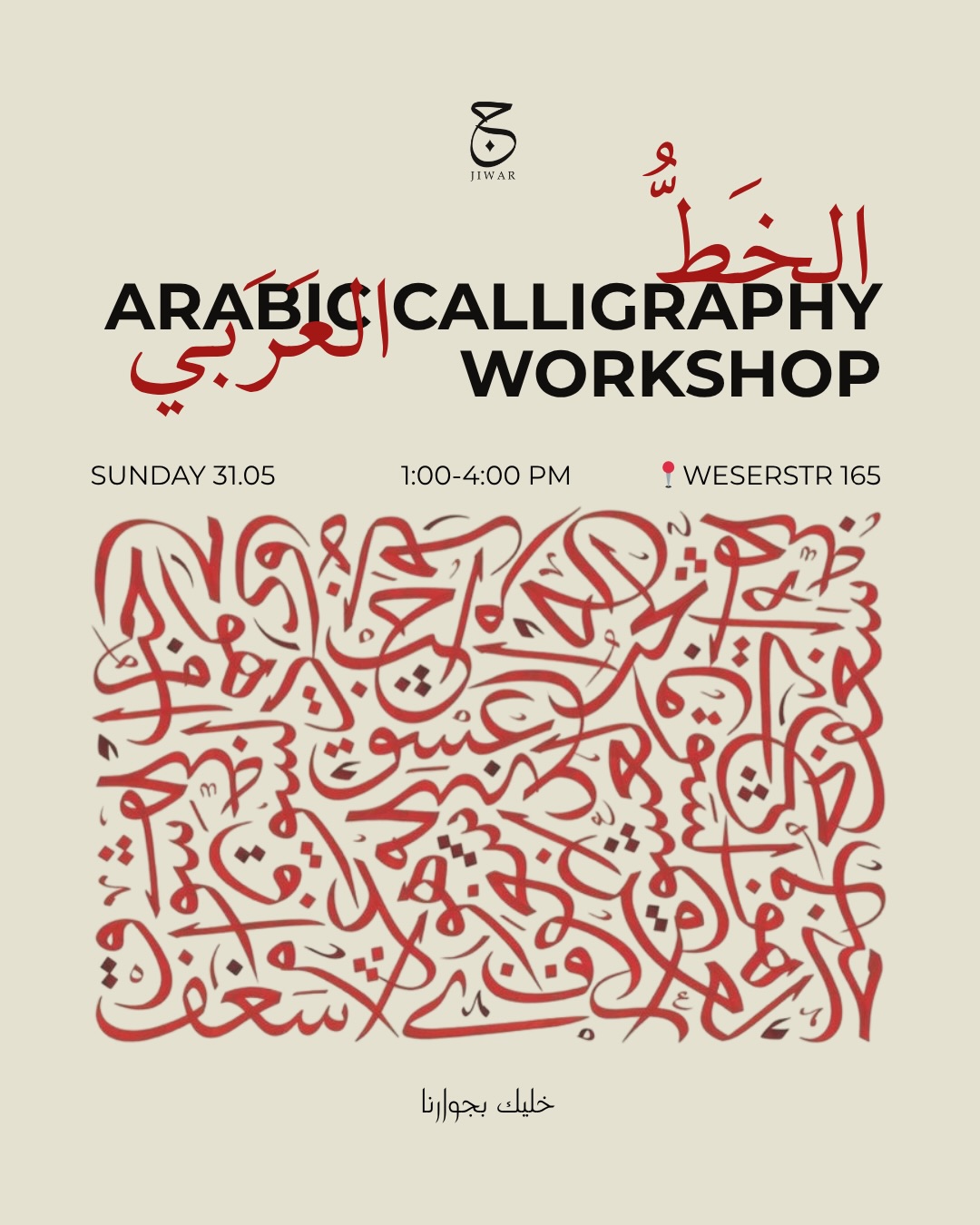
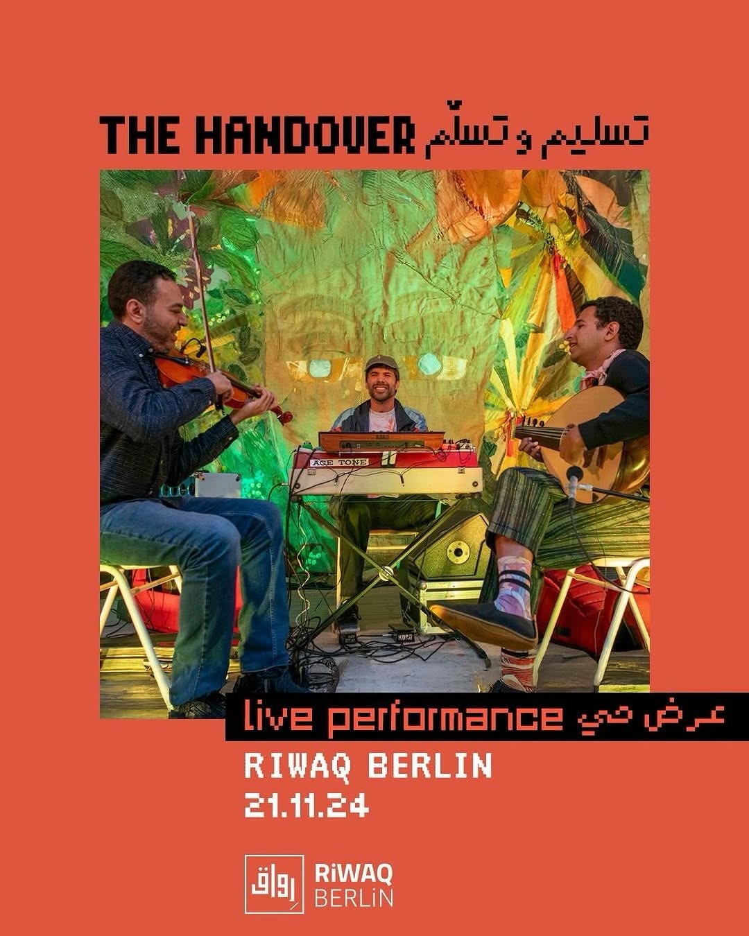
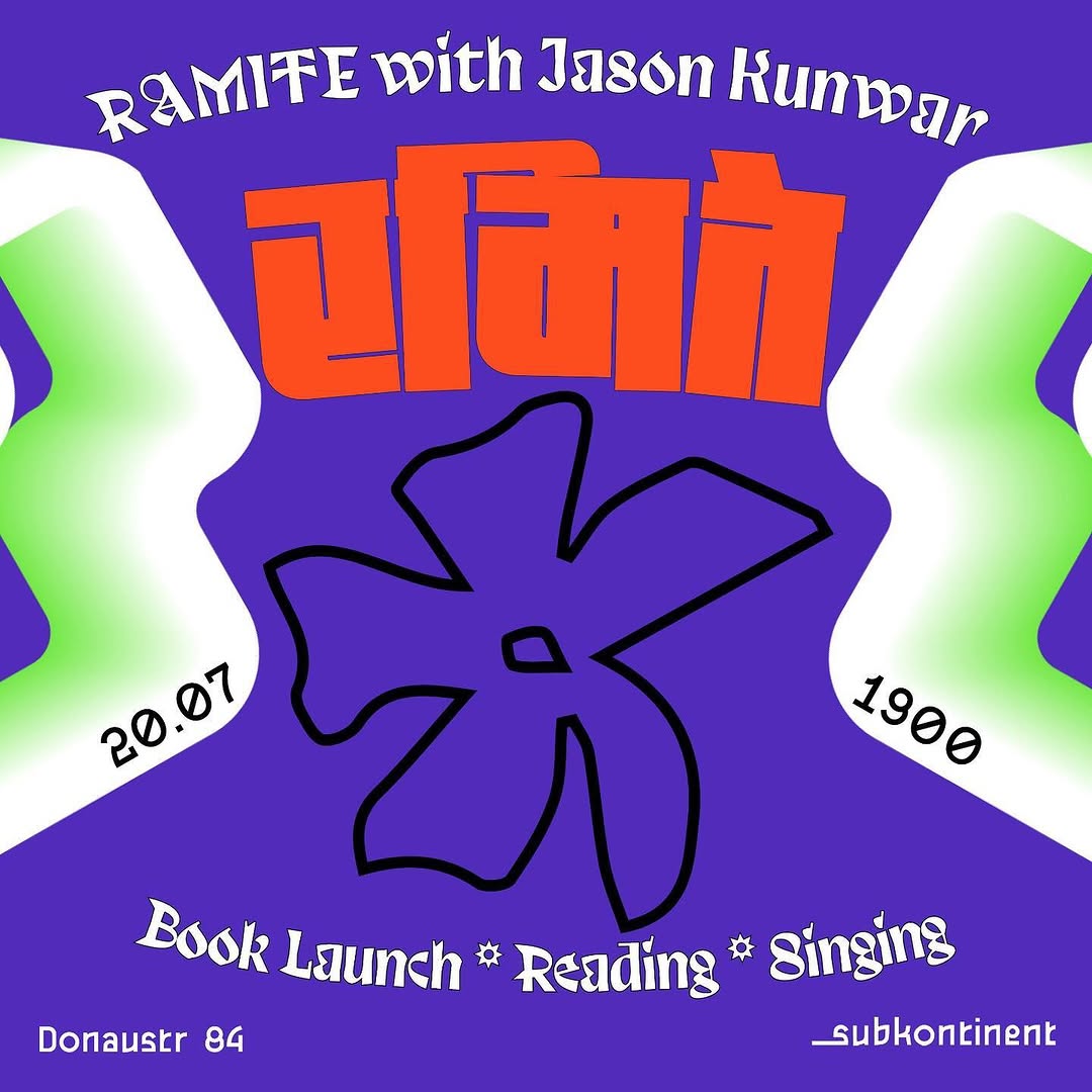
Faces first, warm light
The accounts that feel connecting put real people at the center with dignity: VETO shoots activists like cover stars in warm streetlight; Refuge catches the barista laughing across the zinc counter; Missy breaks its designed grid with casual snapshots of interns; Tía Chucha's story hours and festival performers sell more warmth than any of its graphics; Riwaq's crowd spilling onto the street outside the glowing storefront is proof of life no poster can fake. Warmth is carried by photography of people, never by graphics alone — and the venue feeds that skip it (Subkontinent, DARNA) feel like poster archives, not places.
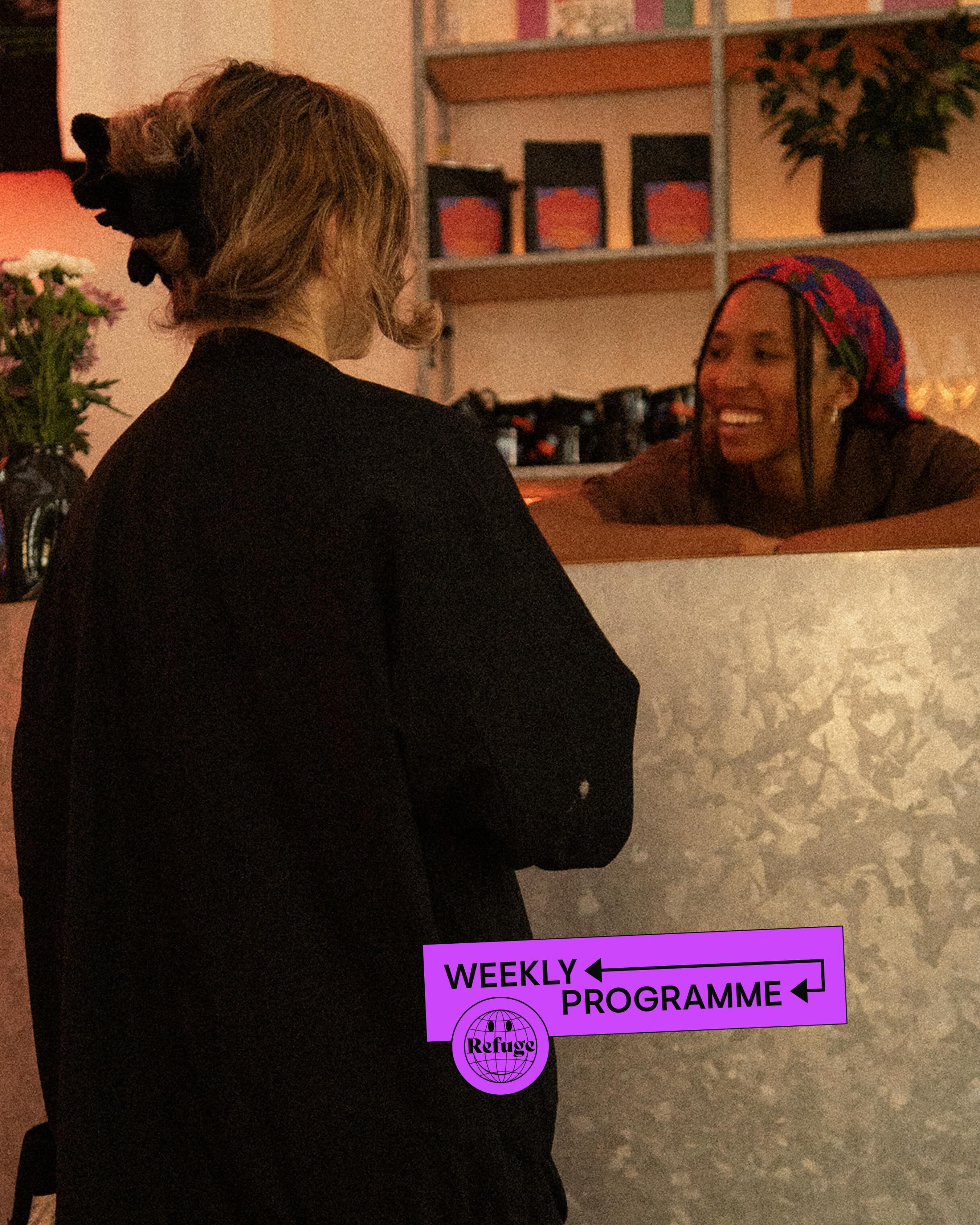
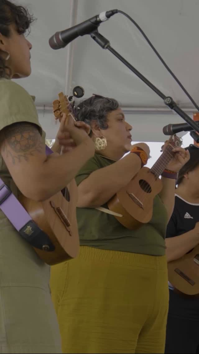
Two temperatures, one house
Strong feeds run a quiet register and a loud register and keep them distinct: ACUD separates neon club identity from terracotta café voice; Refuge alternates soft film photos with flat-color posters; Missy saves Y2K chrome for covers and merch drops; Barzakh pairs calm cream-and-serif posters with red-lit sensual room photography — though unlinked palettes show the risk: two temperatures still need one thread (a shared mark or color) or the grid splits into two brands.
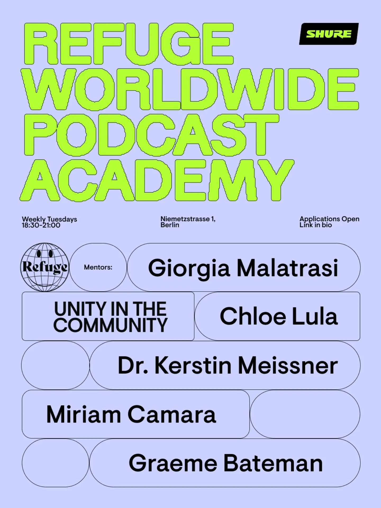
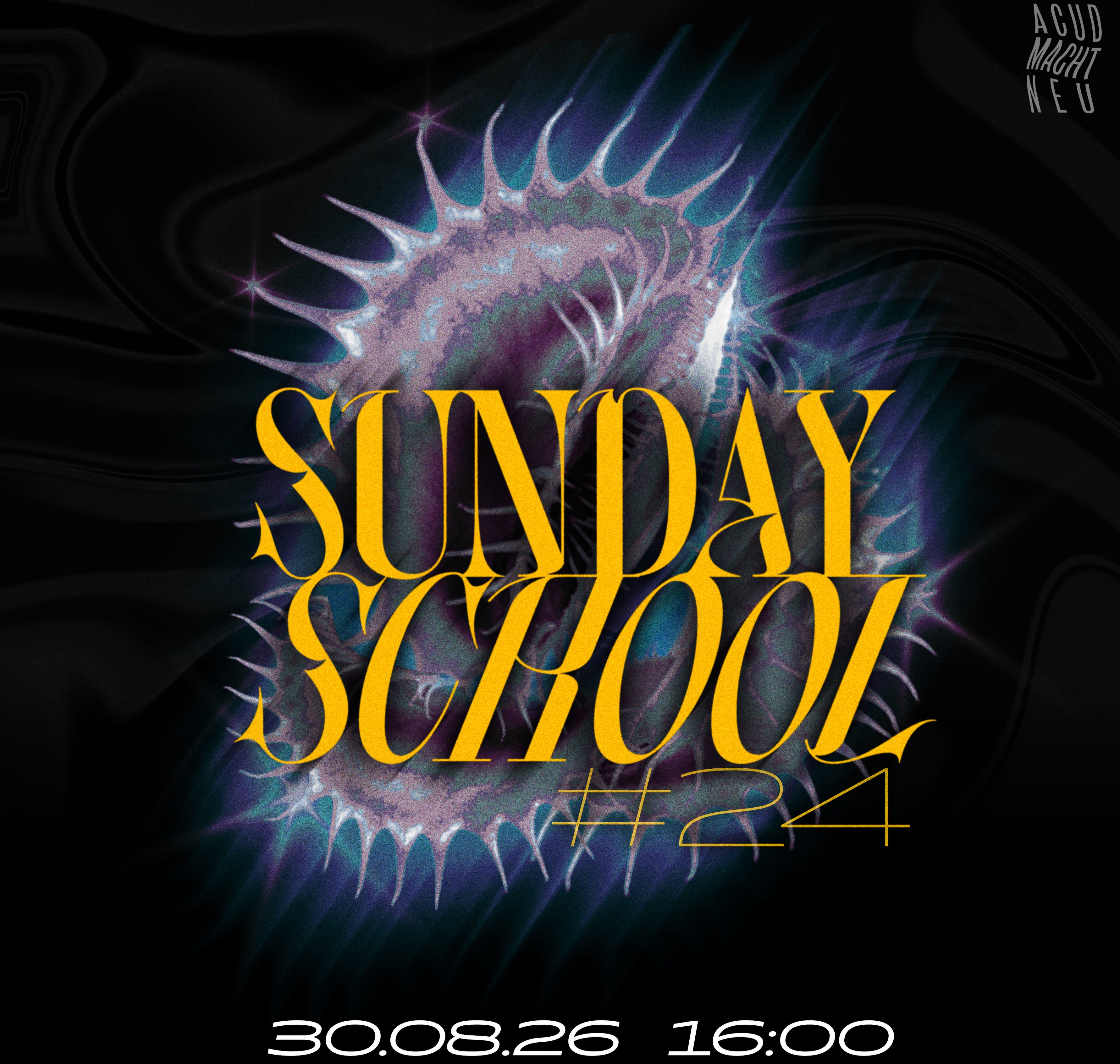
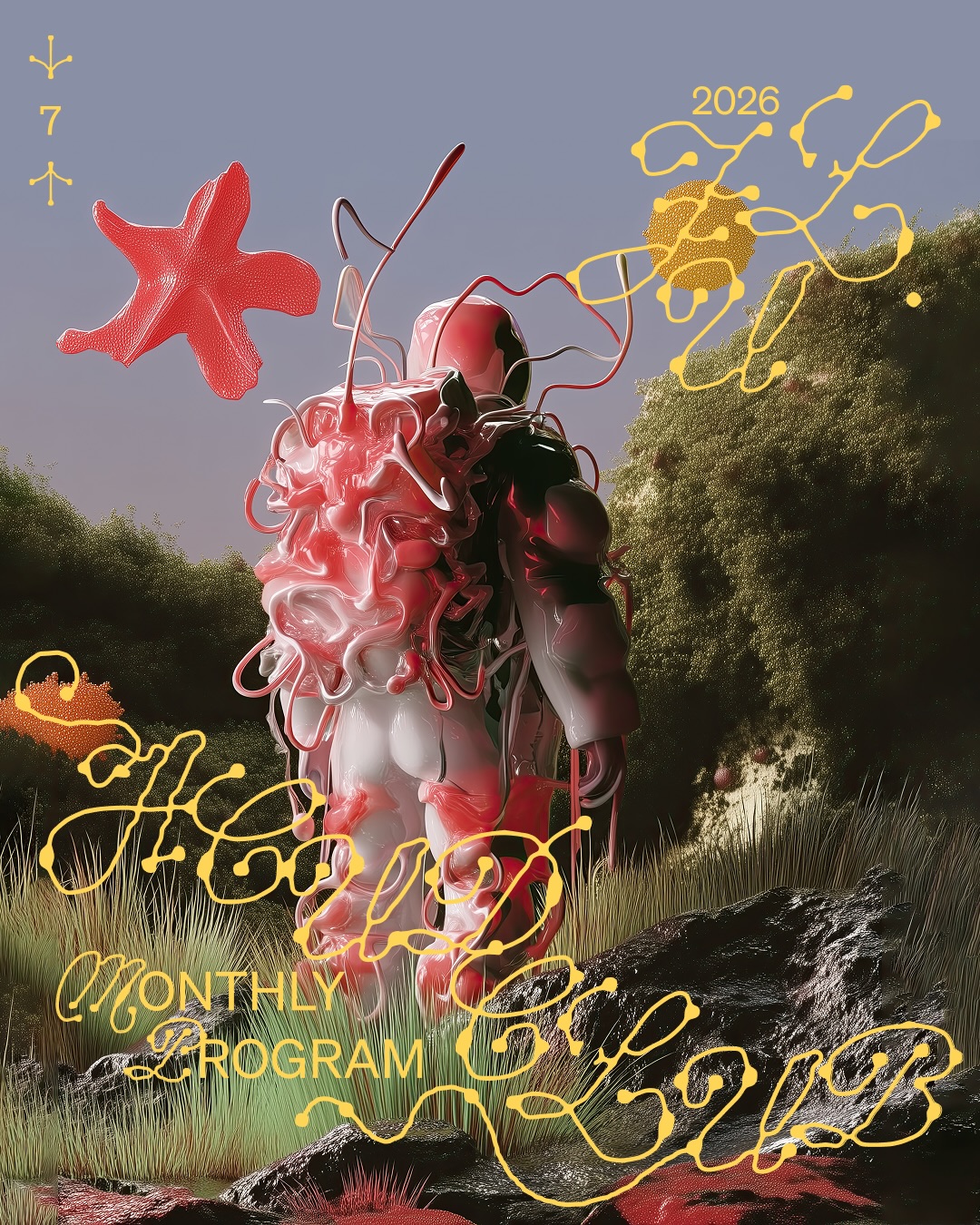
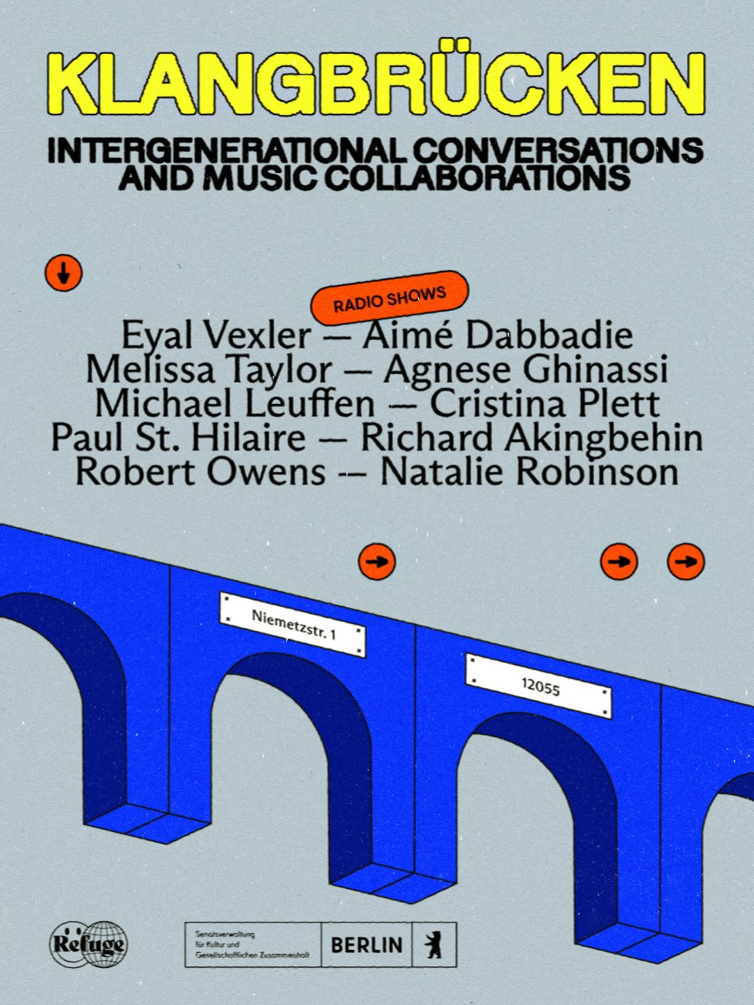
The room is the brand
Vartan shoots every drink against its plate wall, greenhouse pond and crystal lamps; Refuge's green awning, zinc counter and window dog make Weserstraße the identity; Riwaq's amber coffee-pouring, kibbeh platters and pink-candle window table make the feed smell like the space; Barzakh's red-lit, oud-hung, portrait-collaged room photographs like a world; Uncle Bobbie's stenciled bench and hanging sign give every street shot free branding. For a physical venue, interior and neighborhood photography does the work brand graphics do for magazines — environmental branding (signs, stencils, textiles) makes it compound.
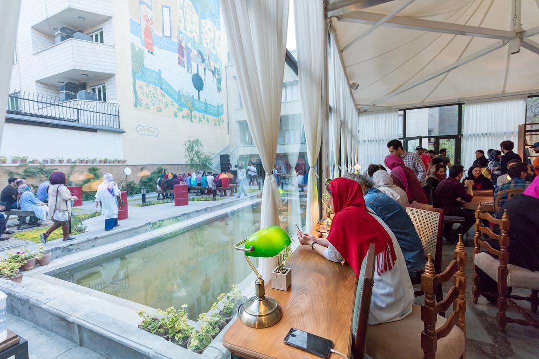
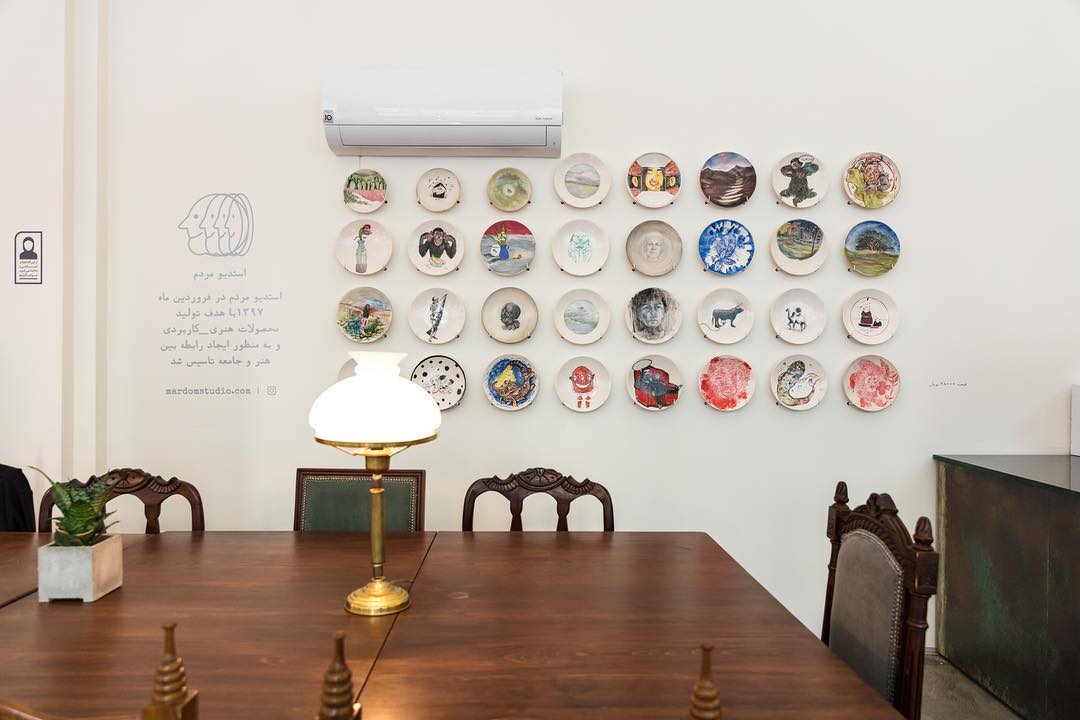
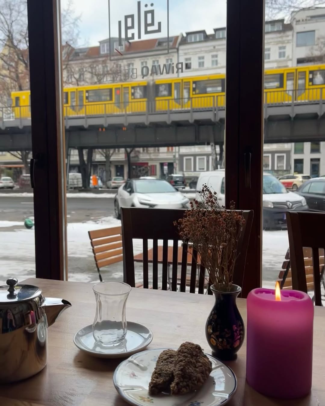
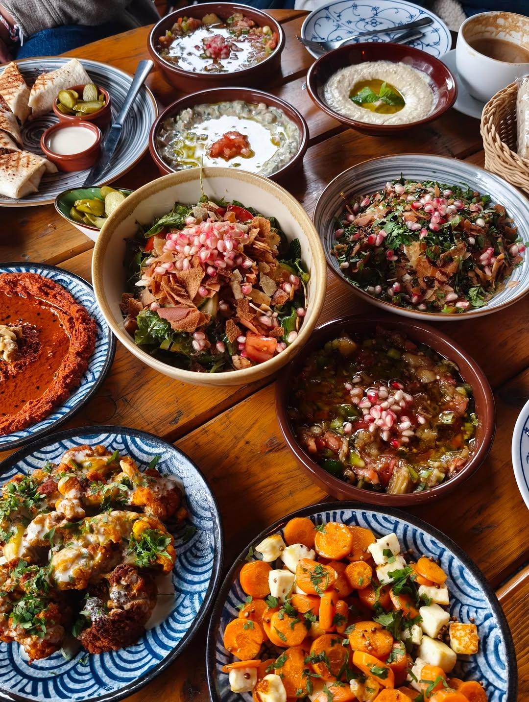
The costume-change trap (what breaks venue feeds)
The recurring failure mode of the topically-close venues: Uncle Bobbie's picks new fonts, palette and layout for every author flyer, so only the logo says who's posting; Tía Chucha's runs three unrelated systems (multiplex movie posters, scrapbook collage, turquoise product shots); DARNA's strong flat system collapses whenever a partner supplies clip-art flyers; Riwaq's posters share nothing but the logo; Jiwar slips to default bold sans when others provide the art. The lesson is structural, not aesthetic: a small team needs one locked template plus one repeating motif, and a rule for partner material — restyle it or frame it, never paste it raw.

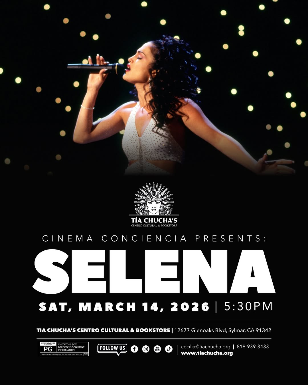
Where each reference sits
Horizontal: photography-led ← → graphic-led. Vertical: warm / home ← → dynamic / trendsetting. Descriptive only — where majal should sit is a branding-phase decision.
 @missymagazine
 @fluter
 @vetomagazin
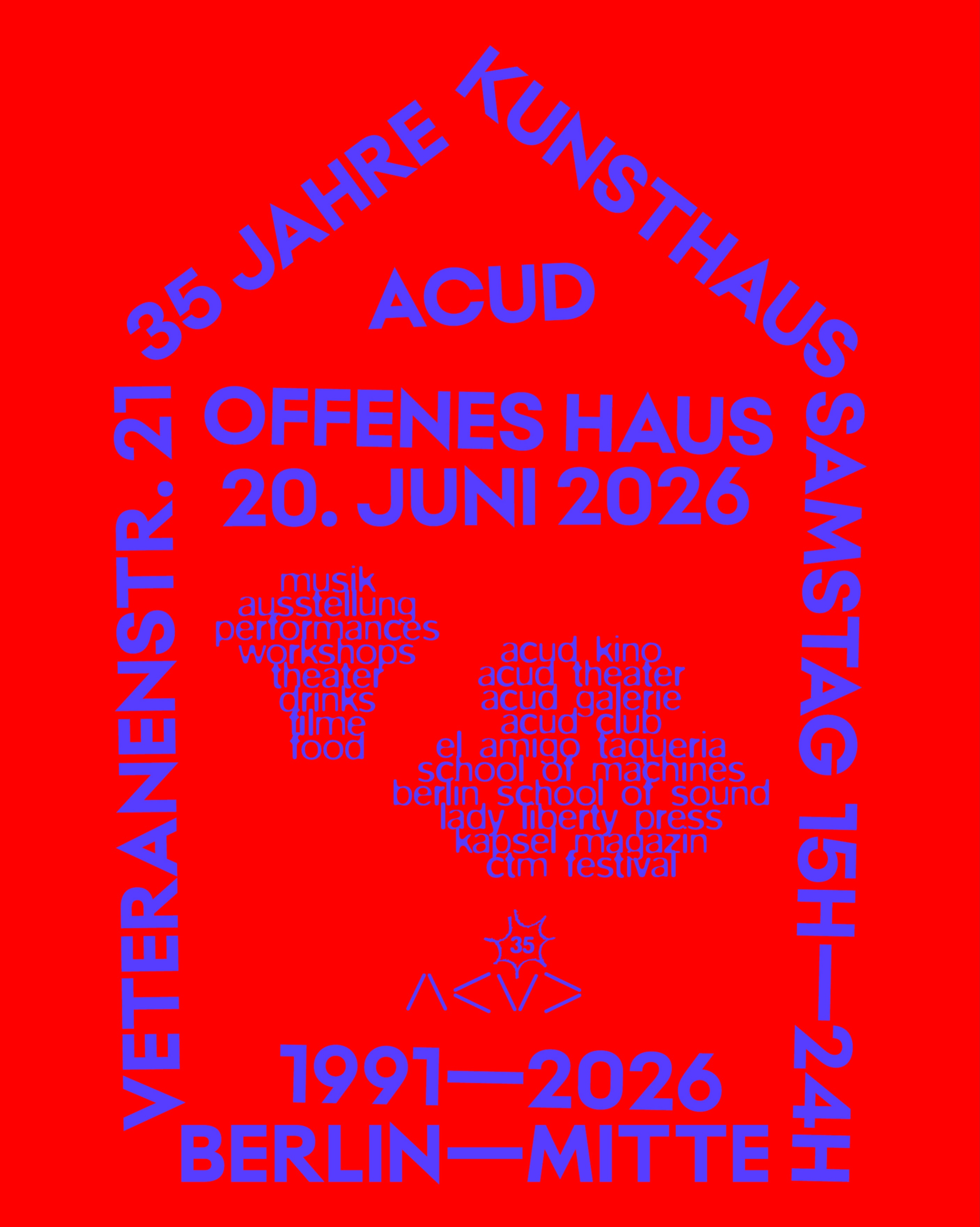 @acudmachtneu
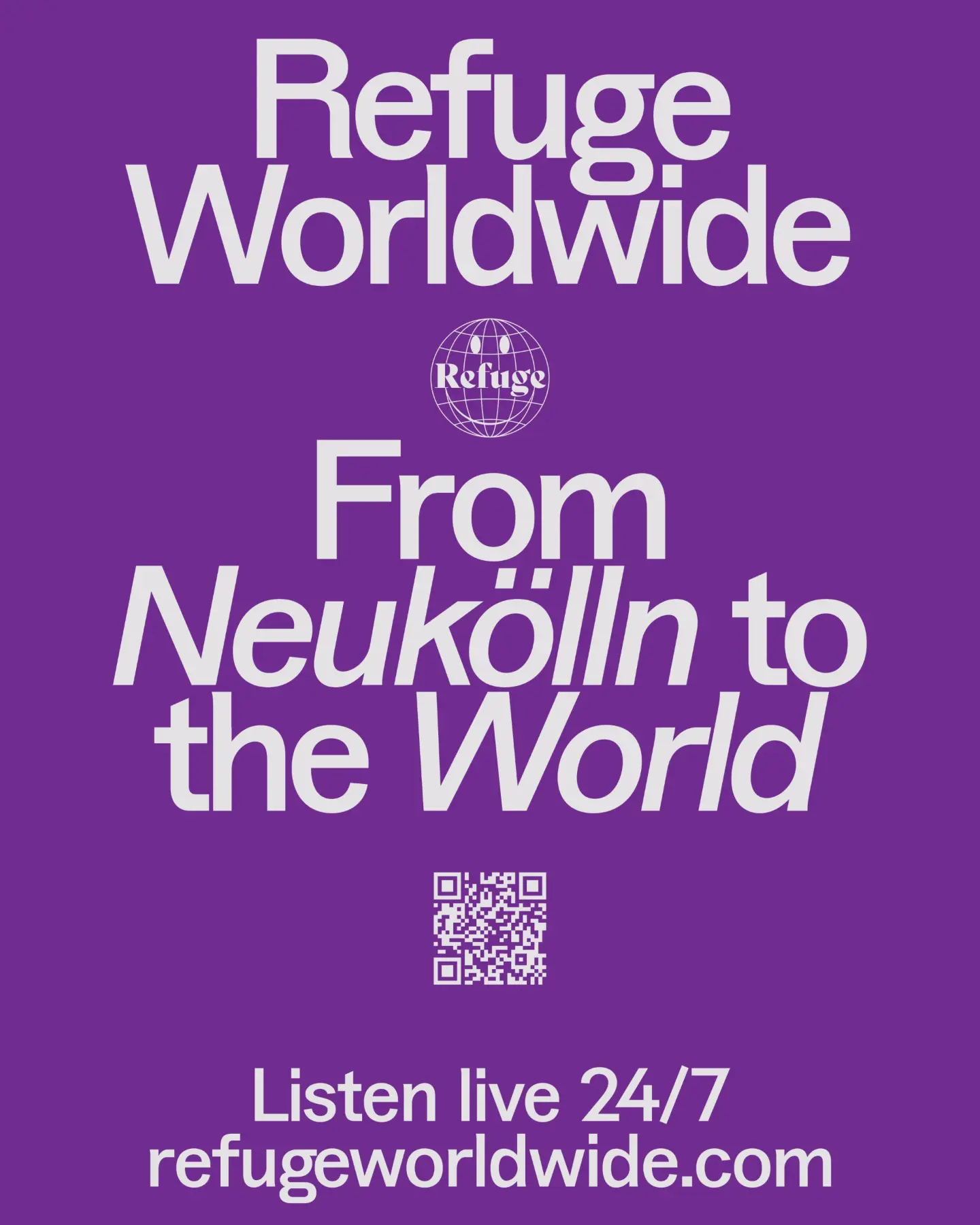 @refugeworldwide
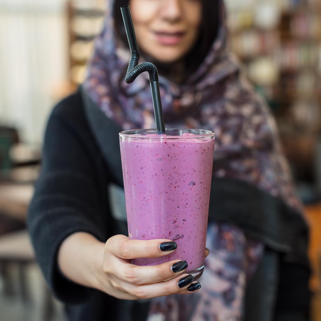 @vartanbookcafe@barzakh.cafe
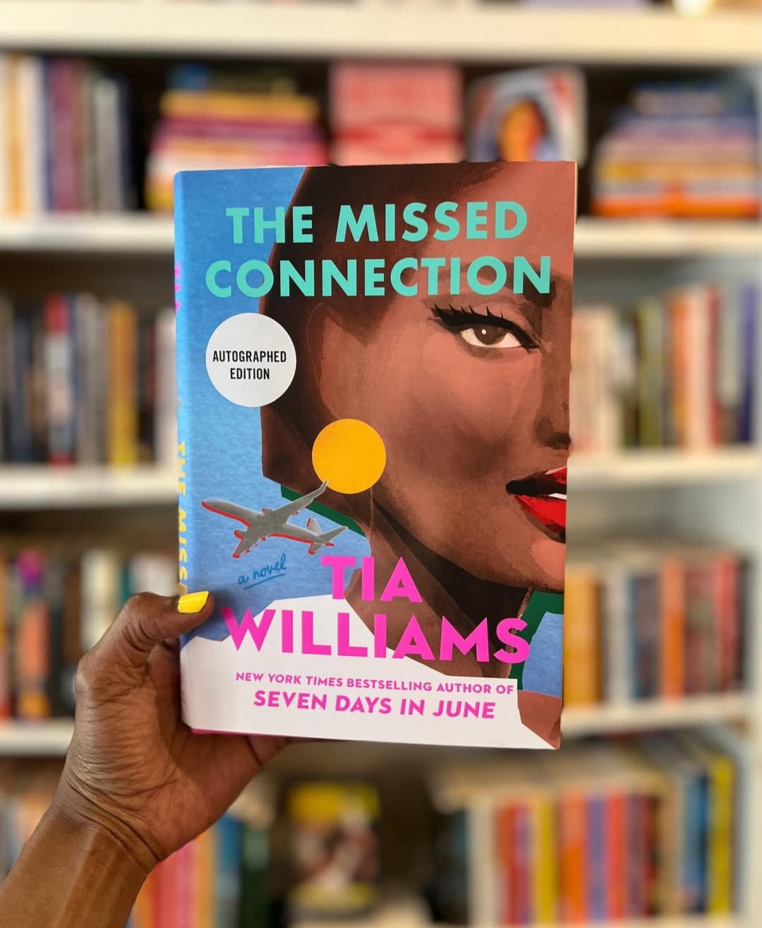 @cafeconlibros_bk
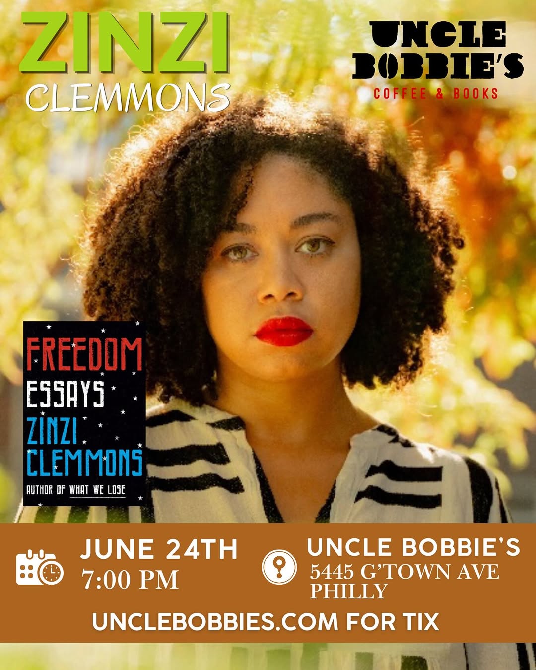 @unclebobbies
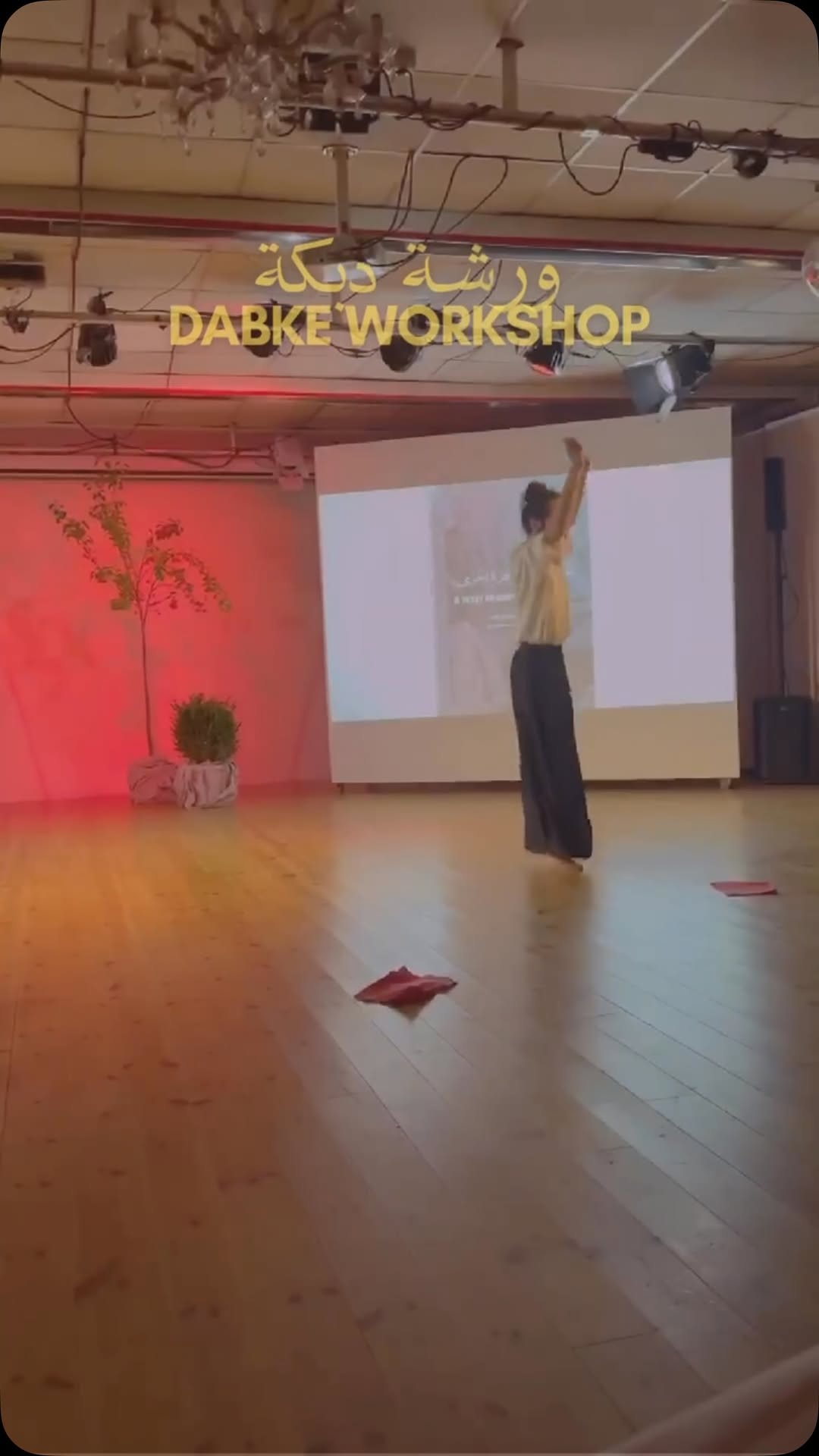 @jiwarspace.berlin
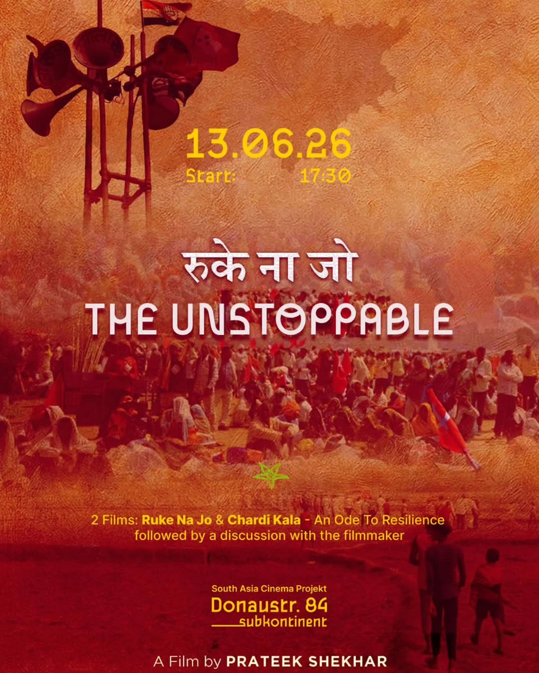 @_subkontinent
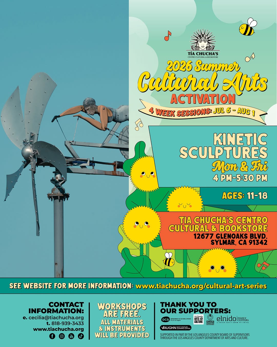 @tiachuchas
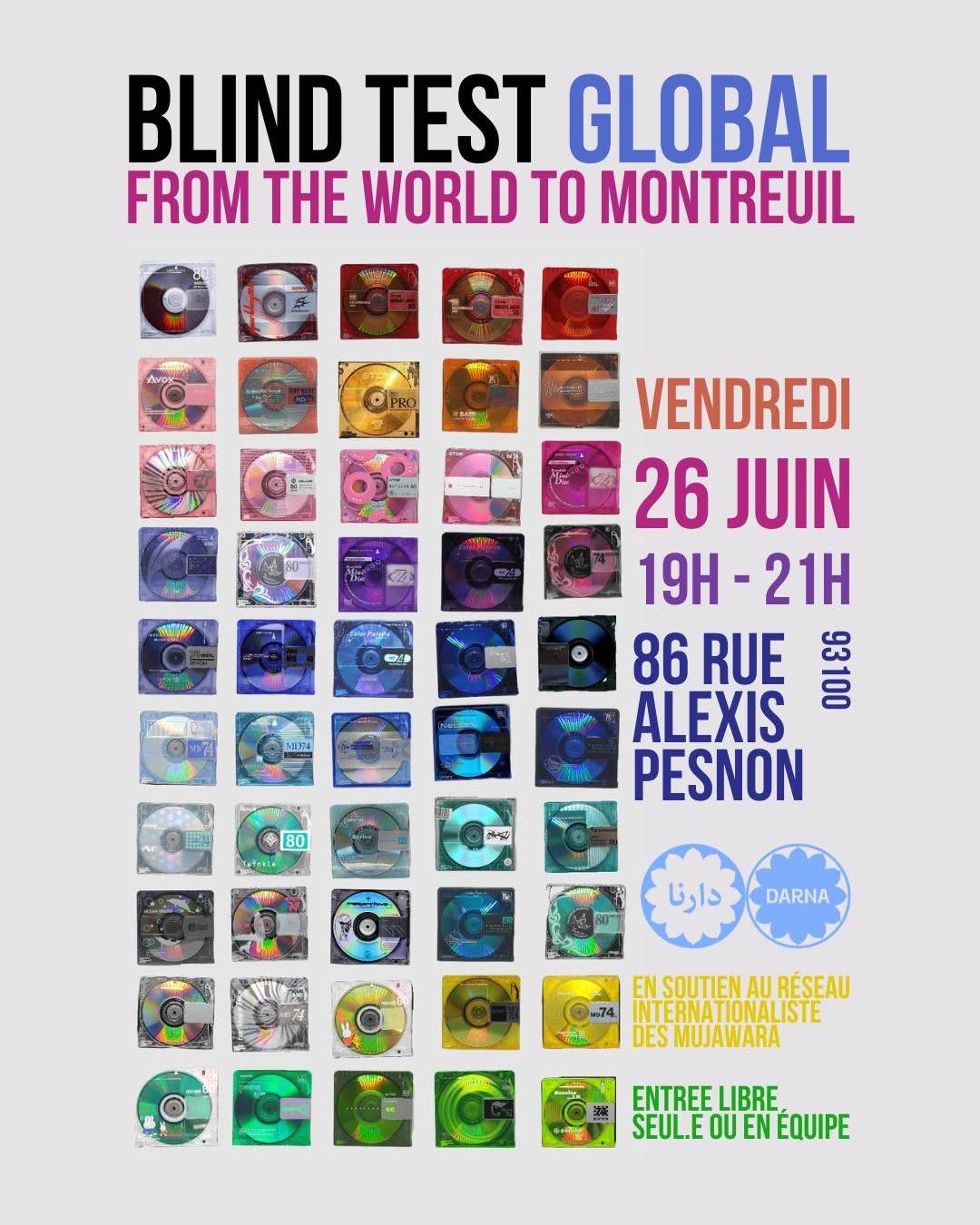 @darna.excantinesyrienne
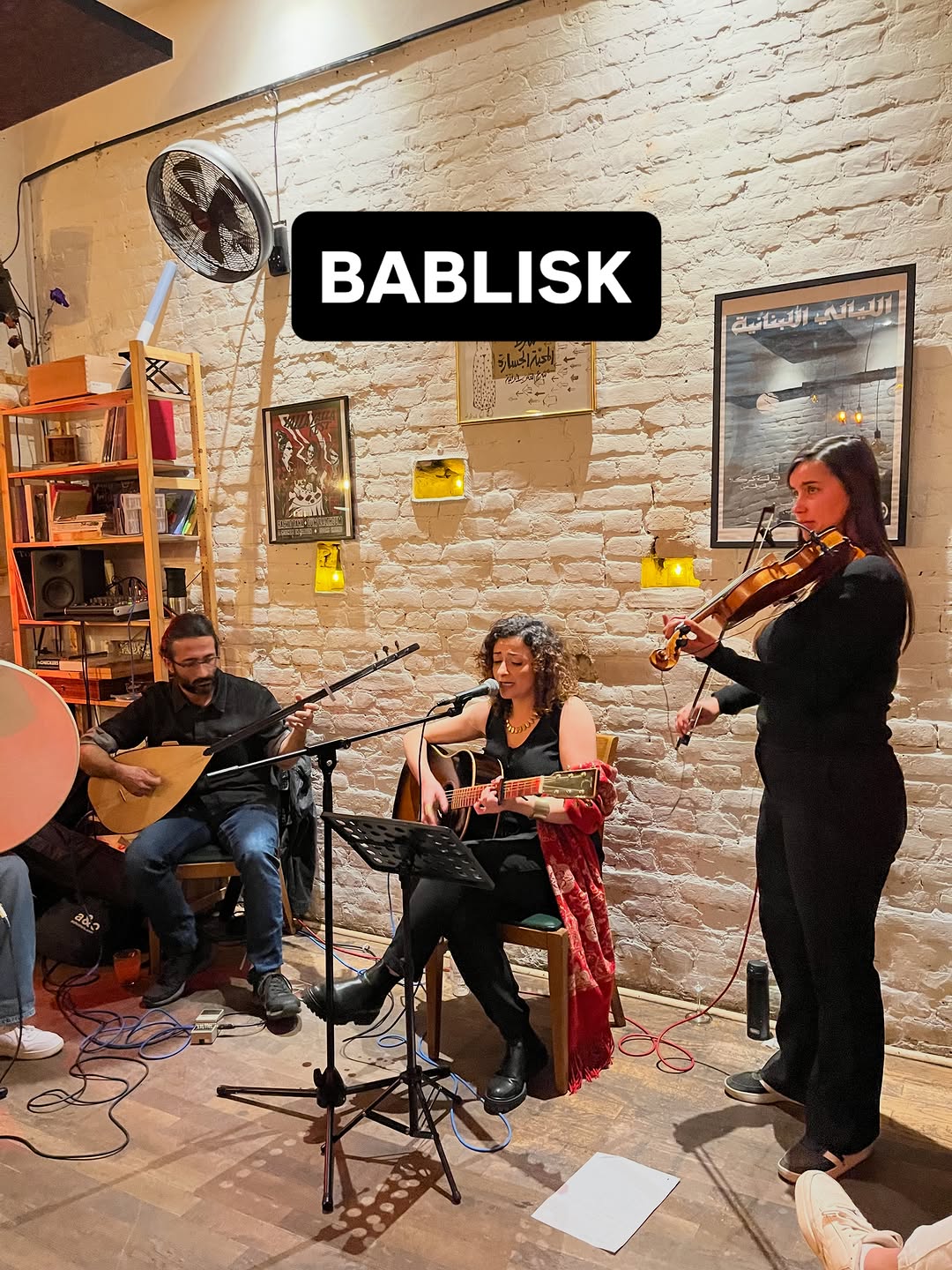 @riwaq.berlin
Berlin venues
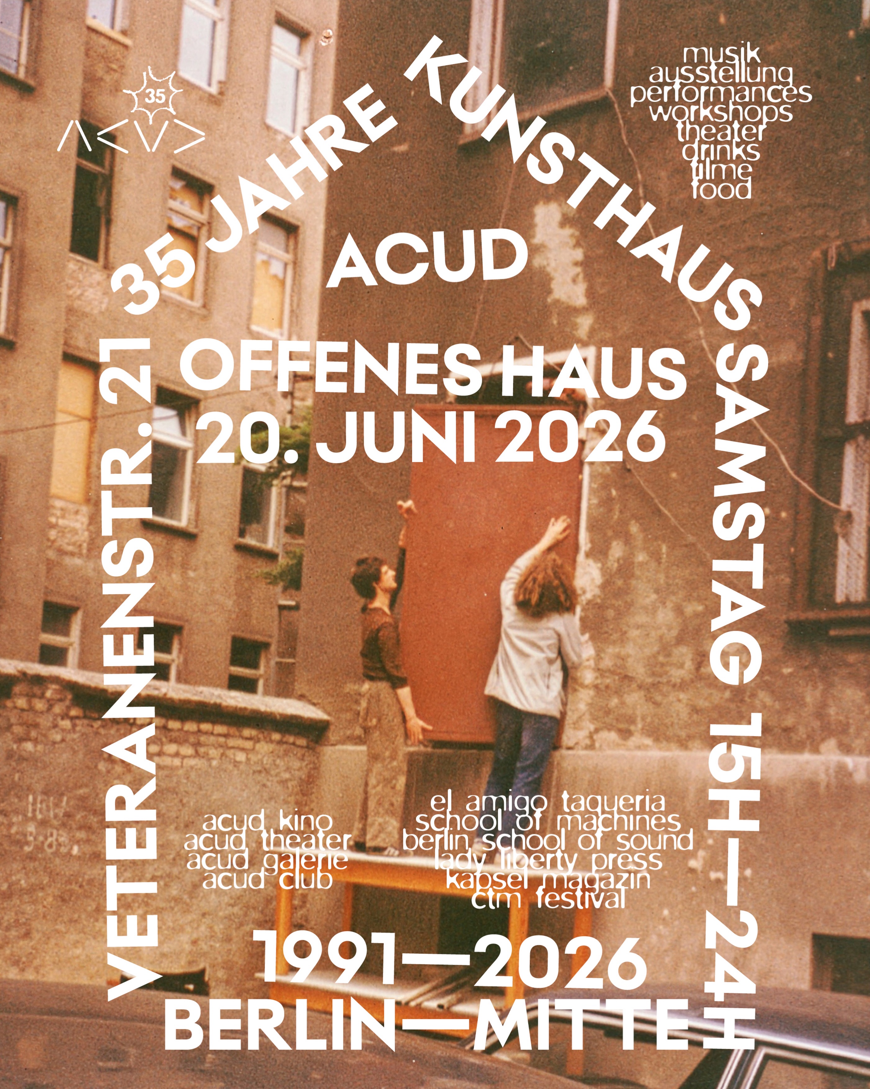
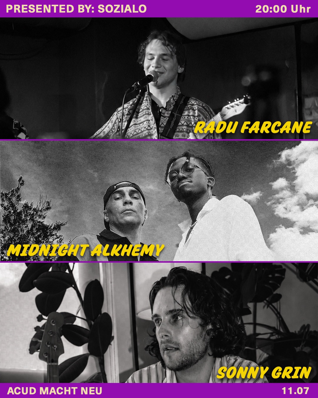
- A single elastic logotype (the wobbly café wordmark) stamped over any photo, video still, or A-board makes a chaotic multi-program house instantly recognisable at near-zero production cost.
- The café sub-brand deliberately shifts palette (terracotta/cream on black, sunlit courtyard photos) away from the neon club identity — one house, two temperatures, clearly separated.
- Reels with people talking to camera under big rounded captions ('Why ACUD?') turn community members into the identity — cheap, warm, repeatable.
- Hand-drawn and ASCII marks show that personality can live in one distinctive letterform gesture rather than a full design system.
- The neon-on-black club maximalism (glitch blur, stage fog, chrome party logos) reads nightlife-cold, not living-room warm.
- Letting every resident program post in its own aesthetic — without Majal's scale of sub-brands this would just look inconsistent.
Visual analysis
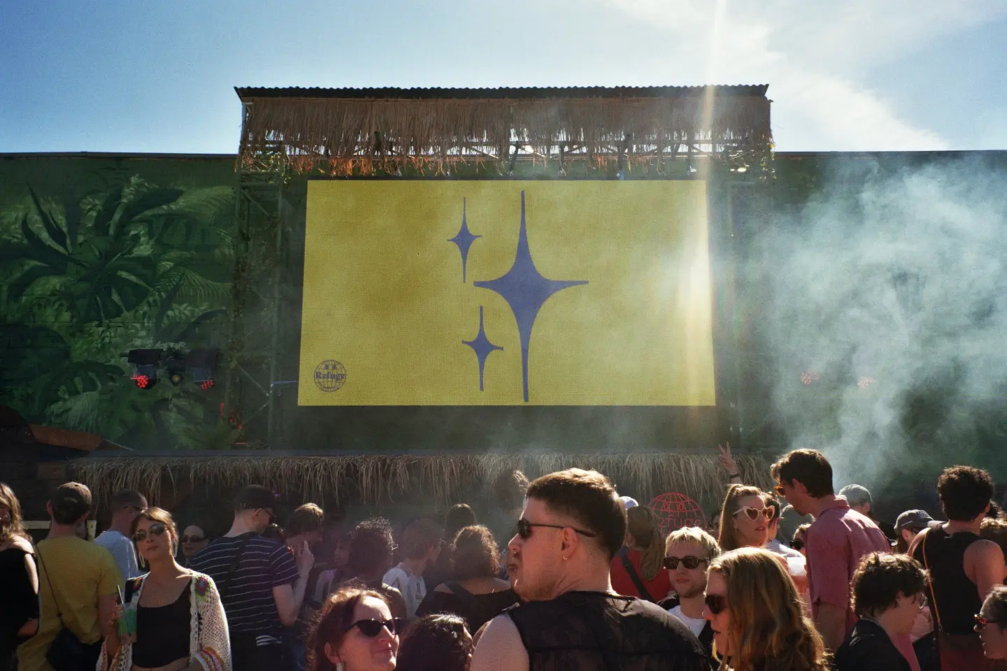
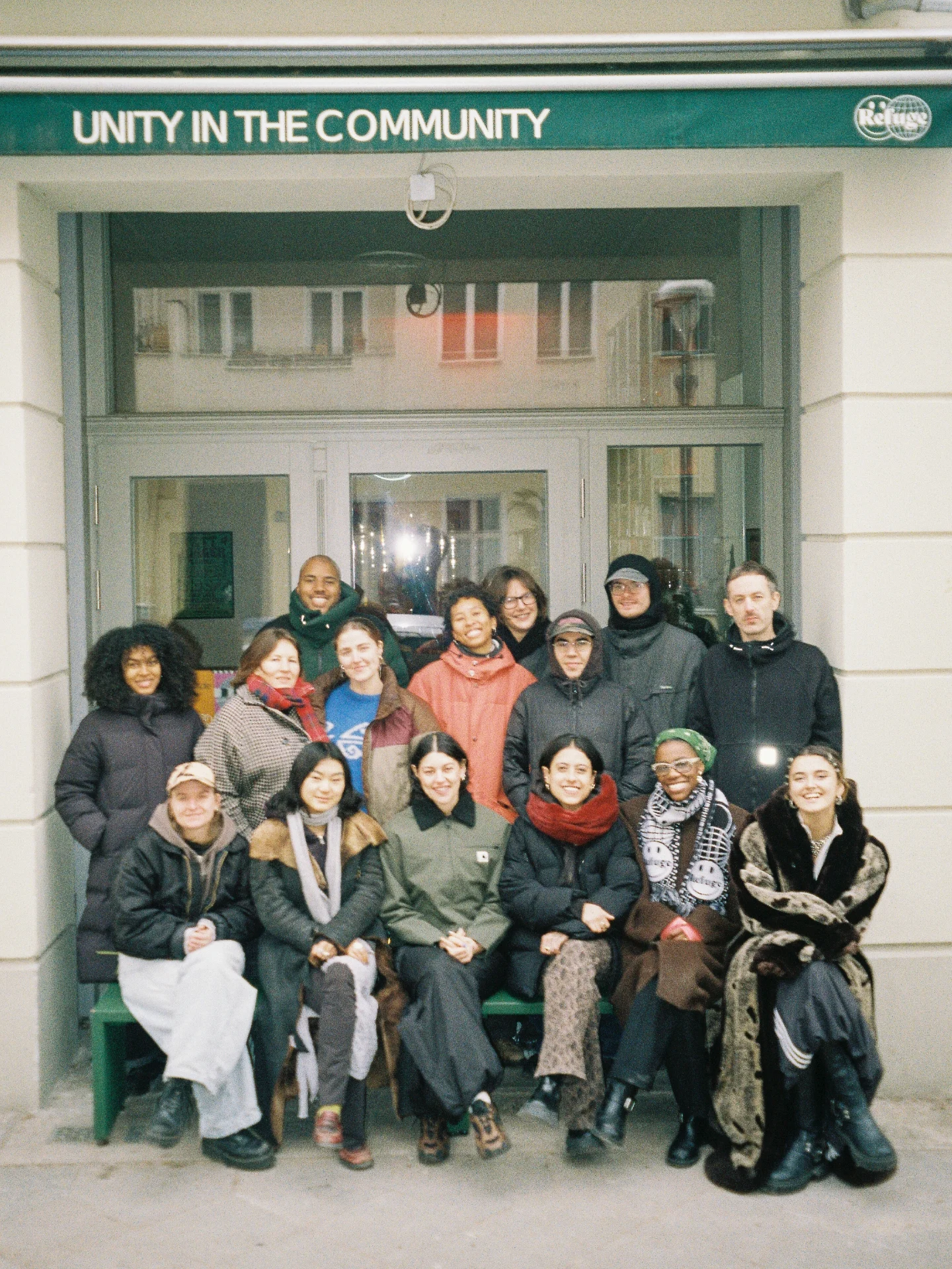
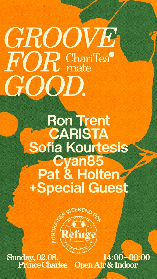
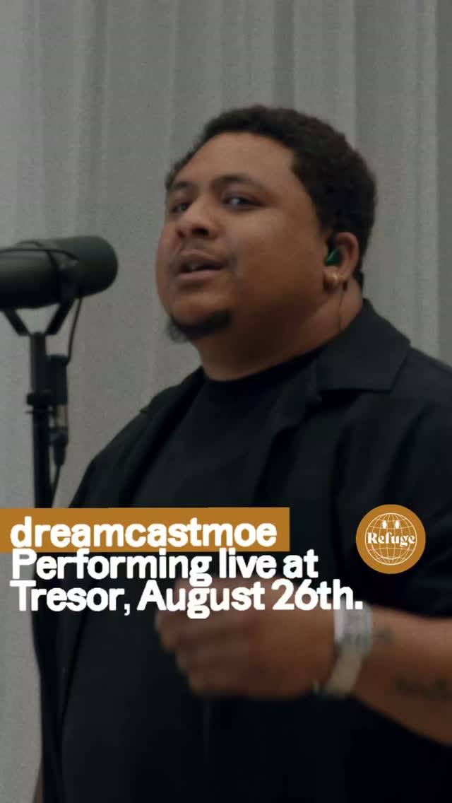
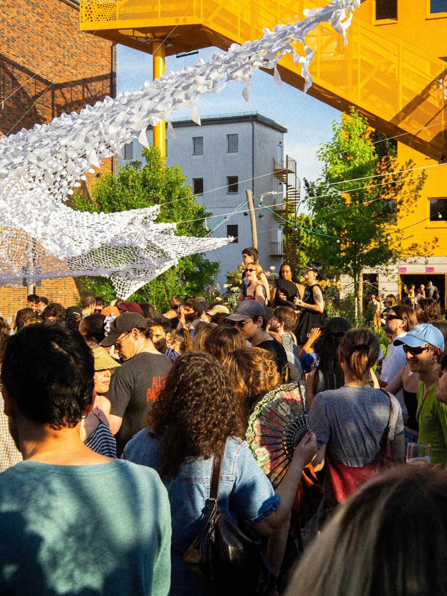
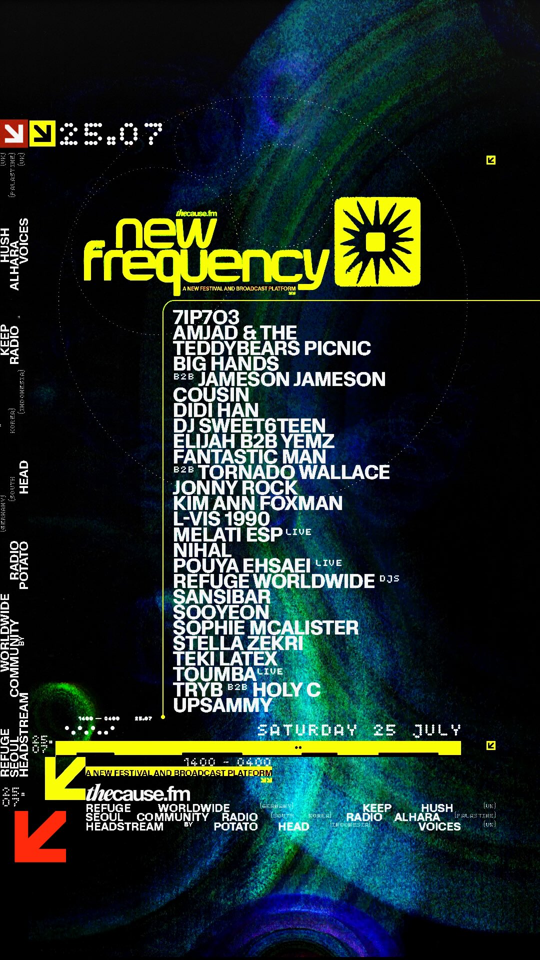
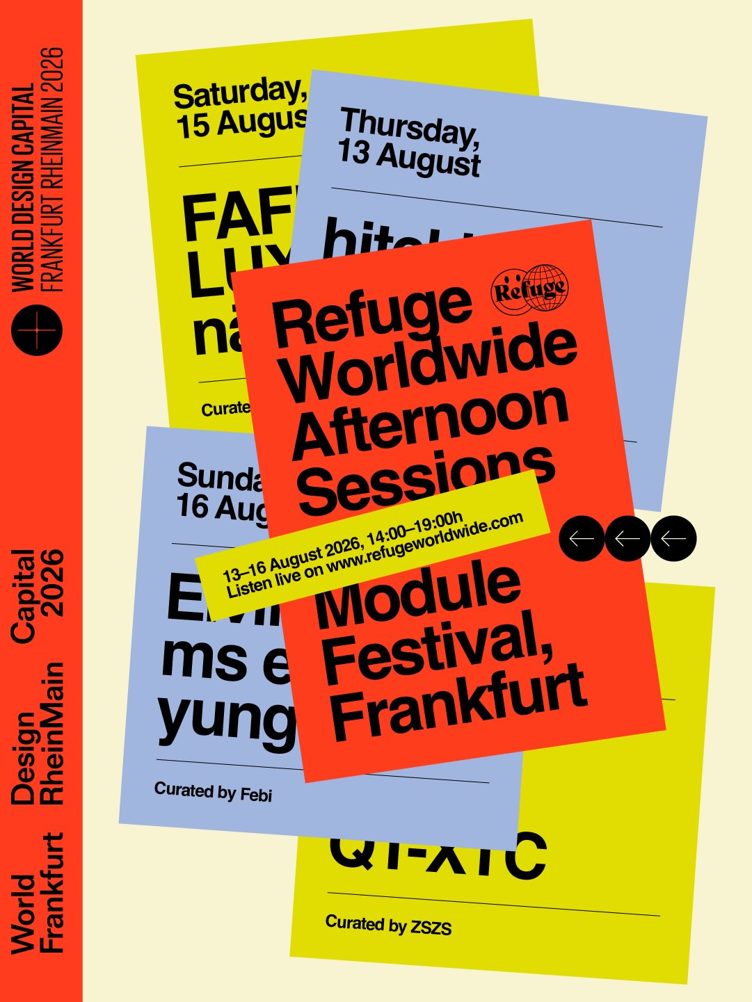

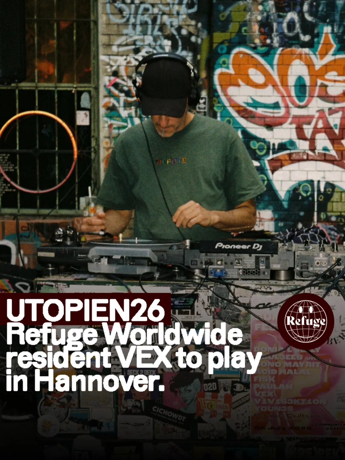
- The sticker-tag system — a small recurring logo badge dropped onto unposed film photos — lets everyday café moments (a dog, a laugh at the counter) do the brand-building; this is the closest existing model to Majal's warm-but-designed ambition.
- Flat single-color grounds with one confident typeface make posters that are fast to produce, unmistakably theirs, and still warm when the color is right (cobalt plus butter yellow reads friendly, not corporate).
- The globe-smiley logo proves a single charming mark can stretch from café window to festival stage without changing.
- Mixing roman and italic in one headline adds humanity to otherwise plain grotesque typography.
- The acid-green glitch and dense DJ-lineup poster styles from festival collabs — rave codes, not living-room codes.
- Leaning so hard on music-scene formats (resident tours, station takeovers) that food, books and daytime life disappear from the grid.
Visual analysis
Iranian café culture
vartanbookcafe
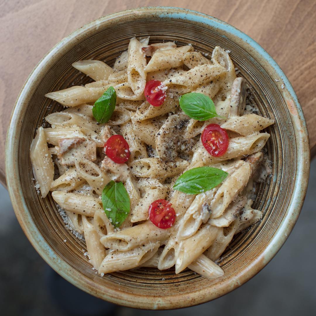
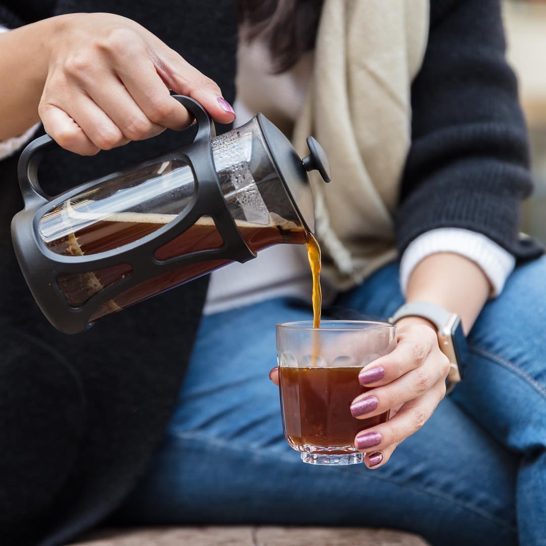
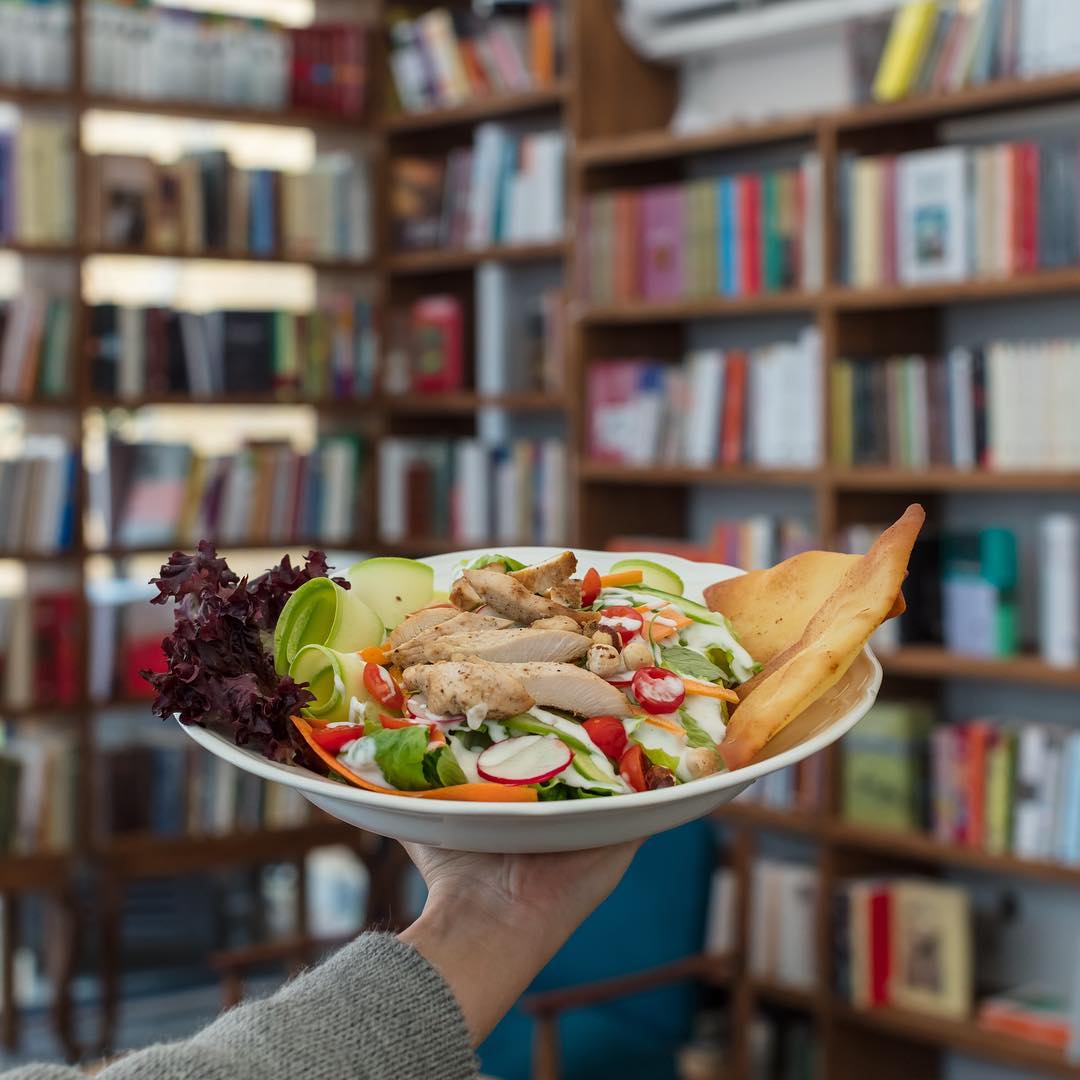
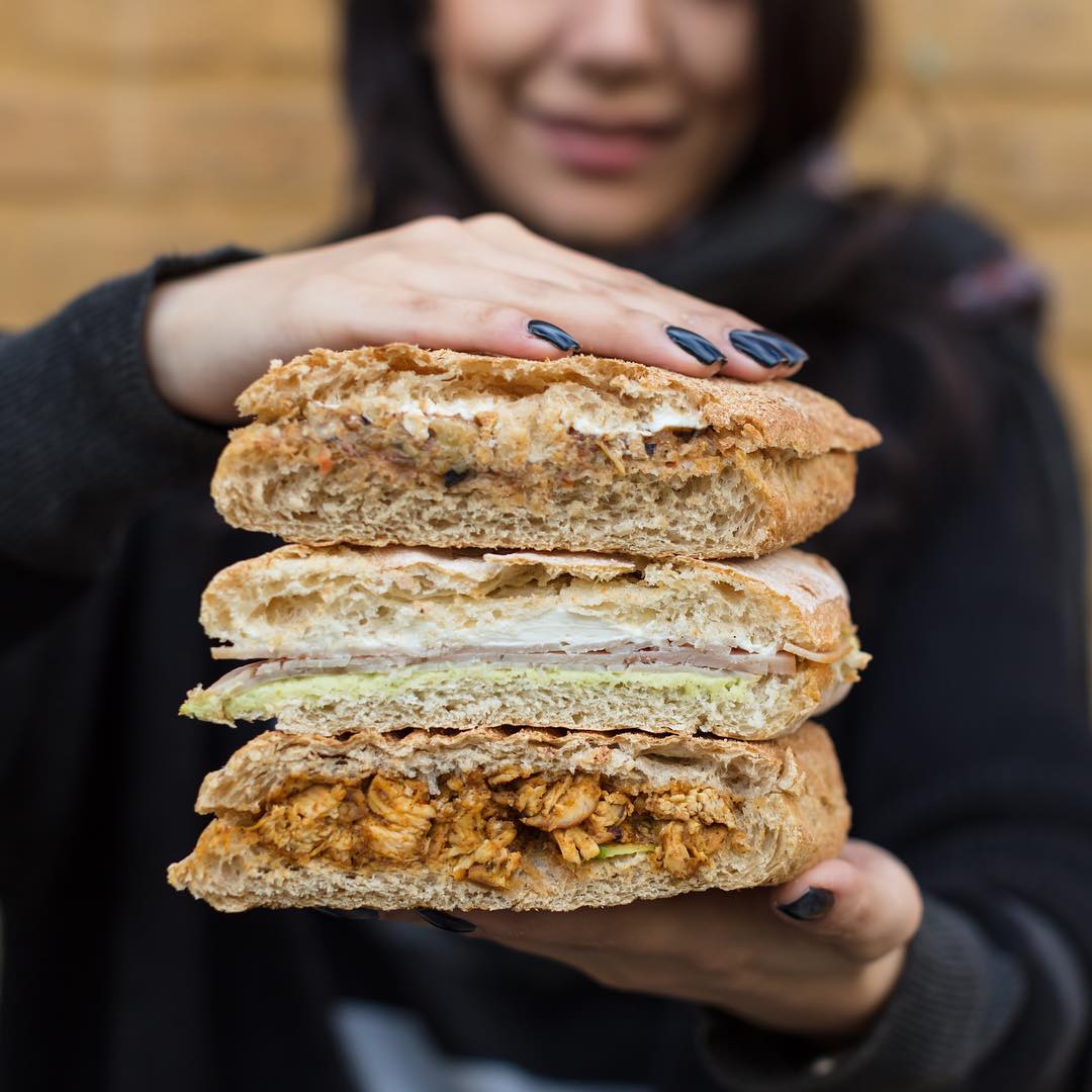

- The interior is the brand: shooting drinks against the plate wall, greenhouse pond and crystal lamps makes every food photo also a portrait of the space
- Hands offering food and drink to the camera turn product shots into gestures of hospitality — the warmest recurring device on any of the three feeds
- Native-script identity done seriously: a geometric Perso-Arabic logotype plus literary captions and a signature hashtag give a café intellectual weight without losing cosiness
- Book culture is shown as activity (people reading, author talks, detective-game posters) rather than shelf still-lifes
- The soft-focus 2018 foodie look (bendy straws, heavy bokeh) now reads dated; copying the style rather than the warmth would age Majal on arrival
- Its palette and props are specifically Iranian-domestic; replicating them literally in Berlin would feel like themed decor rather than a lived space
Visual analysis
Majal reference venues — design read
Barzakh • Café • برزخ
- One locked poster template (cream + serif + monogram) makes a tiny feed instantly recognizable
- Arabic calligraphy used as a signature mark, quietly, on every poster — branding without shouting
- The room itself is the brand asset: red-lit, instrument-hung, portrait-collaged interiors photograph like a world, not a café
- Poster template and venue photography live in two unrelated color universes (cream/blue vs red/magenta) — the feed doesn't cohere as a grid
- Venue photos are phone-grade: blown reds, motion blur, no exposure control; atmosphere survives, detail doesn't
Visual analysis
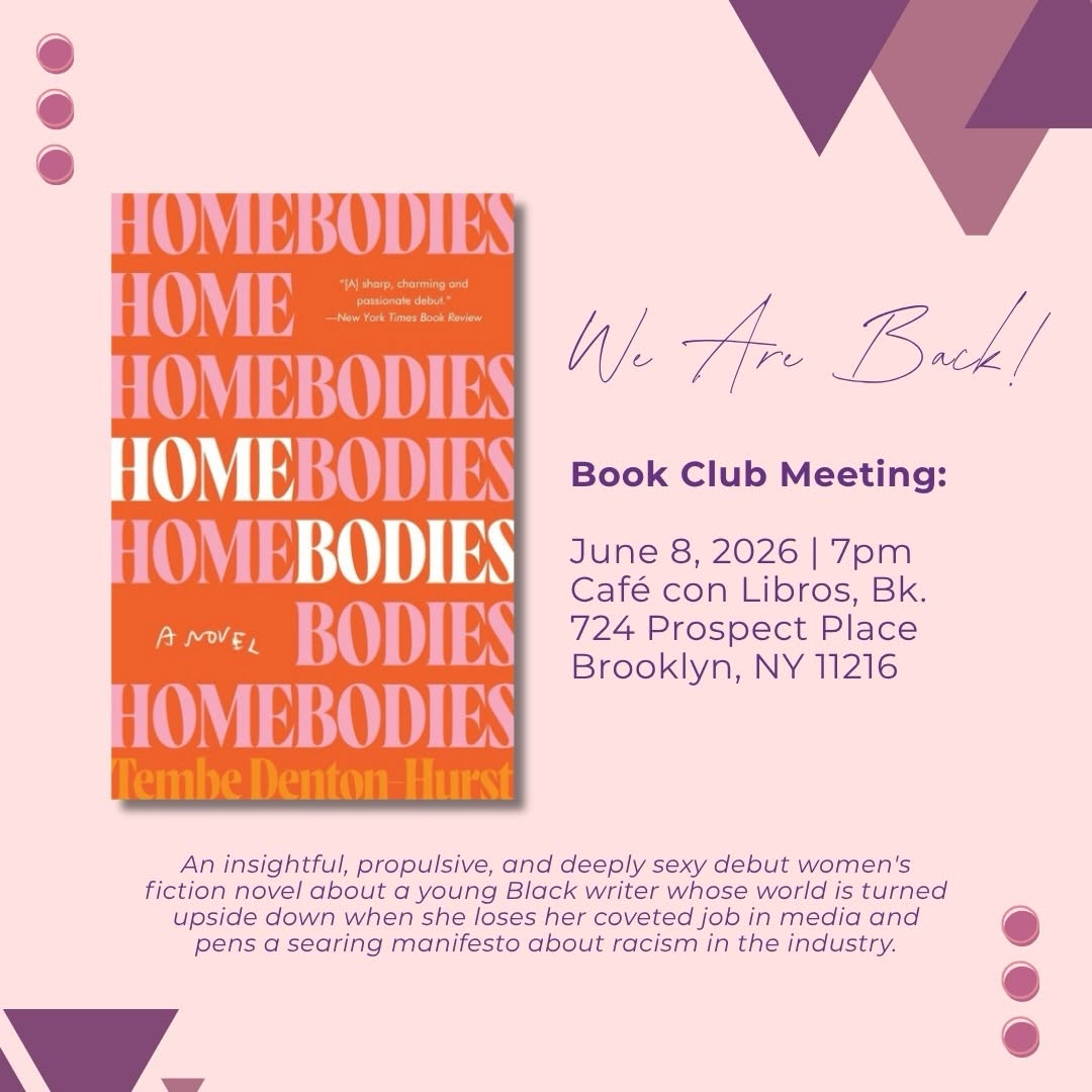
- The repeated hand-plus-cover frame is a genuinely ownable, zero-budget format — instantly identifiable at thumbnail size
- Letting colorful book covers be the art keeps the grid vivid with no design labor
- The blurred white-shelf backdrop functions as a de facto brand background — consistent light, consistent depth
- Total absence of a graphic layer: no event/typographic posts, so announcements live in captions where they're invisible in-grid
- Personal snapshots (vacation, selfies) at inconsistent quality dilute the venue's visual identity — charming for a founder account, weak for a brand
Visual analysis
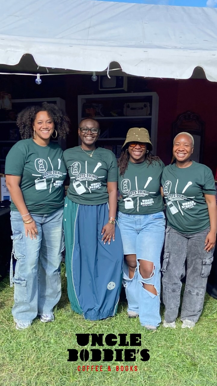
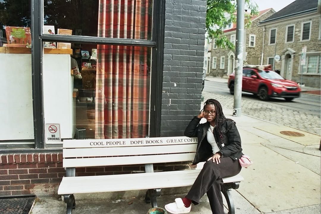
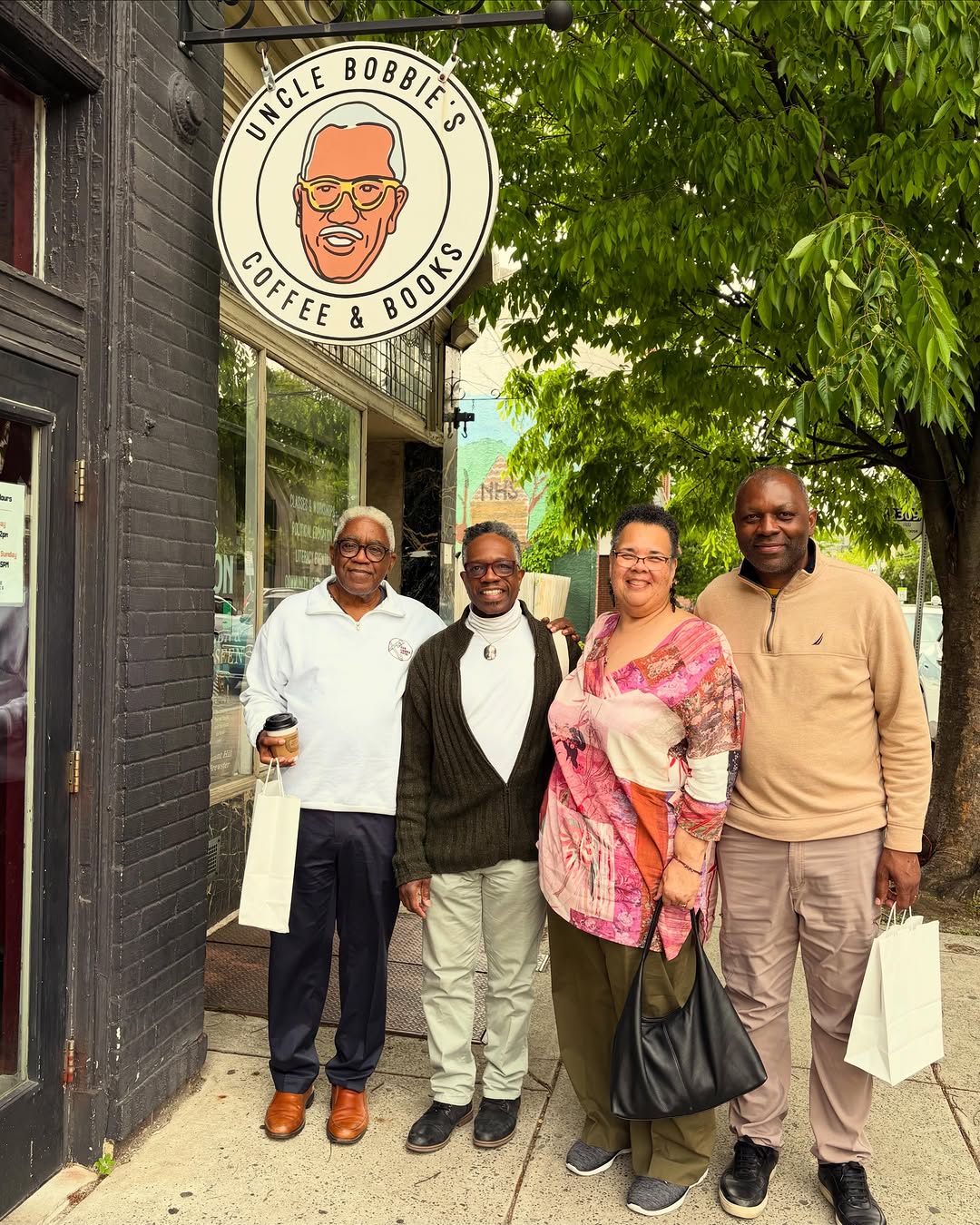
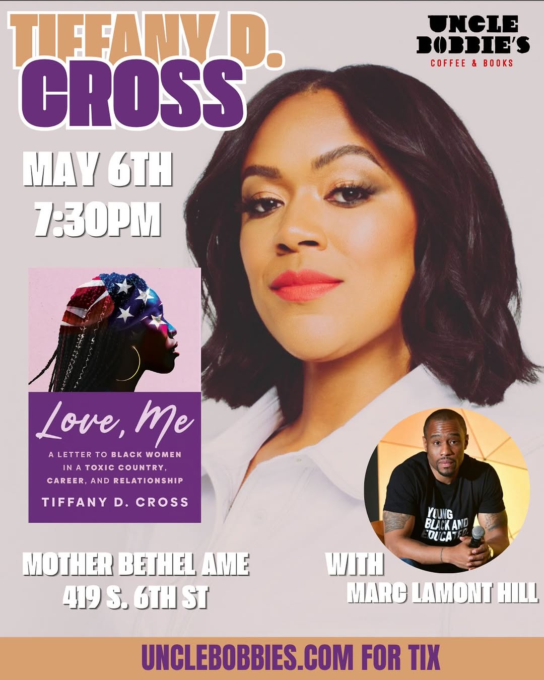
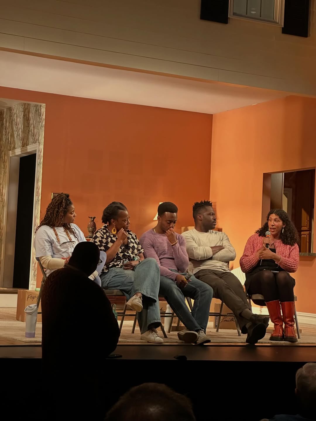
- The mascot roundel is a masterclass — human, warm, legible at any size, and it brands photos, flyers and the physical sign identically
- Environmental branding (stenciled bench, hanging sign, black storefront) gives photographers free brand assets in every shot
- Film-stock street photography carries more identity than any flyer — neighborhood-rooted and unpolished in the right way
- The Pride collage proves a stronger editorial direction exists: archival cut-outs + one type family + two colors
- Zero flyer-to-flyer consistency — new fonts, new palette, new layout every time, so only the logo says who's posting
- Flyers are overcrowded: headshot + book cover + inset circle photo + 4 type styles + icons competing in one frame
Visual analysis
underperformer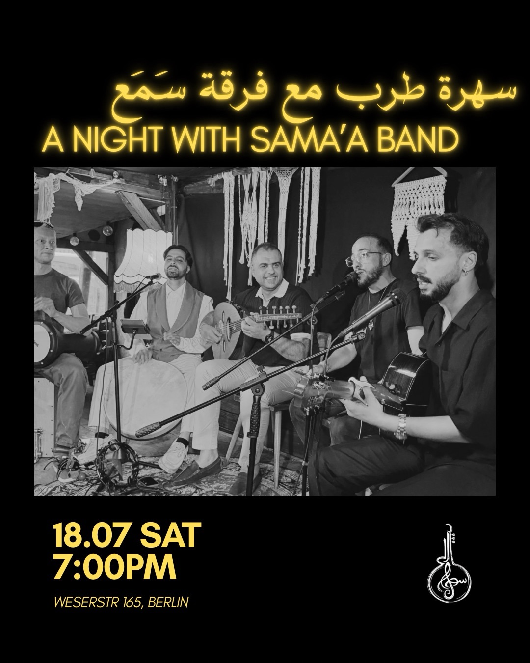 underperformer
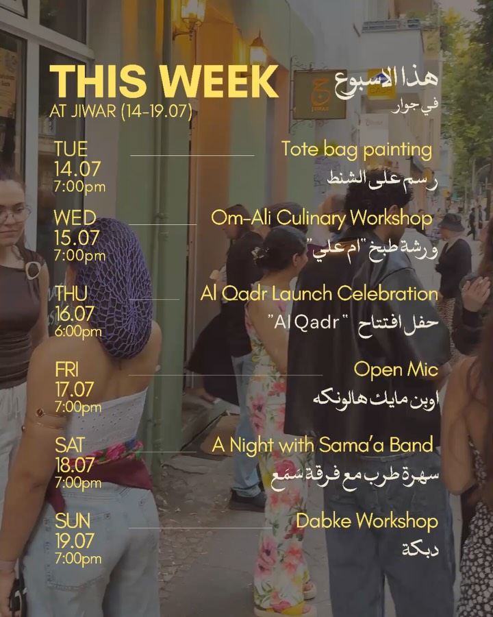 underperformer
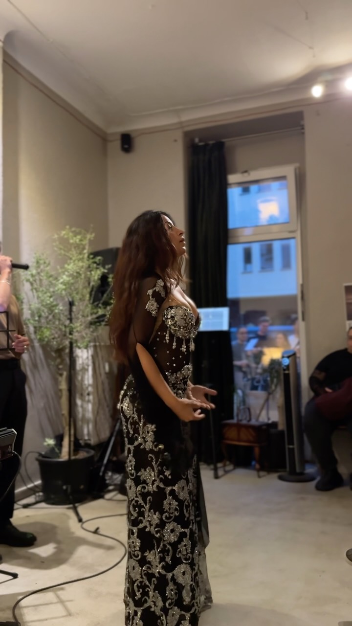 underperformer
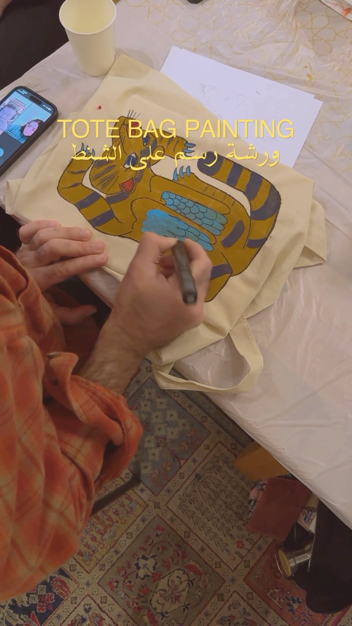 underperformer
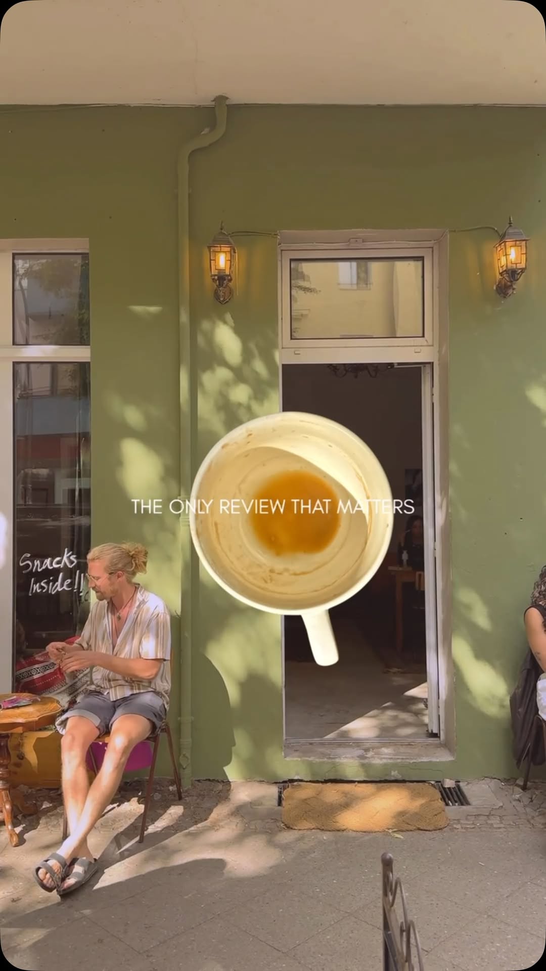 underperformer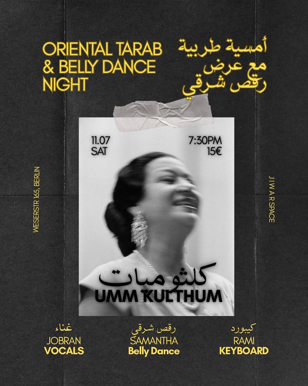
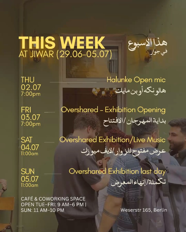 underperformer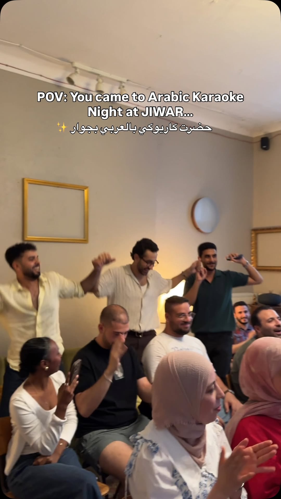
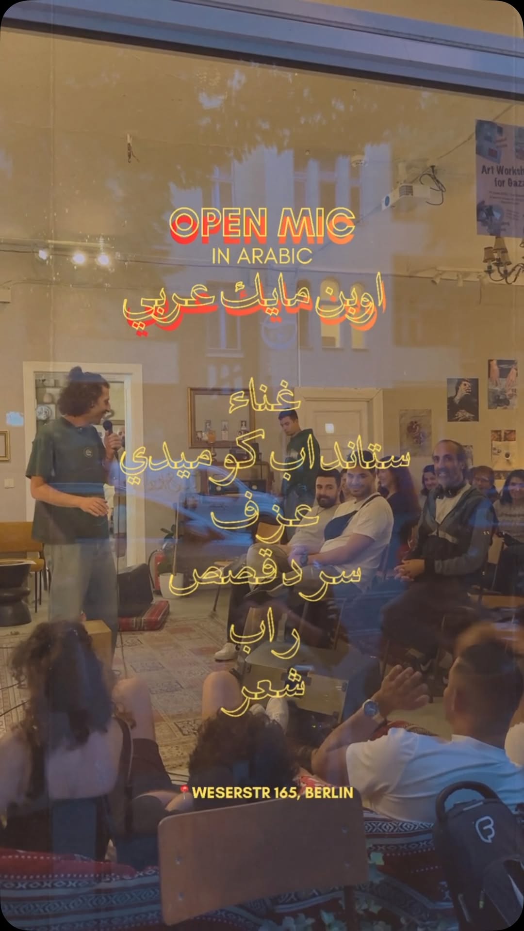 underperformer
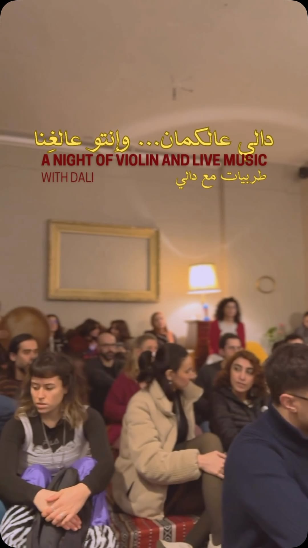 underperformer
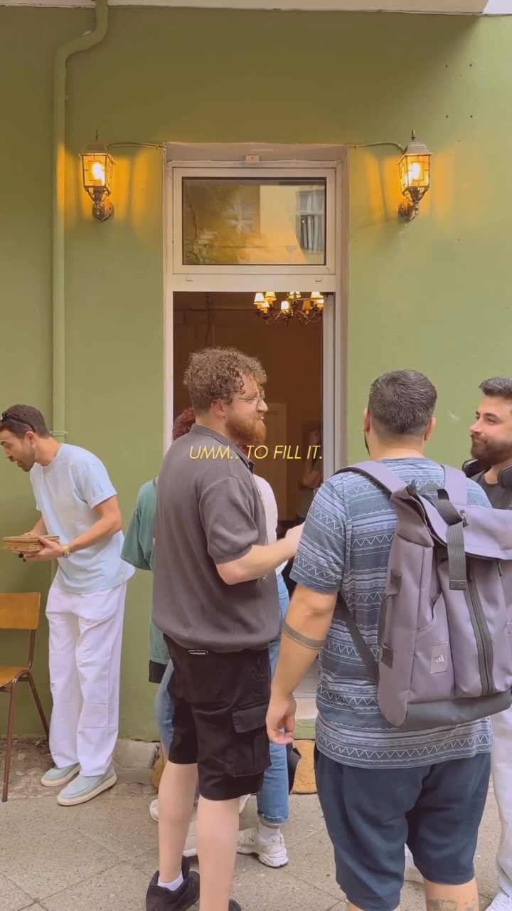 underperformer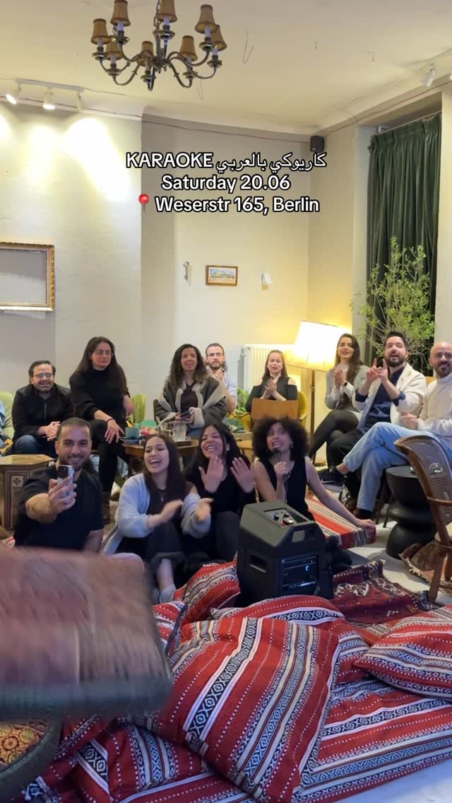
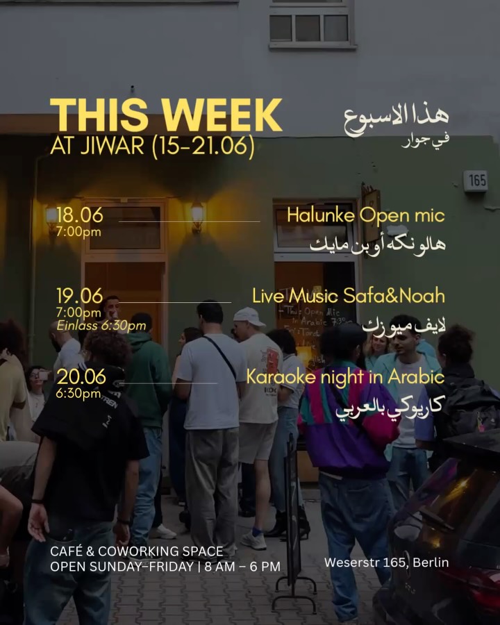 underperformer
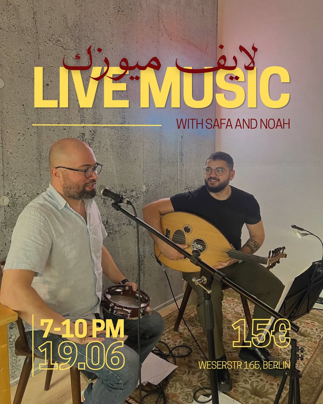 underperformer
- Latin/Arabic treated as one interlocking display unit at equal scale — exactly the bilingual posture Majal needs, and rare in this reference set
- Disciplined earth palette + photo desaturation makes wildly different events (dabke, tarot, tatreez, iftar) grid together
- Textiles (kilims, tatreez, keffiyeh) used as literal backgrounds ties graphics to the physical space
- Monogram + Arabic tagline as fixed furniture on every asset builds recognition fast for a young space (opened Dec, ~85 posts)
- System slips when others supply art — the exhibition poster (default bold sans, clip layout) and plain 'coming soon' card look like a different, worse brand
- Reel overlays often revert to plain system fonts and emoji-heavy captions, wasting the poster system's equity in the format that reaches furthest
Visual analysis
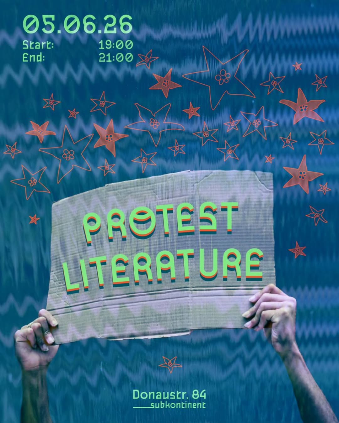
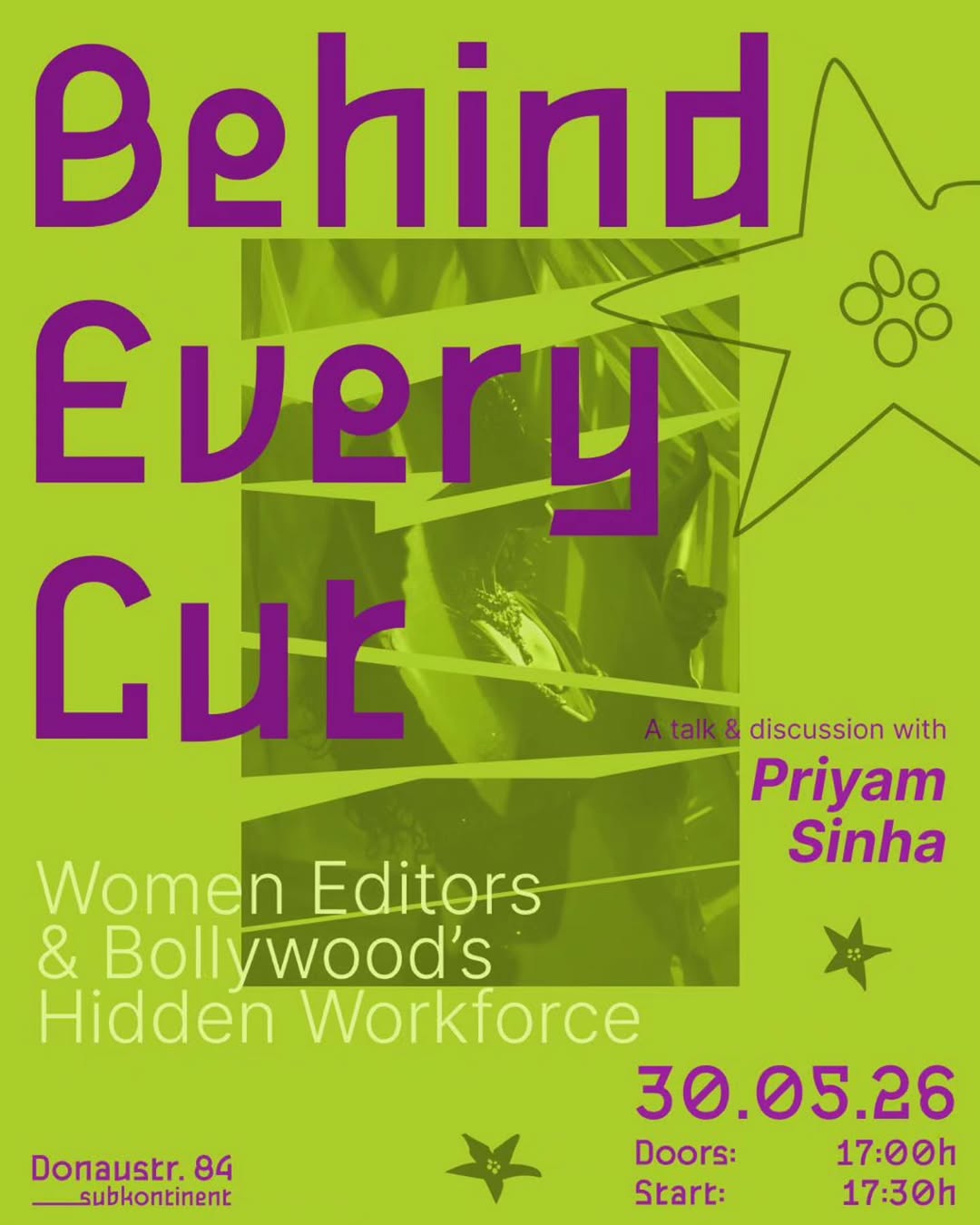
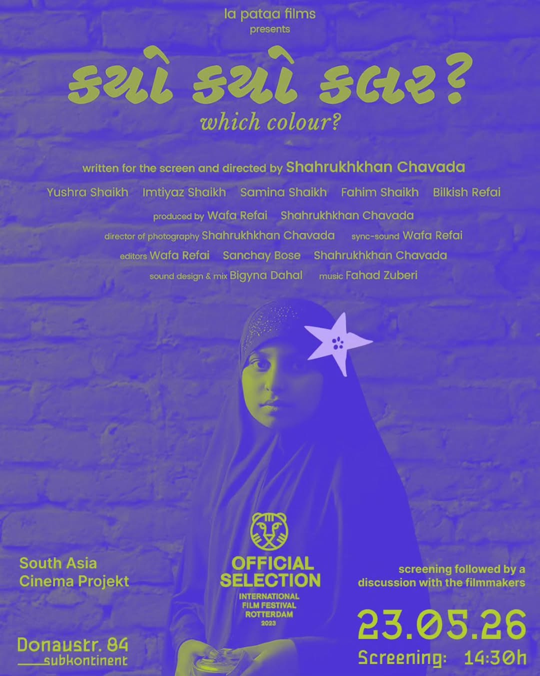
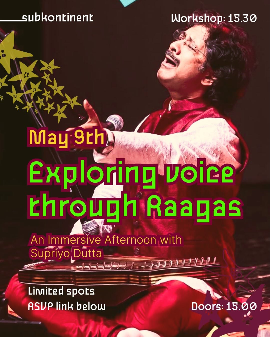
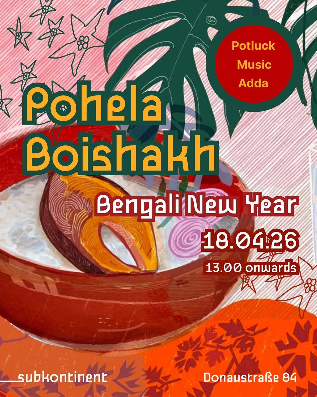
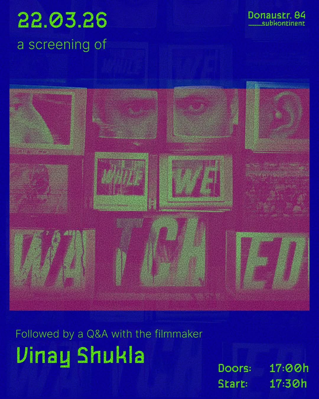
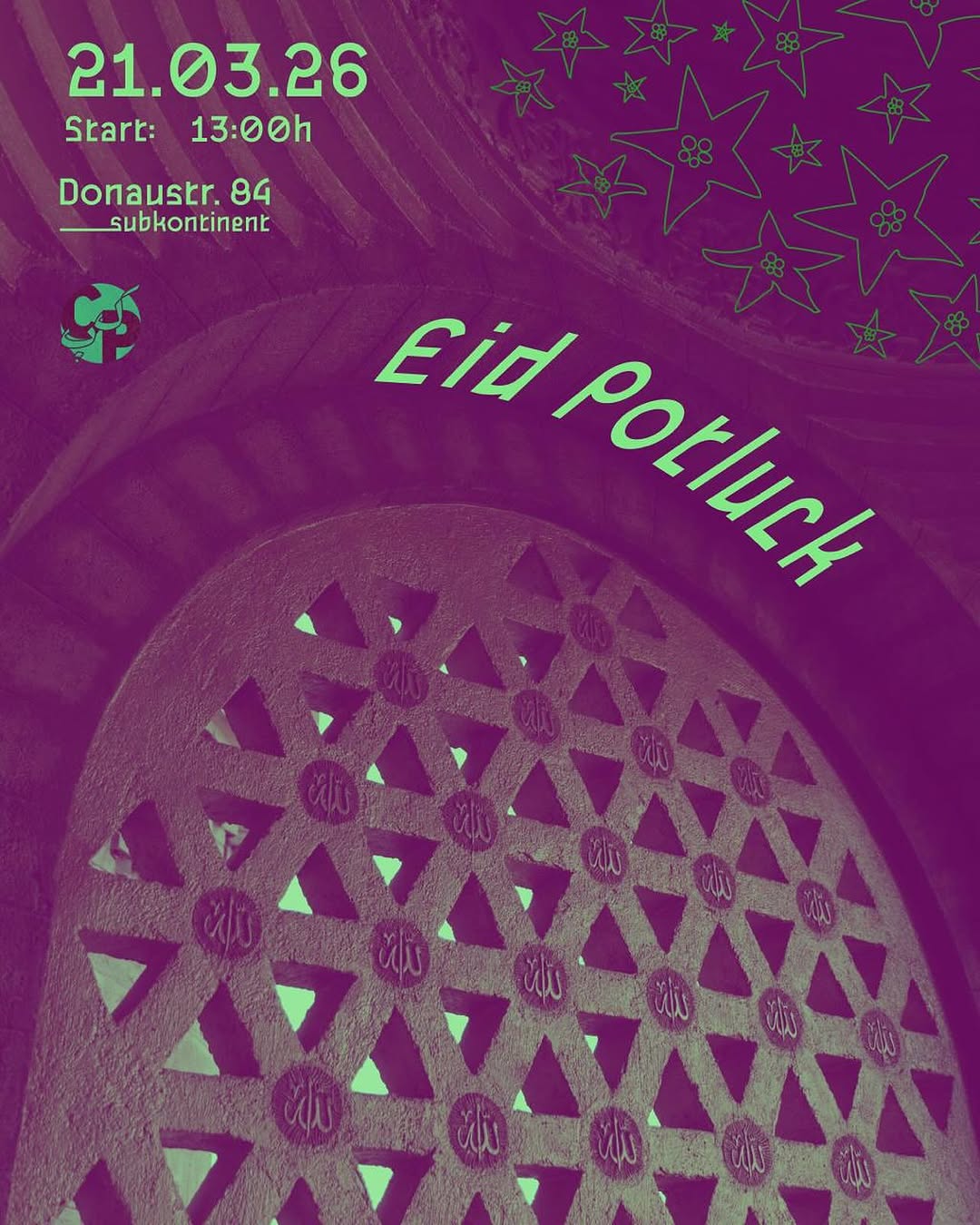
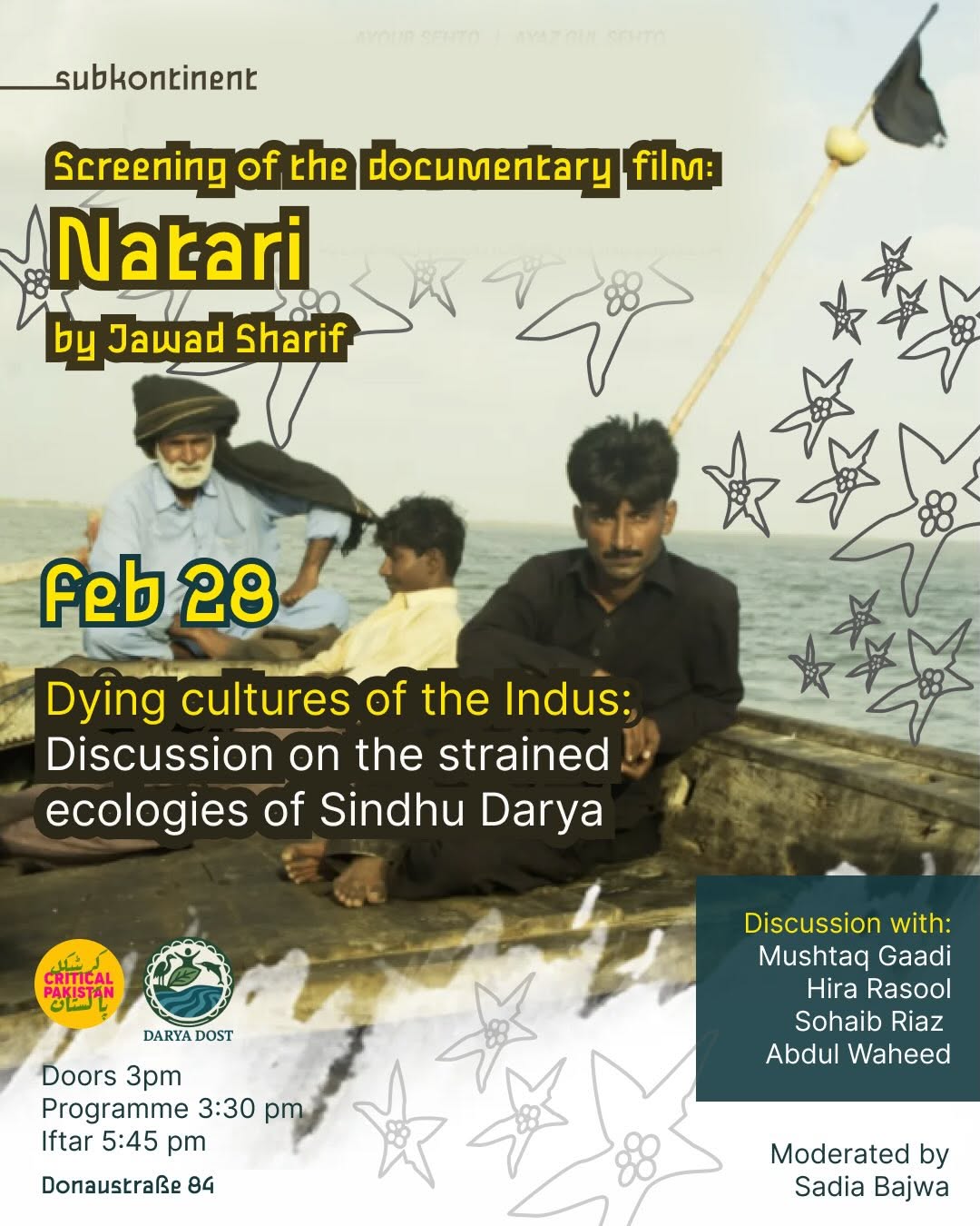

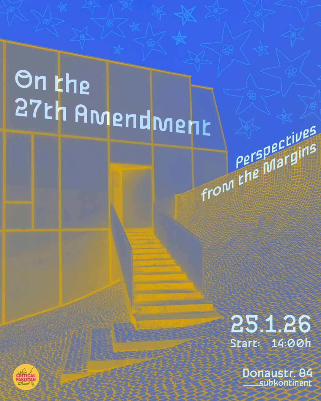
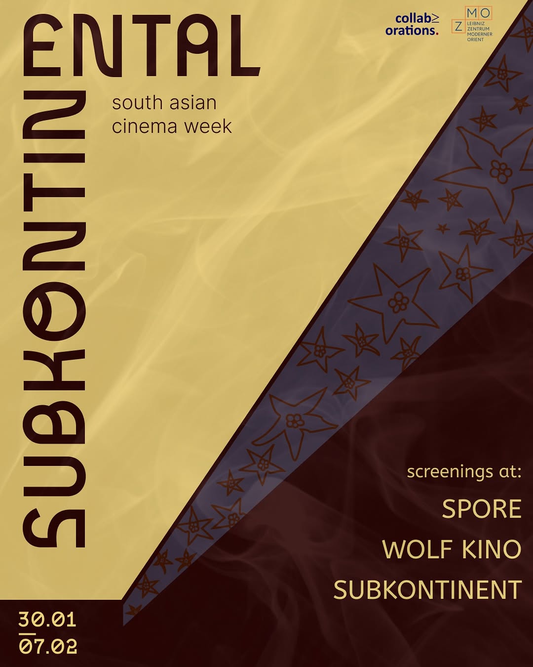
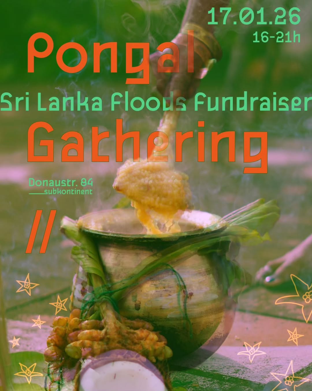
- Poster-as-identity: treating every event as a designed artifact makes a tiny space read as a serious cultural institution
- Script-inflected display lettering encodes South Asian identity typographically instead of via cliché imagery
- A repeatable motif (the jasmine-star scatter) plus fixed wordmark placement creates cohesion without a rigid template
- Fearless saturated two-color schemes give the grid energy at thumbnail size
- Legibility casualties: white-outline dates on light gradients and dark-green-on-brown text nearly disappear; info hierarchy often buried in dense copy
- Zero photography means no proof of life — the feed shows the design culture but never the room, the food, or the people
Visual analysis
Tía Chucha's Centro Cultural
underperformer underperformer
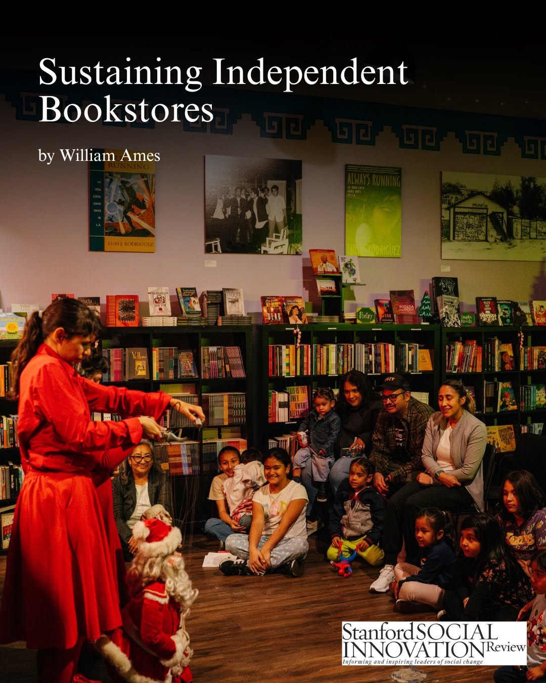 underperformer
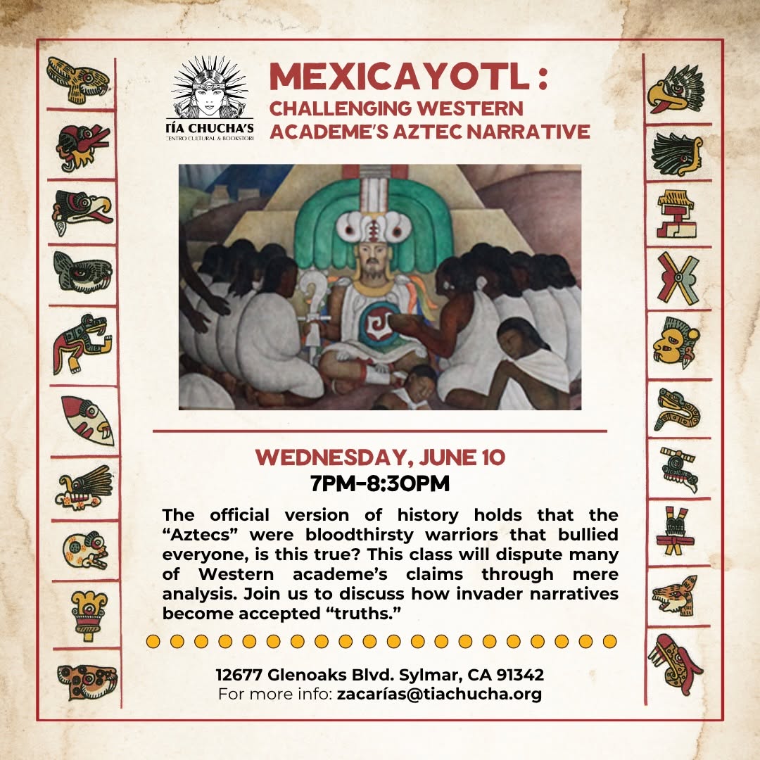 underperformer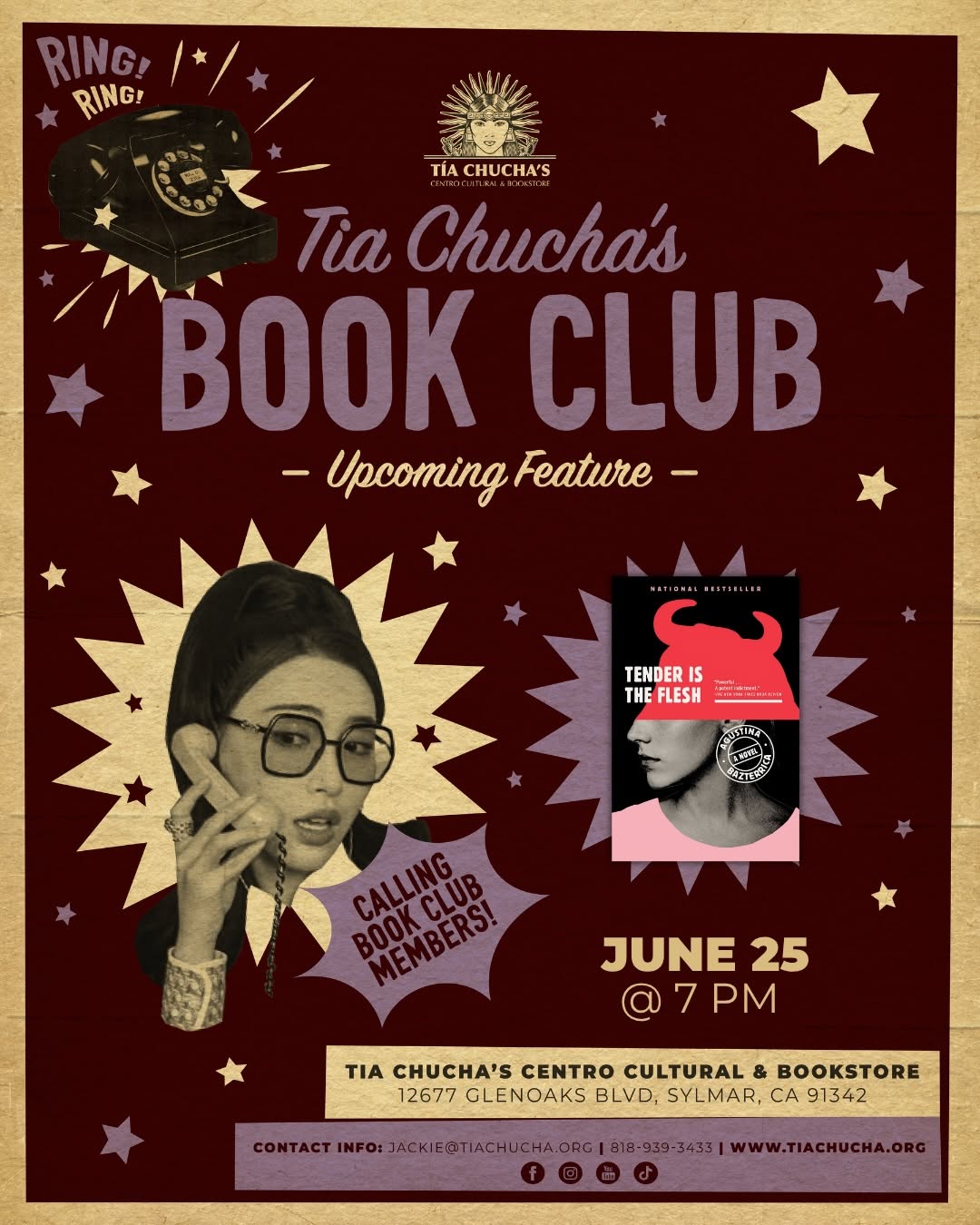
 underperformer
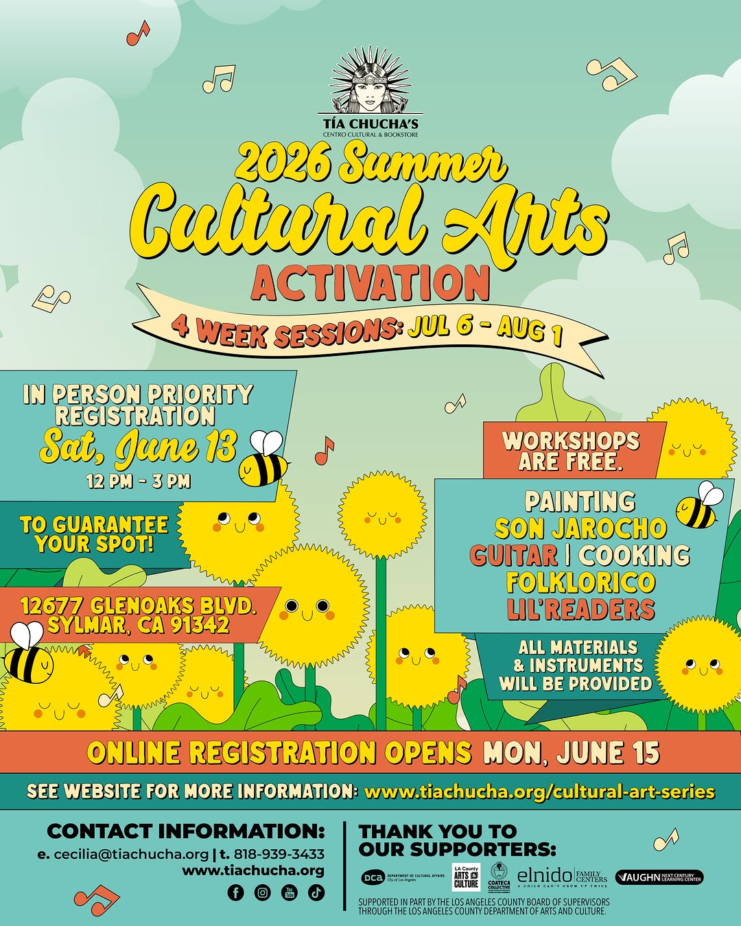 underperformer
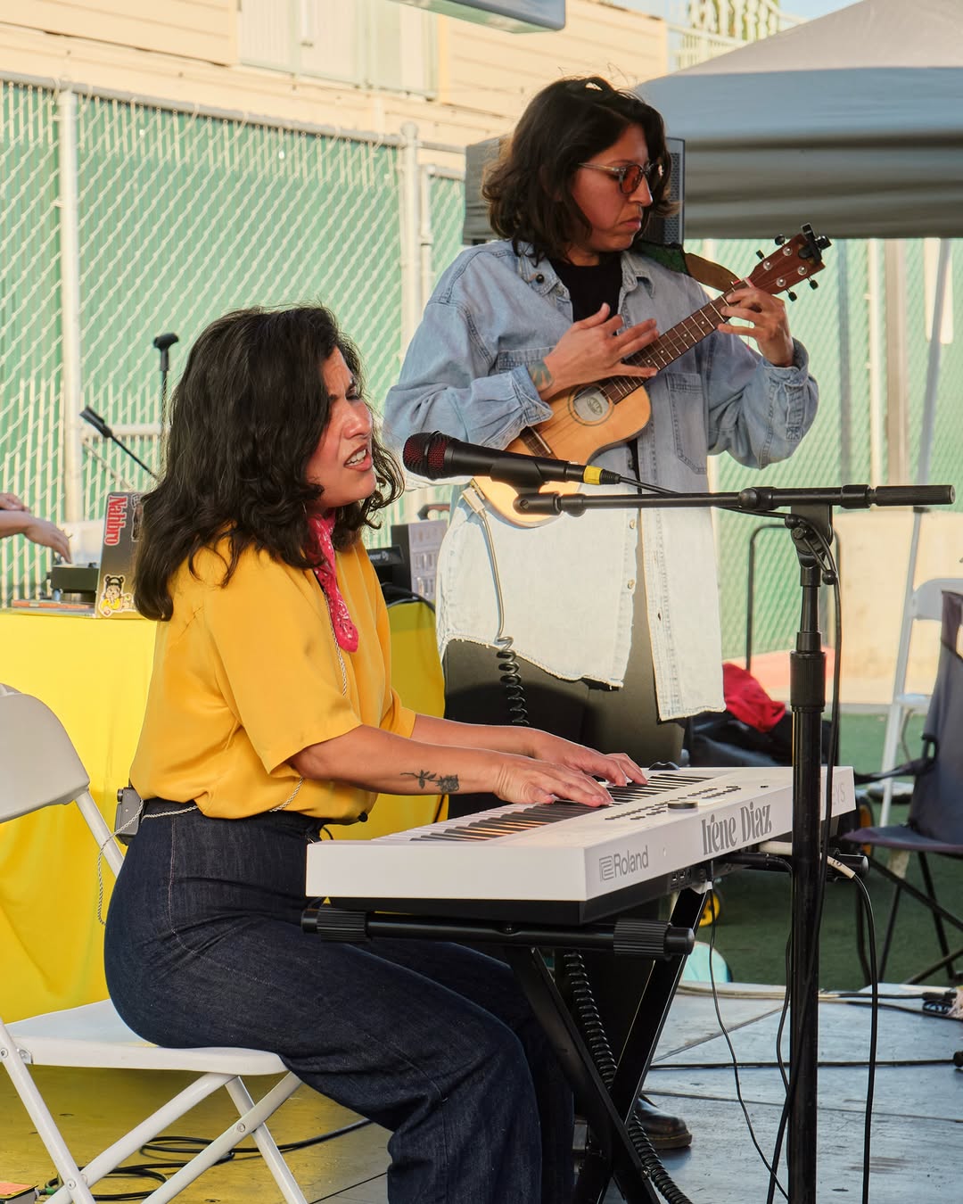 underperformer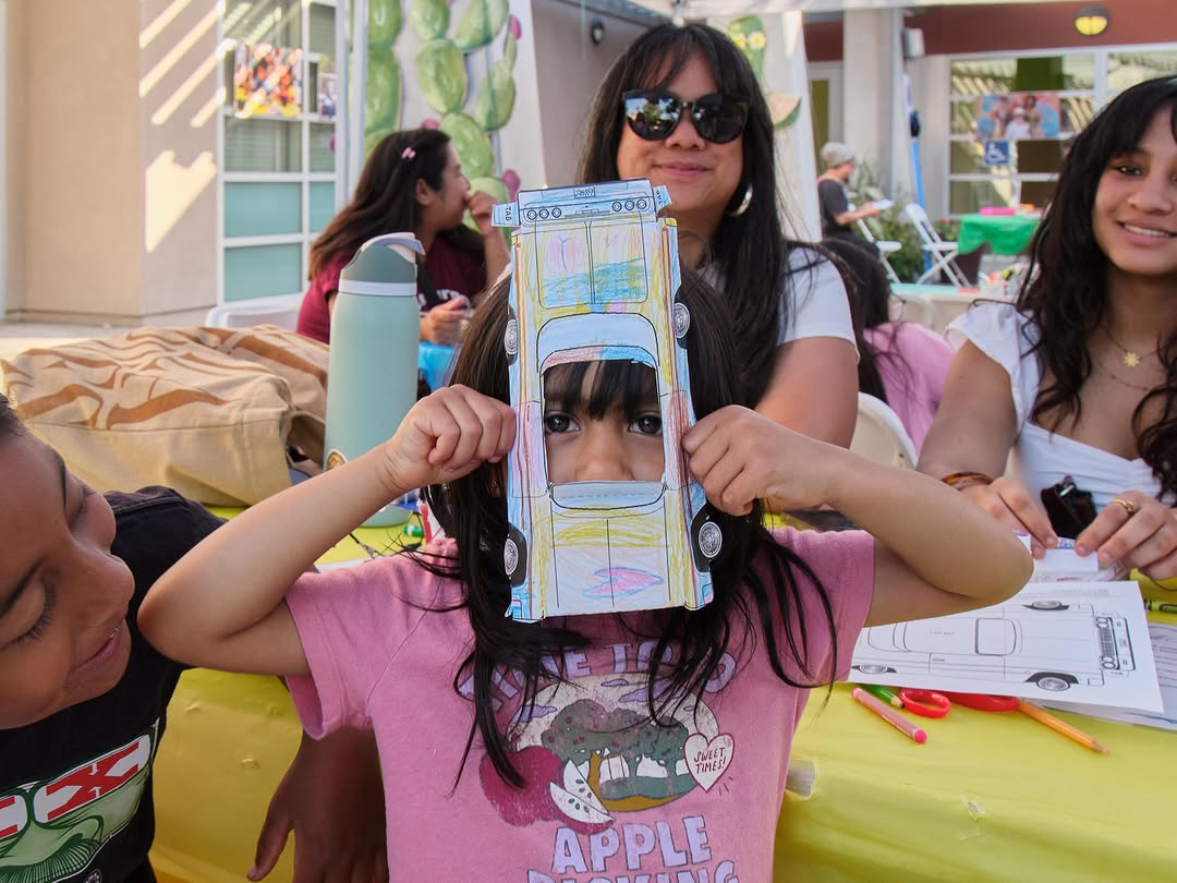
 winner
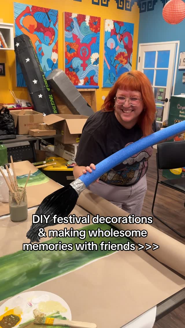 winner
 underperformer
 winner
 winner
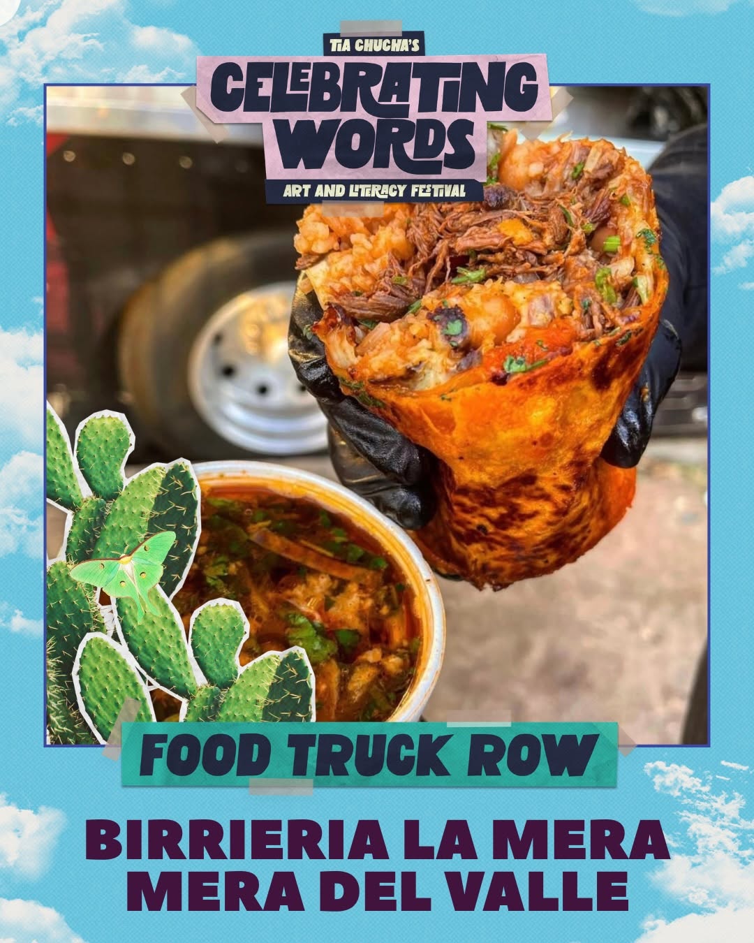 underperformer
- Books shot on a single loud turquoise background is a cheap, repeatable, instantly-ownable product format
- The festival collage style has real personality — hand-lettering plus cut-outs feels community-made in the best way
- Photography of real people in the space (kids, story hours, performers) sells warmth no graphic could
- The black-band movie-poster template (ratings box, follow-us bar, contact line) reads as mall-cinema advertising, not an indie cultural space — the venue's soul vanishes from its most frequent format
- Three disconnected visual systems plus centered text-boxes slapped over photos make the grid feel like several different organizations
Visual analysis
DARNA دارنا - ex cantine syrienne
underperformer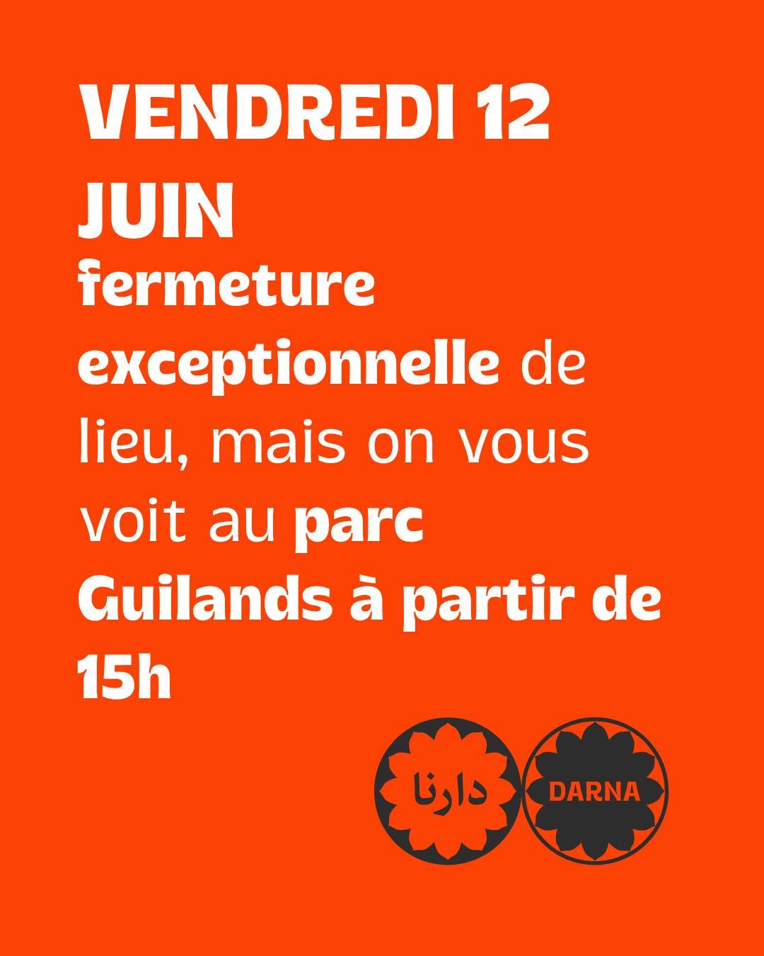 underperformer
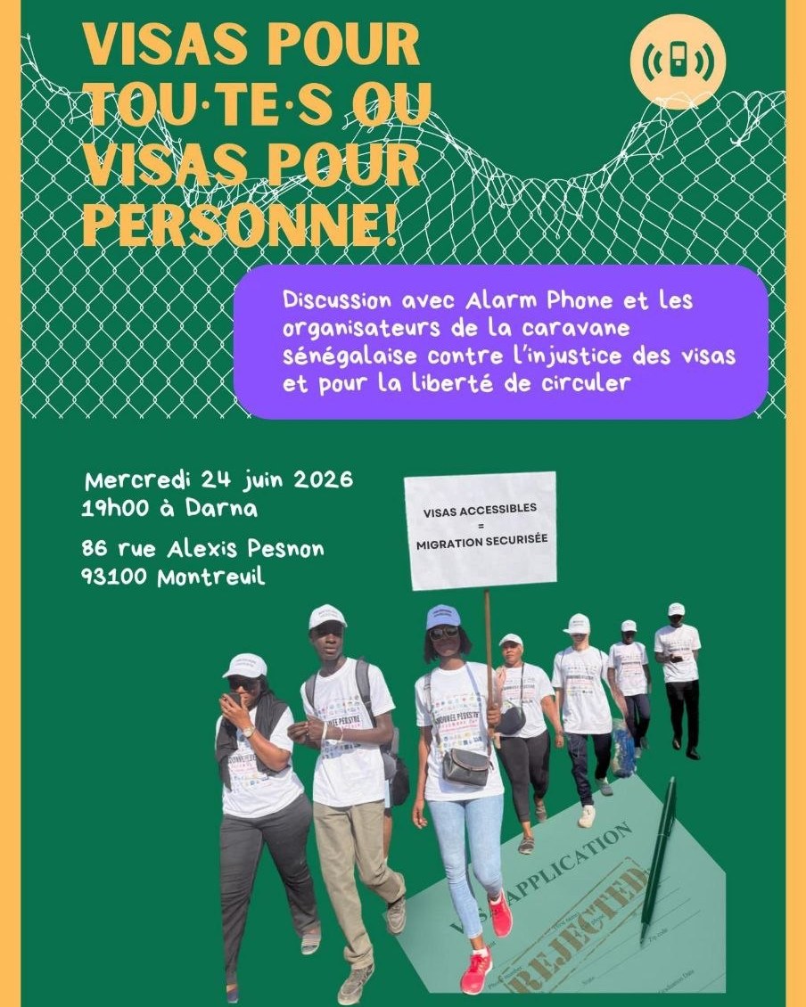 winner
![[Portraits d’insurgé.es - De hier et d’aujourd’hui] « Les révolutions d’août à s…](photos/darna.excantinesyrienne/DZDN2tJNfKp.jpg)
 underperformer
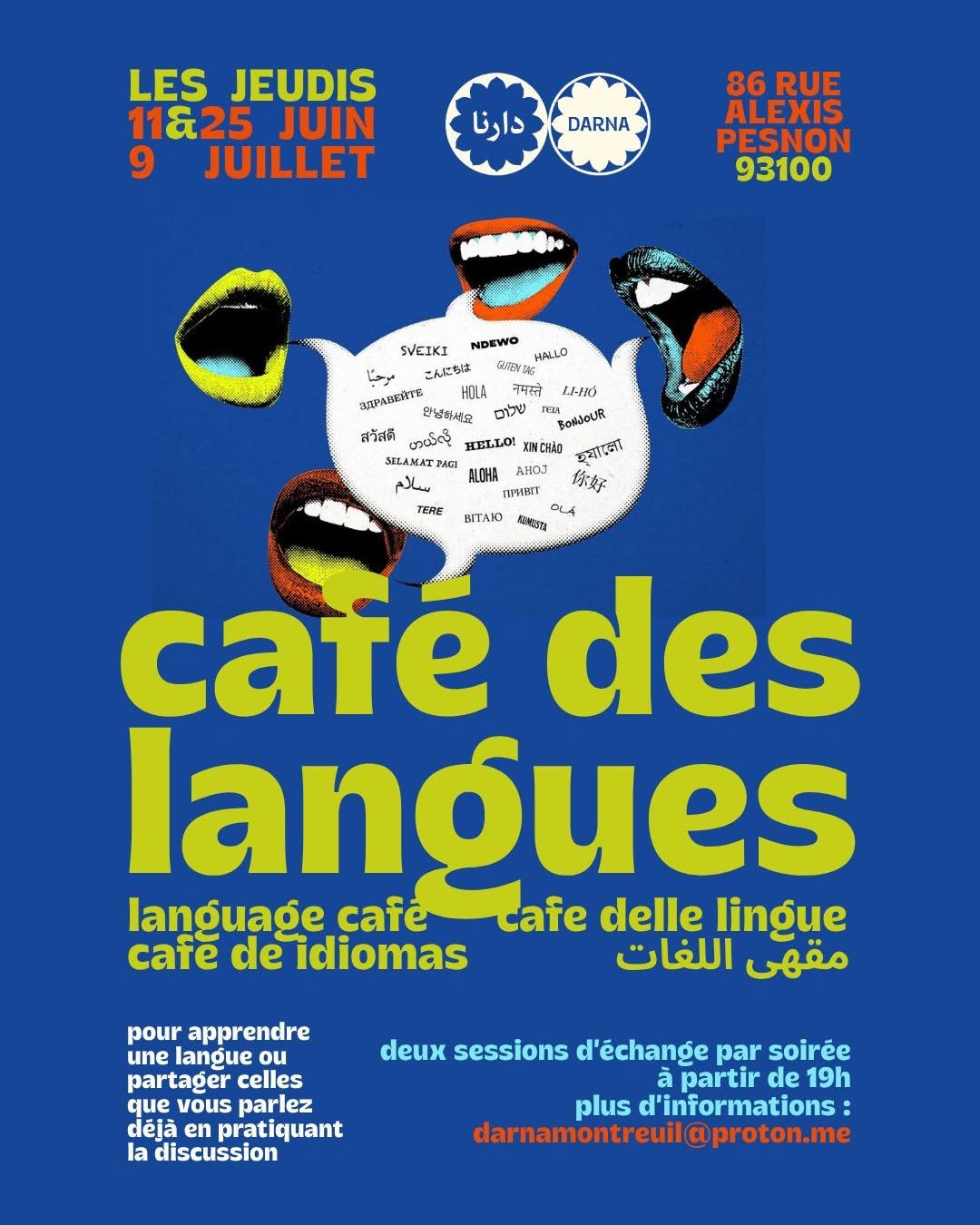 underperformer
![[Portraits d’insurgé.es - De hier et d’aujourd’hui] Video #1 : « The spring revo…](photos/darna.excantinesyrienne/DY7XtDMNxyV.jpg)
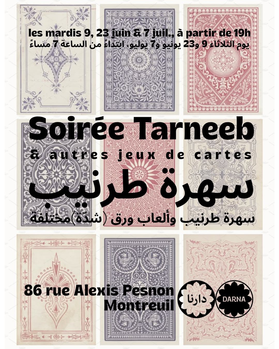 underperformer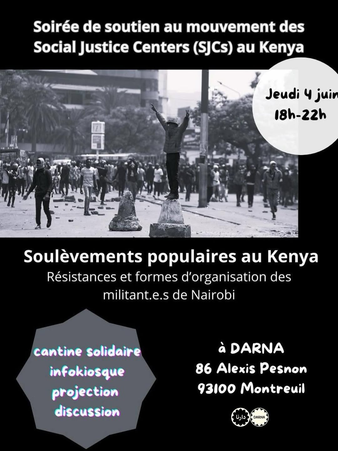
 winner
 underperformer
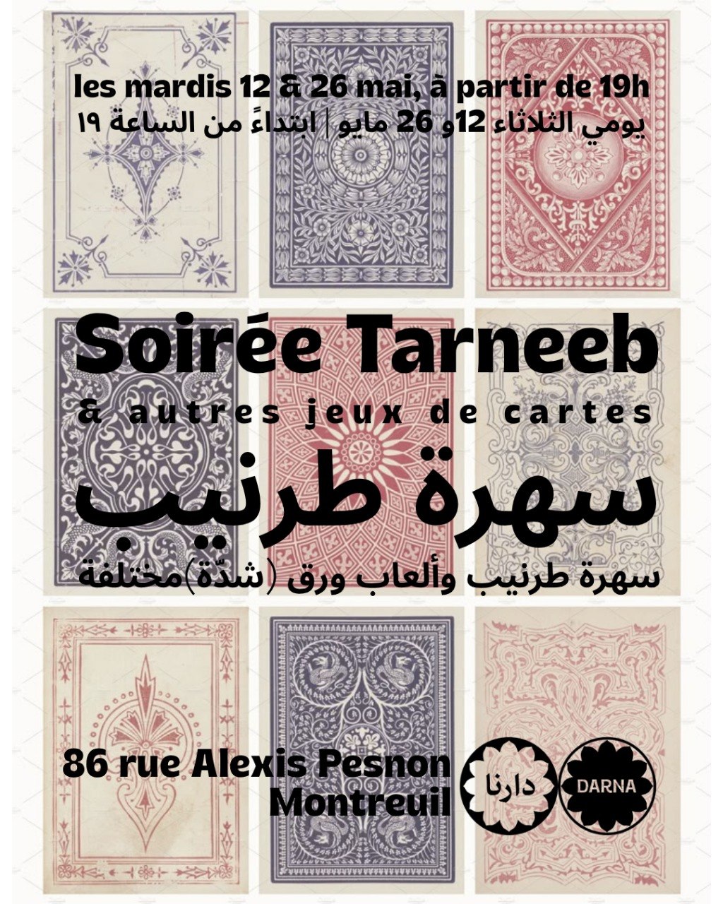 underperformer
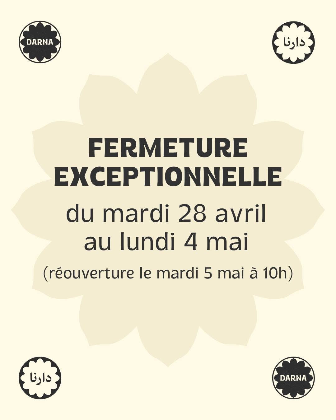 underperformer
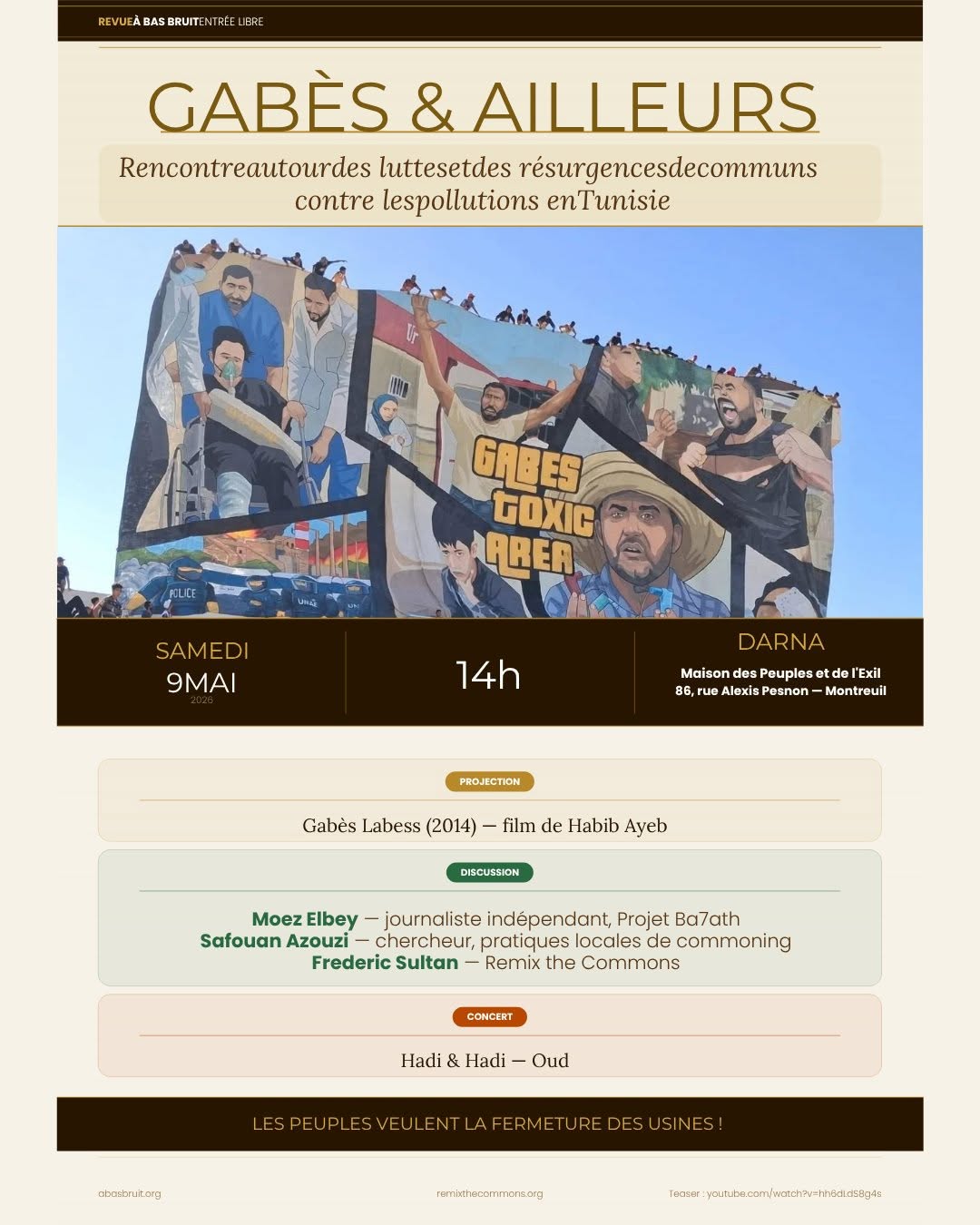 underperformer
- The twin-rosette Arabic/Latin logo pair is a model for bilingual identity — same shape, two scripts, equal weight
- Flat color + one bold typeface + seal placement = a system a tiny volunteer team can actually maintain
- Restrained monochrome color-blocking per month (orange June, blue May) gives the grid rhythm with near-zero design effort
- Off-template posters (sparkle clip-art, stock musician illustrations, five fonts on one flyer) crater the credibility the menu system builds
- Almost no photography of the actual food or room — for a cantine, the strongest asset is missing from the feed
Visual analysis
underperformer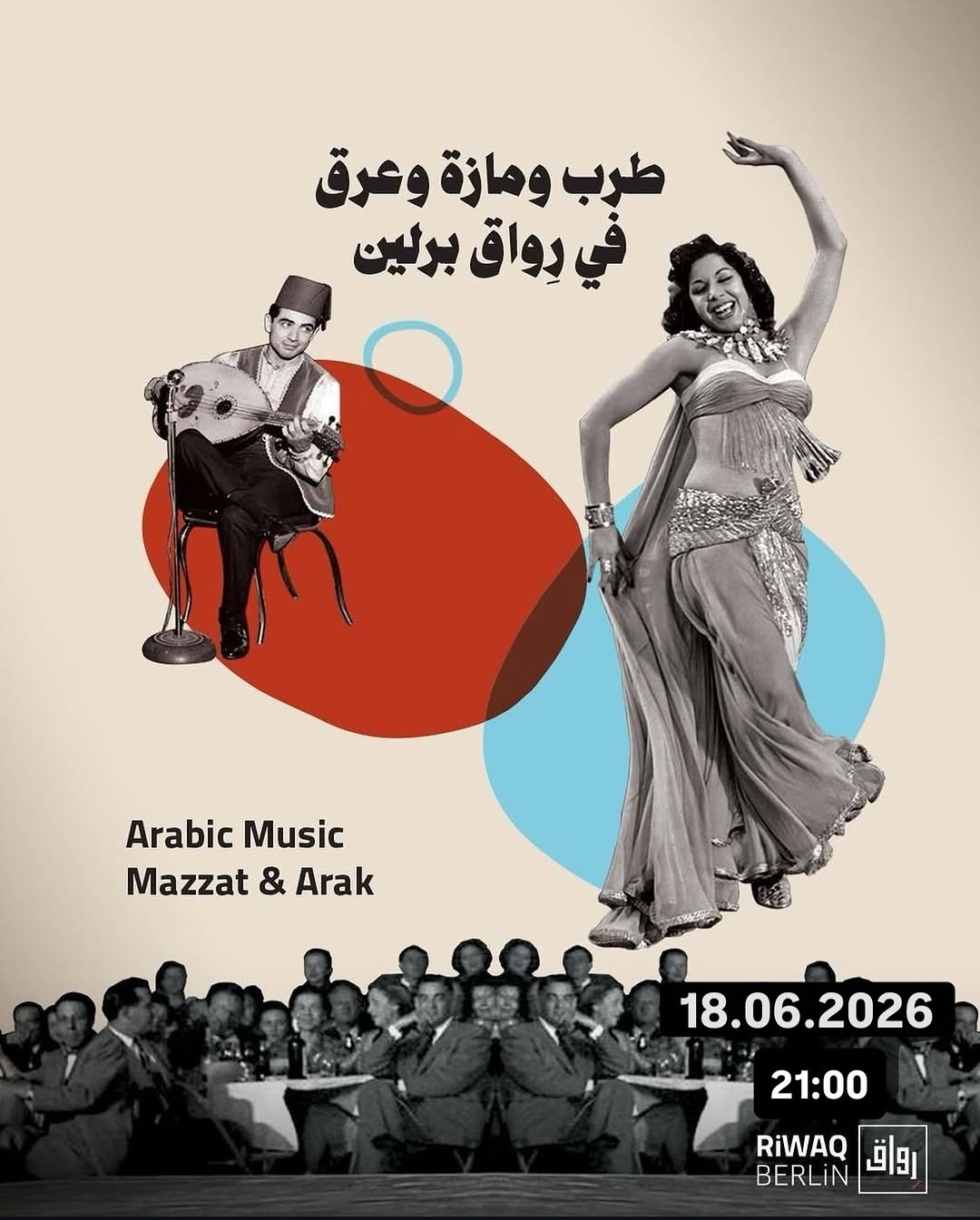 underperformer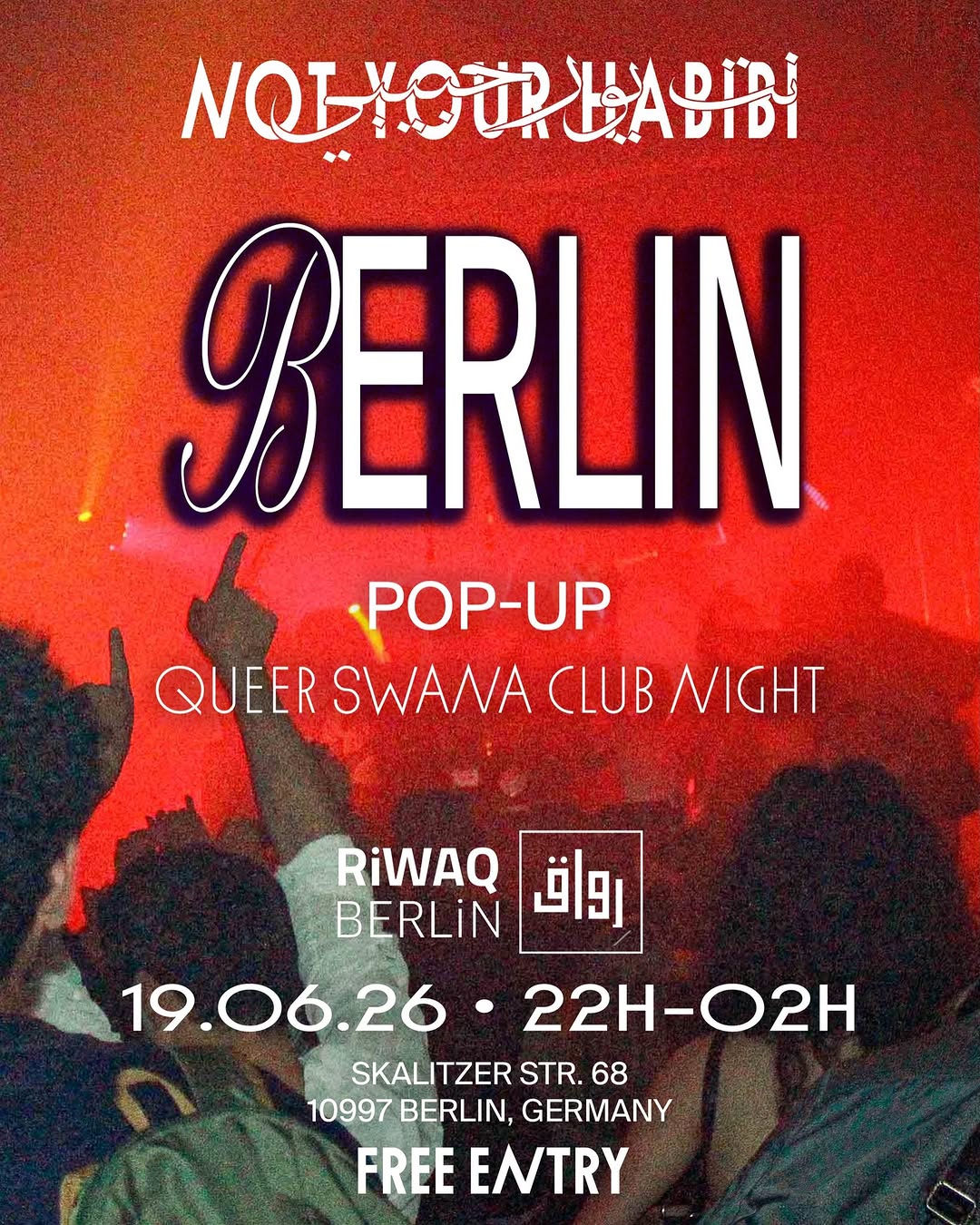
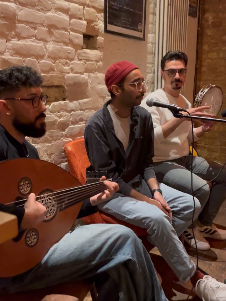
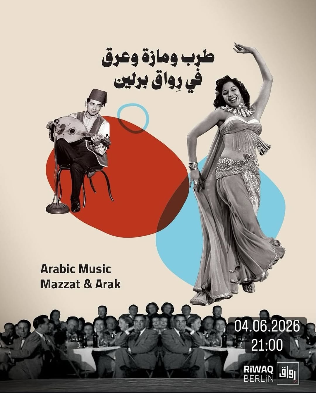 underperformer
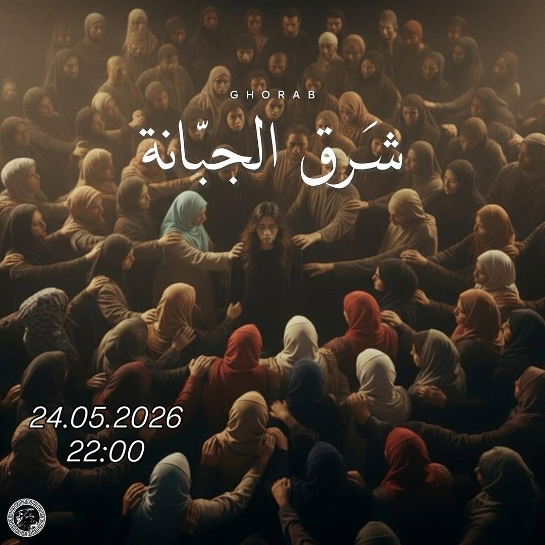 underperformer
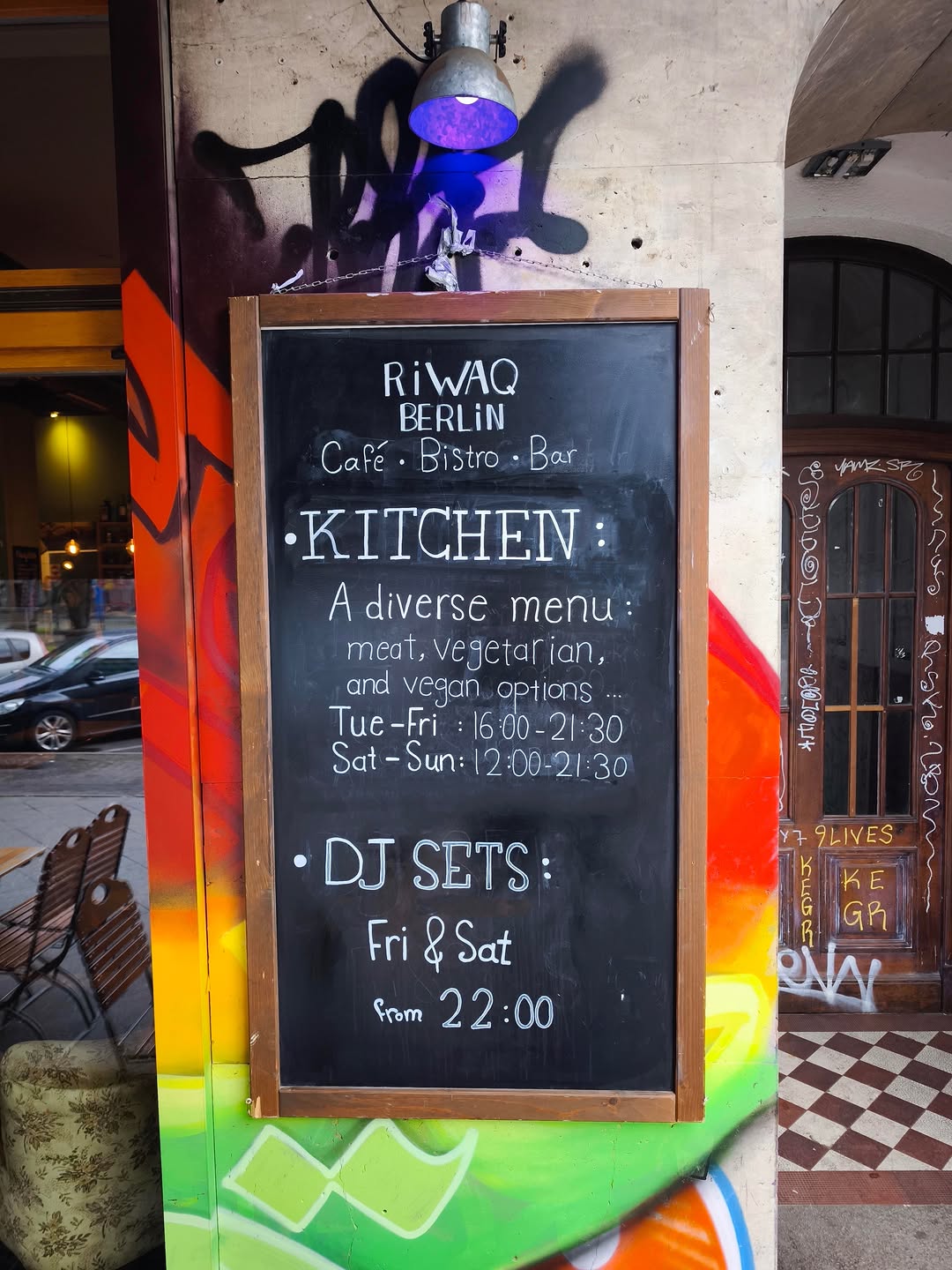 underperformer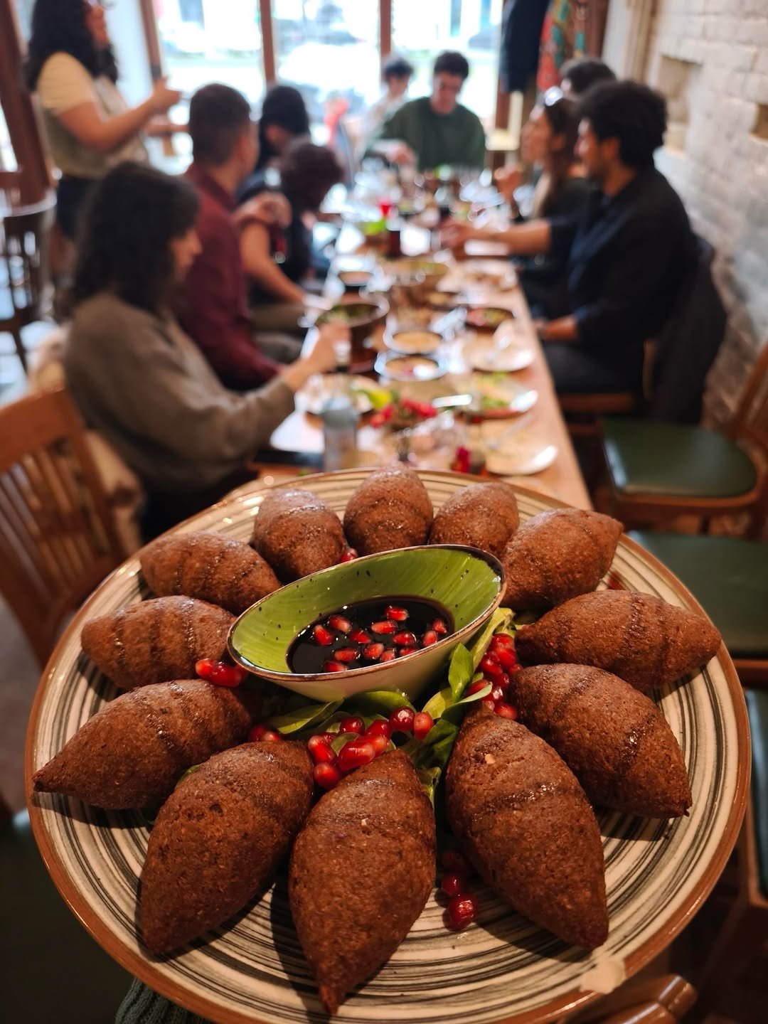
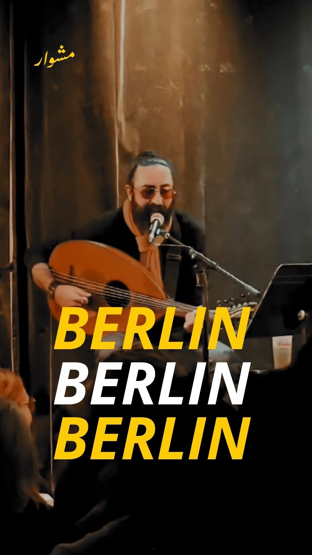 winner
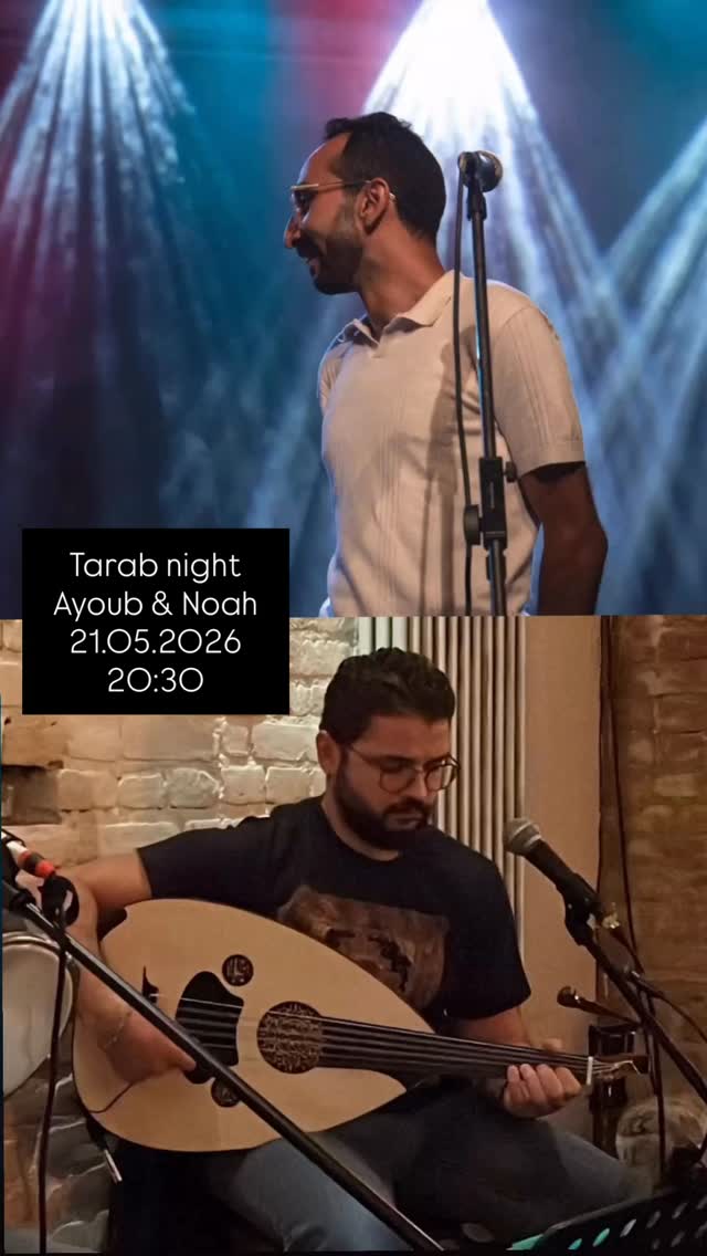 underperformer
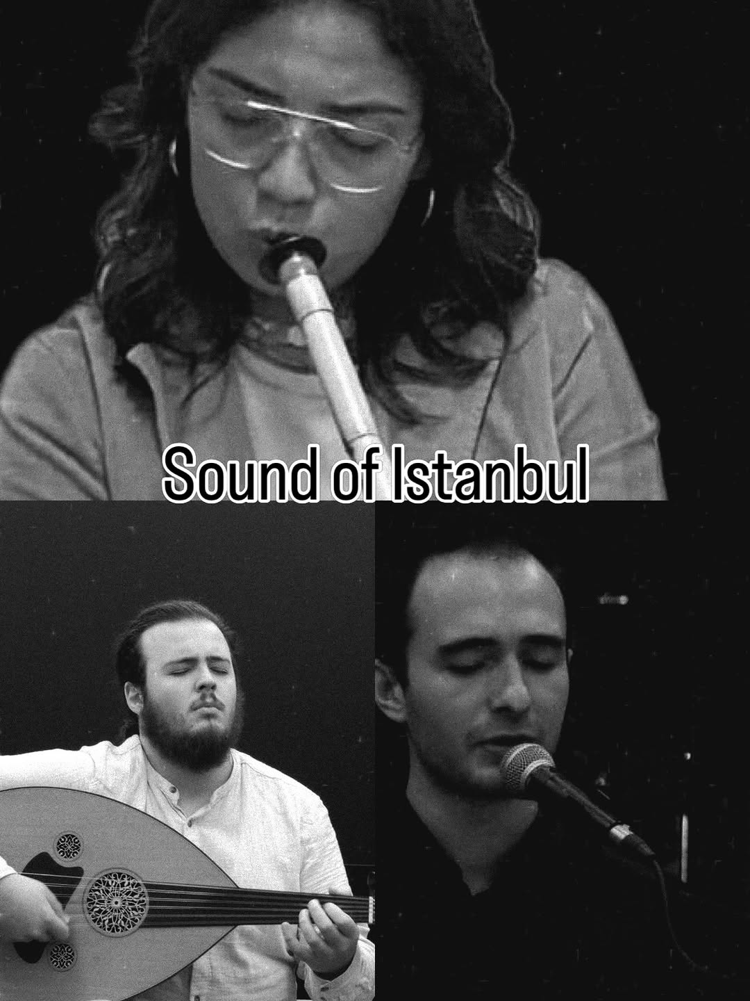 underperformerwinner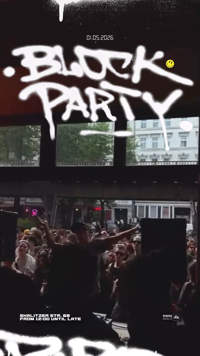
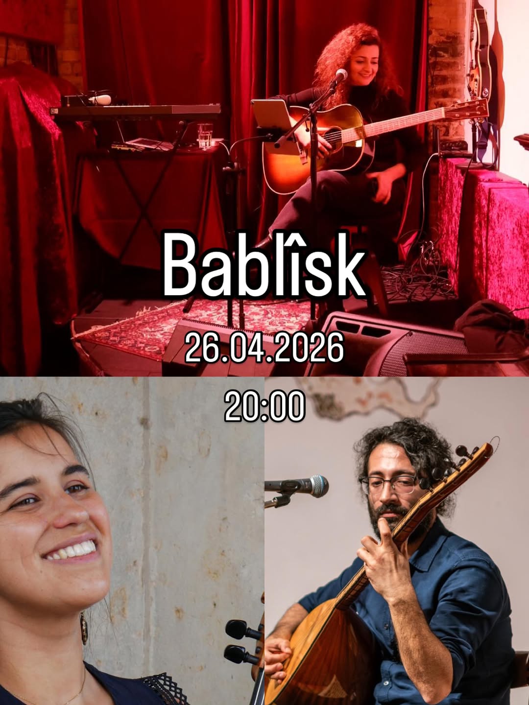
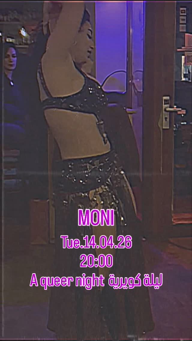
- Warm low-light amber/red photography makes the space itself the brand — you can smell the coffee and hear the oud
- The vintage Egyptian-cinema collage posters are a distinctive, ownable SWANA visual language worth systematizing
- Levantine-Arabic-first captions with playful emoji create insider intimacy the diaspora audience clearly responds to
- Documenting real nights (not promo renders) proves the community is alive
- No graphic system beyond the logo: spray graffiti, kaleidoscope edits, plain sticker text and collage all coexist, so event posters carry no recognizable Riwaq signature
- Snapshot quality dips (blurry glasses, default sticker type, emoji-wall captions) read as improvised rather than intentional
Visual analysis
Political & editorial media
underperformer
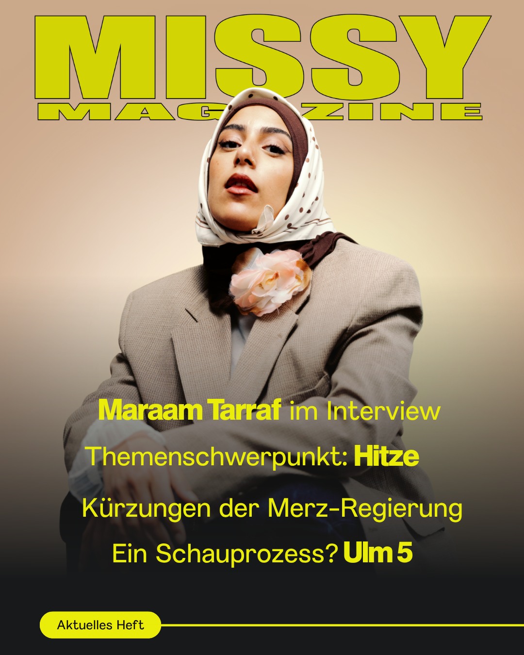 underperformer
 underperformer
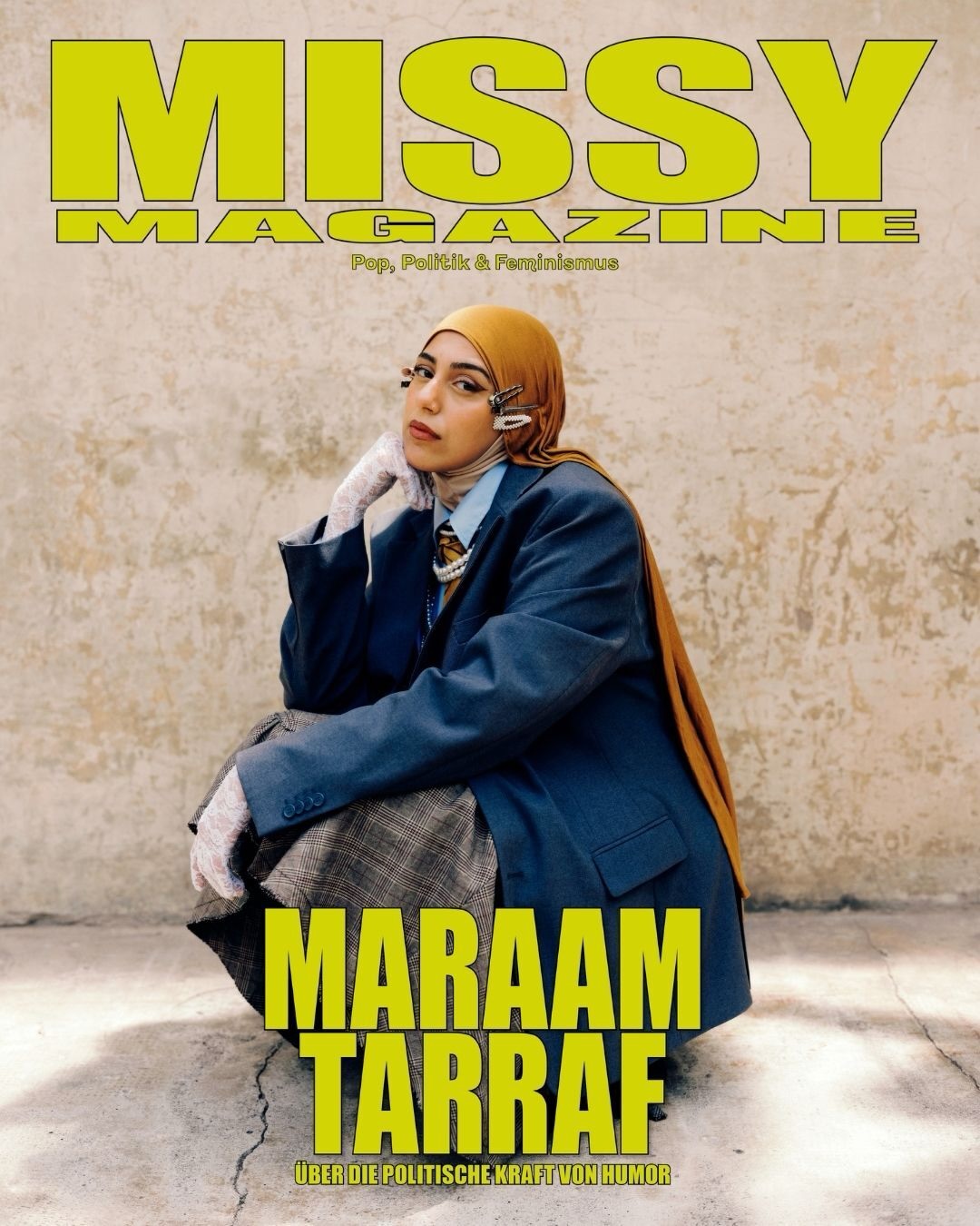 winner
 underperformer
 underperformer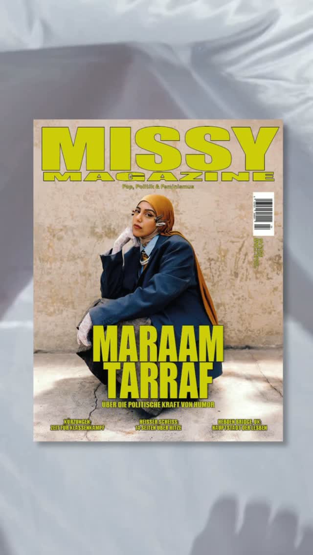
 winner
 underperformer
 underperformer
 underperformer
 winner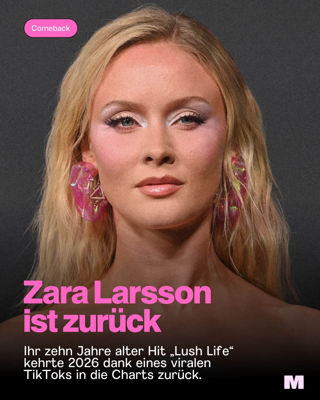
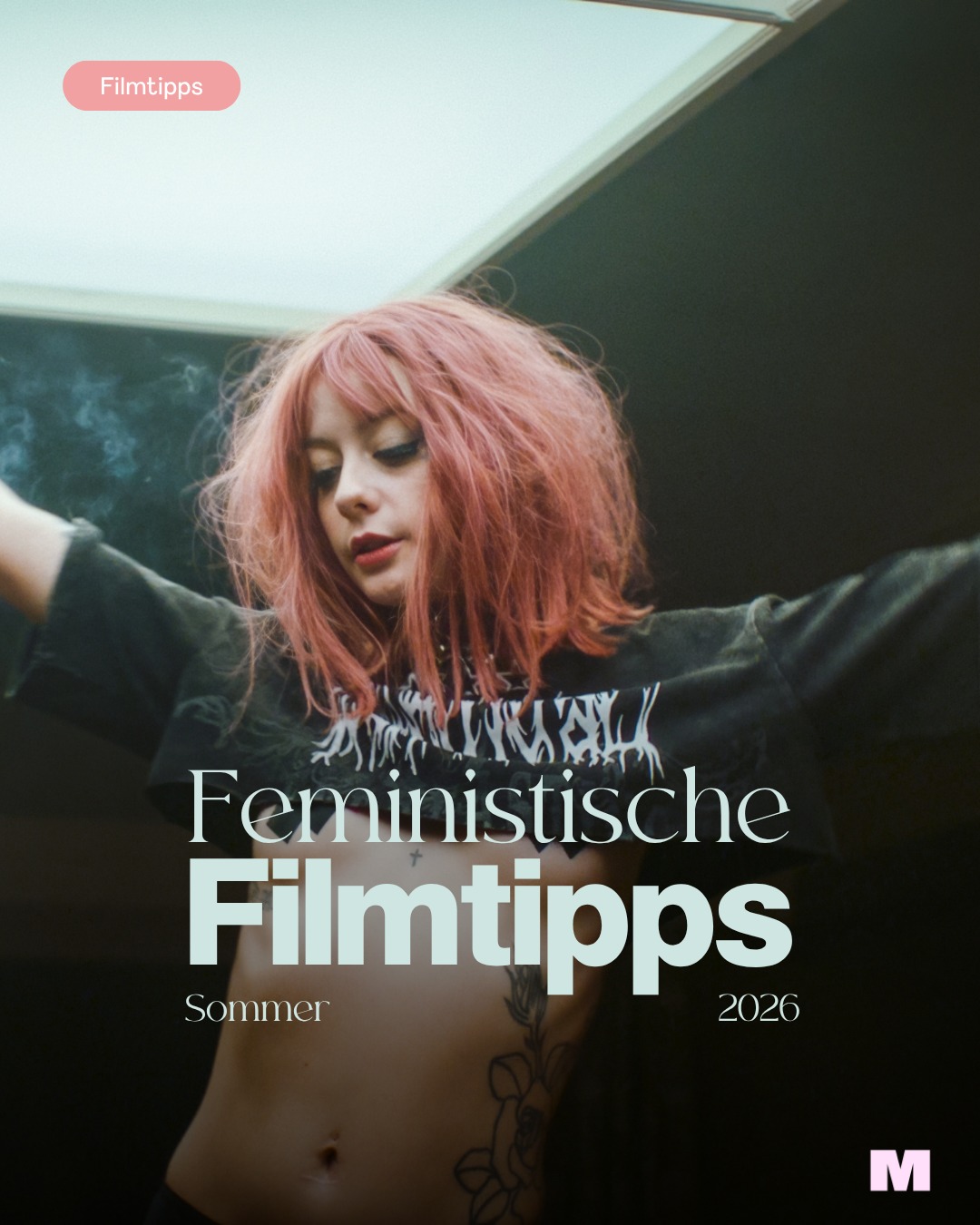
 underperformer
- A single reusable template (pill tag + gradient + bold white type) lets wildly different content — war in Sudan, menopause, film tips — sit together without the grid falling apart
- The accent color rotates per issue/season instead of being fixed, which keeps the feed fresh while the layout system carries recognition
- Casual low-fi photos of real team members holding the product break up the designed posts and add warmth and credibility
- Serious political explainers and playful culture tips share one visual language, so neither feels out of place
- The dark, black-gradient base treatment reads activist-urgent rather than hospitable — a café/bookshop feed built on it would feel heavy
- Deliberately provocative merch language and shock-register headlines suit a magazine's edge, not a safer-space venue
Visual analysis
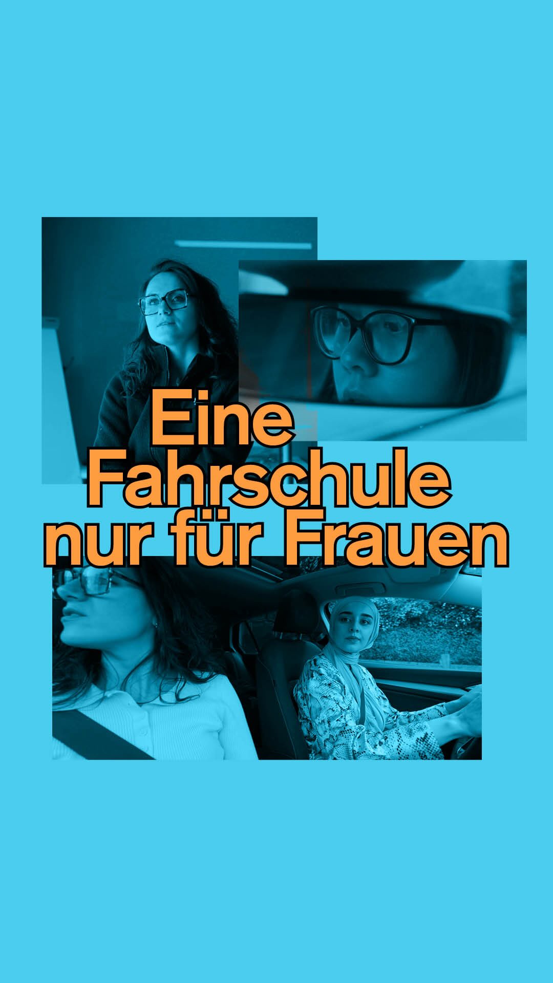


- Letting an ordinary person's long, unedited quote fill the whole tile treats community voices as the content — no imagery needed when the words are strong
- A rotating set of 4-5 saturated background colors creates variety inside a rigid template; the typeface trio does the branding
- The typewriter-set attribution ('Paula, 22') is a small device that makes testimony feel documentary and credible
- Ending cards with a simple arrow glyph converts a quote into a carousel invitation without cluttering the design
- Wall-to-wall text tiles with zero photography would starve a physical space of atmosphere — Majal needs to show its room, coffee and shelves
- The ironic meme register requires constant editorial energy and can undercut sincerity, which a community space depends on
Visual analysis
- Shooting community members like cover stars — warm light, real locations, direct gaze — is the single strongest move here: it dignifies ordinary people, which maps directly onto celebrating Majal's community
- The face–statement alternation gives the grid a heartbeat: emotion from photography, message from quote cards, each making the other land
- Two-word titles in one accent color prove that warmth and boldness can coexist — the type is loud but the human stays dominant
- Pill-shaped category tags (Artikel, Podcast, topic) quietly organize a mixed content stream without a rigid grid
- The full neon palette at this intensity reads campaign/activist; a home-like space would want the warmth of the photography with quieter accent colors
- Confrontational political category framing fits a watchdog magazine, not a venue that must stay welcoming across a diverse diaspora community
Strategy core
Goals, in priority order
Membership and book/café sales follow trust — they ride on goal 1, they aren't campaigns.
Audiences
One brand, two registers
community channels speak warm and political; hire touchpoints speak facts-first (capacity, access, price). Never sell rentals on the community feed; never run mission posts through the rate card.